
RESUME

84th classic cafe rebranding
(SCHOOL PROJECT)
This rebranding project was for 84th Classic Cafe in West Allis, WI for my Identity Design class at Milwaukee Institute of Art and Design. The goal of this project was to choose a local business with a less than desirable brand identity and rebrand it with a new logo and other assets.
The process for this project began by gathering information on potential competitors, brand problems, and the current brand identity. From there we had to create roughly 25 sketches of different types of logos, refine eight of them, recreate them digitally, revise them further, finish the forms of the logos, and add color to each of the variants. After that chose what we thought to be the best of our logos and created a presentation and brand identity guide where we included various mock ups relevant to our brand.
Logos were created in Illustrator, photographic elements and mock ups were created in Photoshop, and the final presentation and brand identity guide were made in Figma.

Letter Mark - Colored

Letter Mark Lock Up - Color

Letter Mark - Black and White

Letter Mark Lock Up - Black and White

Business Applications - Business Cards Front

Business Applications - Business Card Back

Business Applications - Business Cards Mock Up

Business Applications - Website

Business Applications - Website Mock Ups

Business Applications - Social Media Mock Ups
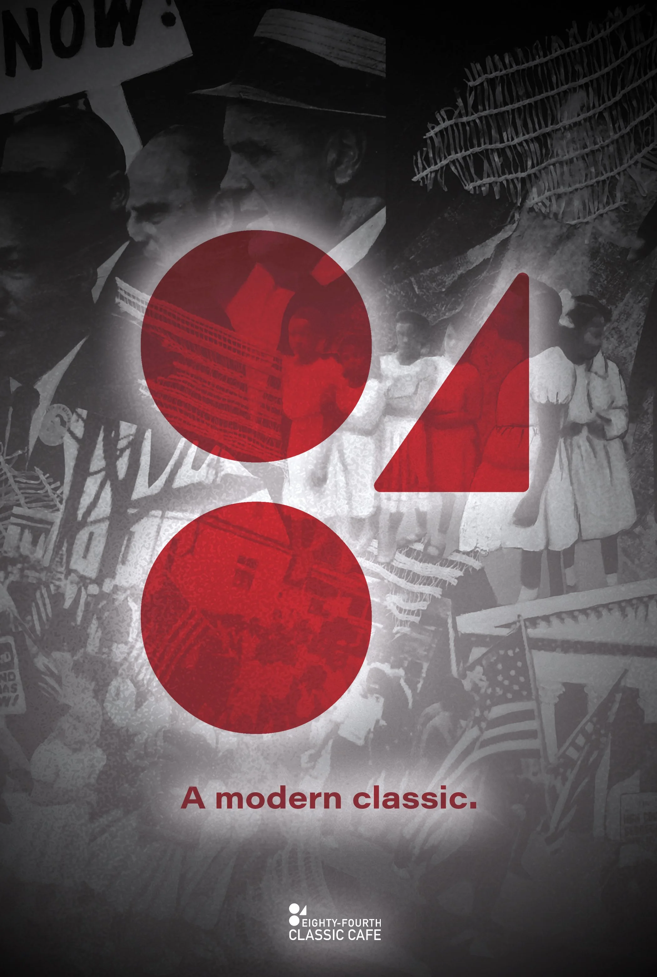
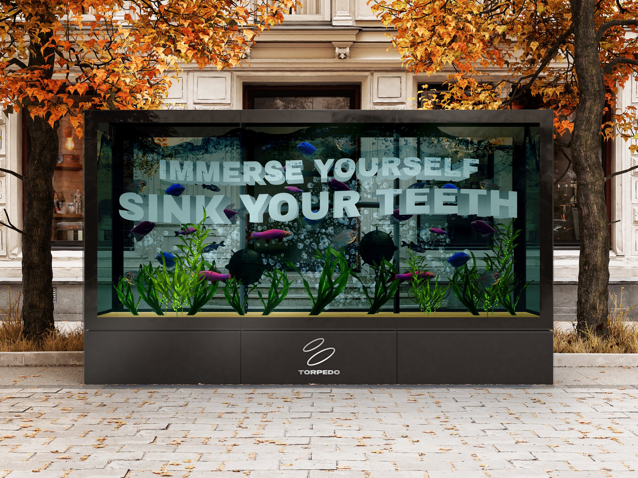
Advertising - Poster Ad

Advertising - Poster Ad Mock Up

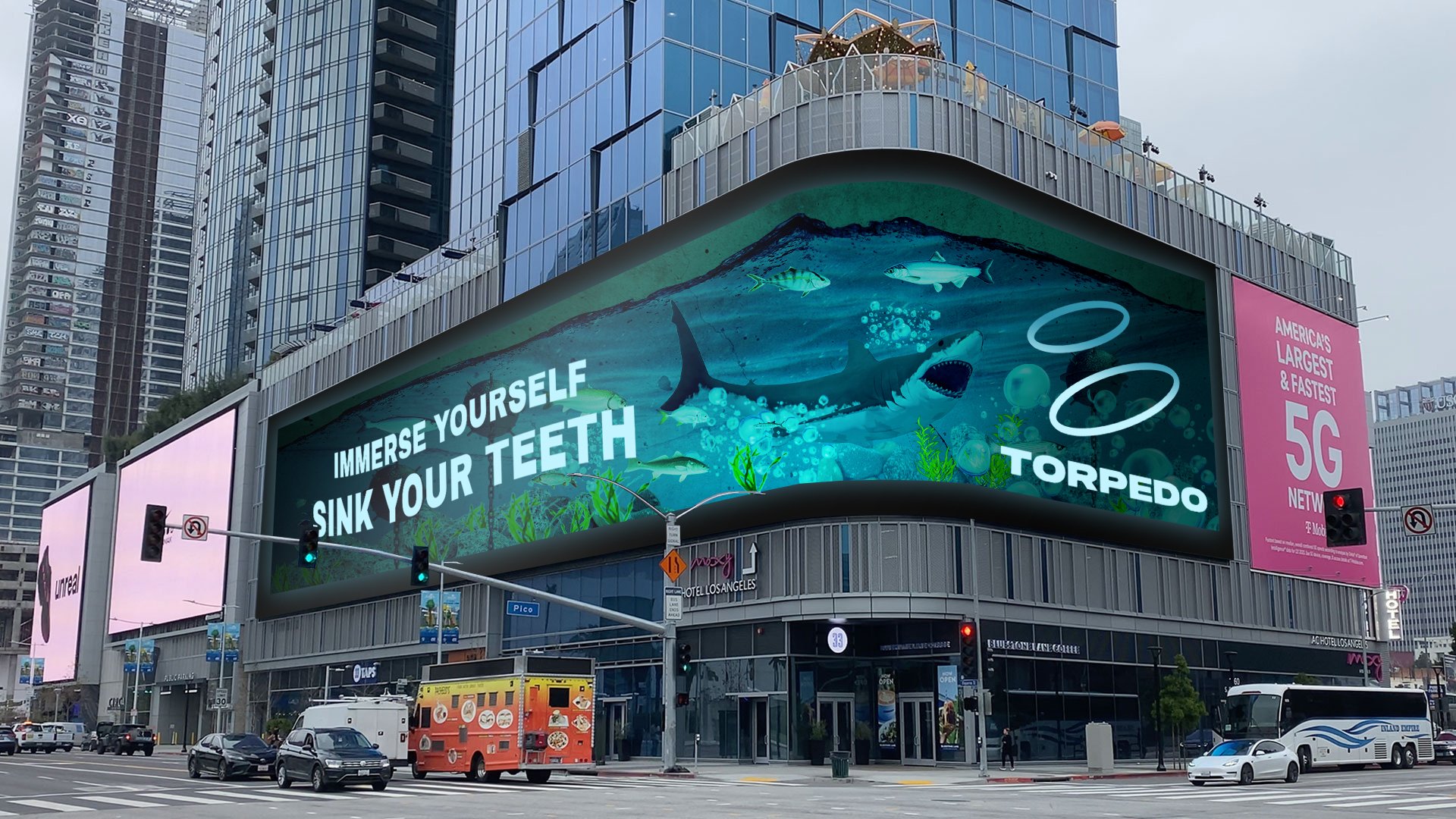
Advertising - Billboard Ad Mock Up

Advertising - Billboard Ad Mock Up

Business Applications - Apparel Mock Ups

Business Applications - Furnishings Mock Ups

Business Applications - Interior Mock Up

Business Applications - Interior Wall Mock Ups

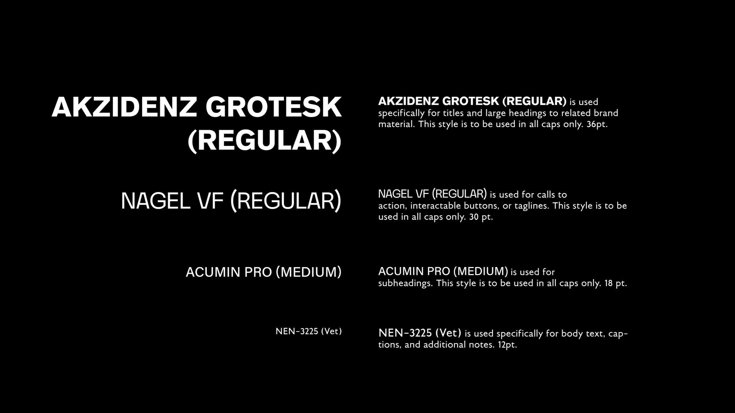
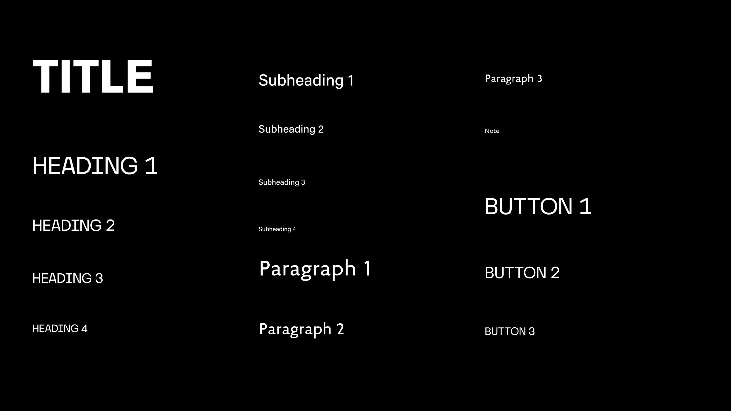
Branding Guidelines - Typefaces

Branding Guidelines - Typeface Application

Branding Guidelines - Type Structure
TORPEDO SEAFOOD RESTAURANT
(SCHOOL PROJECT)
These assets were created for my Identity Design class at Milwaukee Institute of Art and Design. The goal of this project was to create an original brand from scratch and deliver a branding presentation that included final logos, business applications, an interior and exterior with multiple levels of hierarchy within it’s signage, a vehicle mock up, a uniform mock up, and any other assets that would be necessary to enhance the concept of the brand.
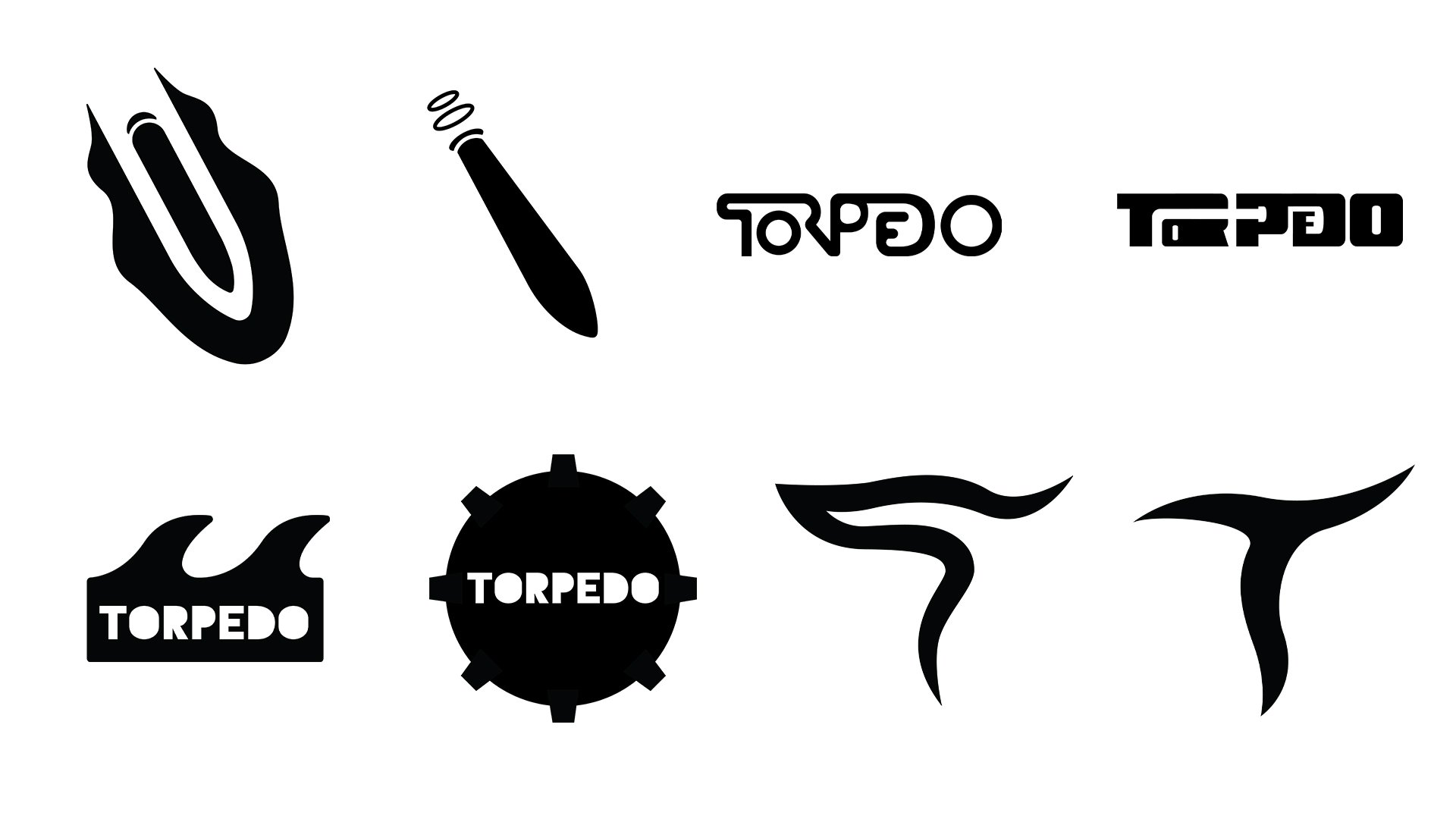
The process for these designs started by brainstorming ideas for potential brands by creating a mind map to come up with a brand concept and name. We then shared our ideas with the rest of the class to choose the best option and began sketching different types of logos including letter marks, word marks, emblems, pictorials, and abstracts. Over the next few weeks we critiqued each other logos and revised them to further simplify the design, emphasize the brands identity, and make the design unique. We then mounted each of our final logos and added them to a wall that was shared with the other Identity Design class during the Fall 2024 semester. From there we applied our final logos to all of the previously mentioned assets and created presentations for our brands. We had an additional week to refine anything that we had gotten feedback on from our presentations and then were tasked with creating a social media ad for the brand that incorporated the logo as a motion graphic as well as a call to action that would promote the brand’s unveiling.
Logos and other designs were created in Illustrator, photographic elements were created in Photoshop, and various assets such as business hours and type structure were laid out in InDesign. The final presentation was created in Figma and the social media advertisement was created in After Effects.

TORPEDO Final Logo (Colored)

TORPEDO Final Logo Lock Up (Colored)

TORPEDO Final Logo (Black and White)

TORPEDO Final Logo Lock Up (Black and White)
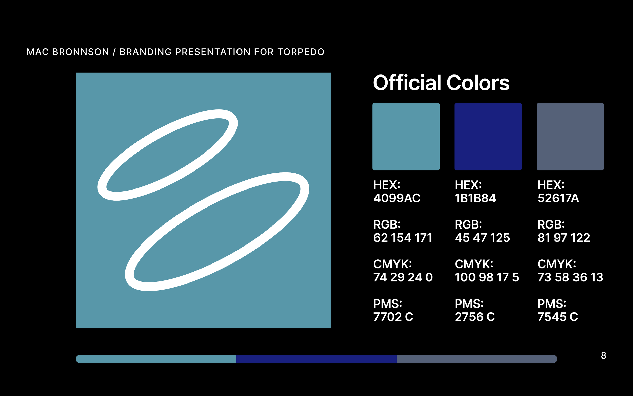
TORPEDO Official Colors

TORPEDO Final Logo Spacing

TORPEDO Final Logo Lock Up Spacing
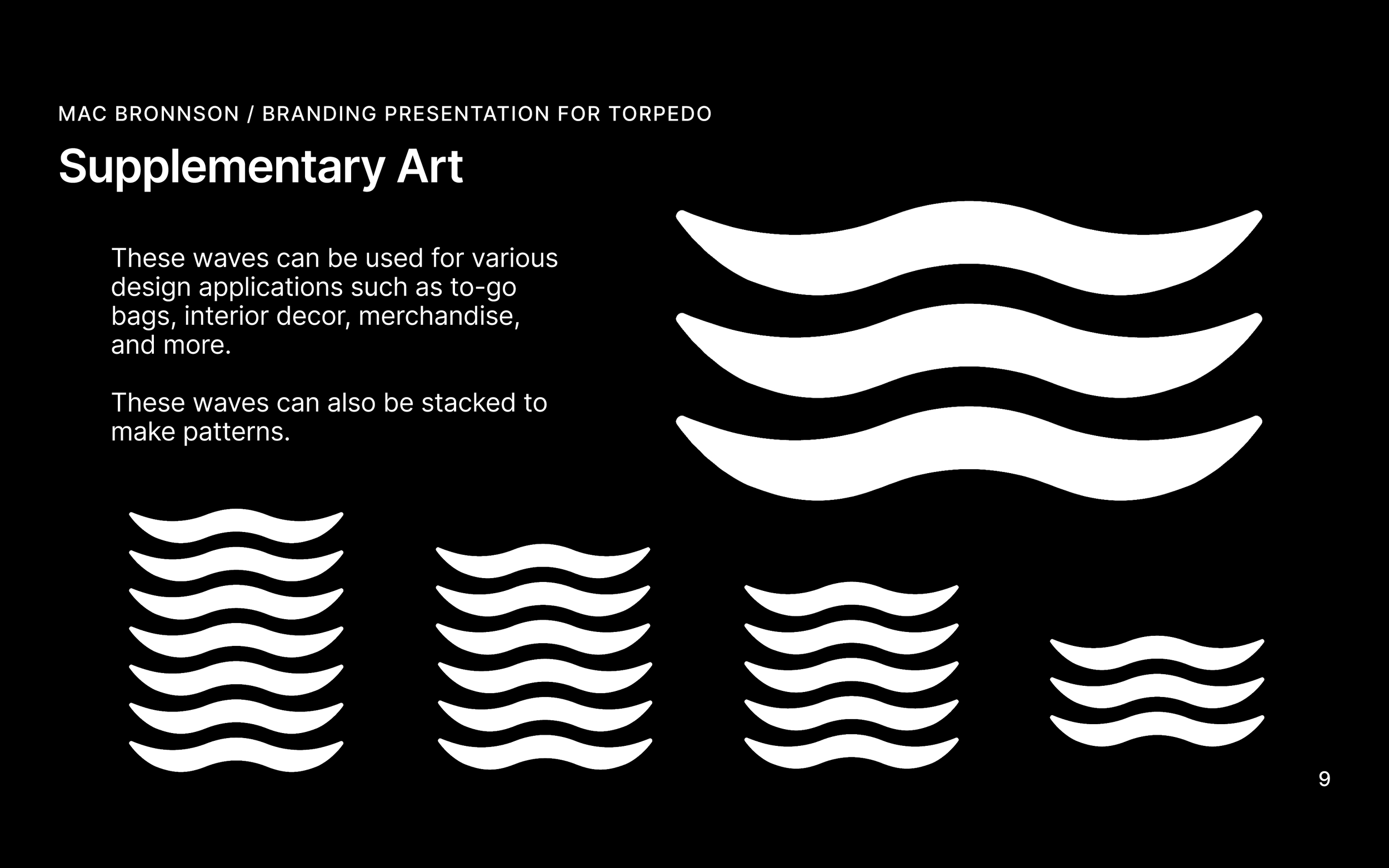
TORPEDO Supplementary Art
TORPEDO Typefaces and Structure
TORPEDO Text Structure
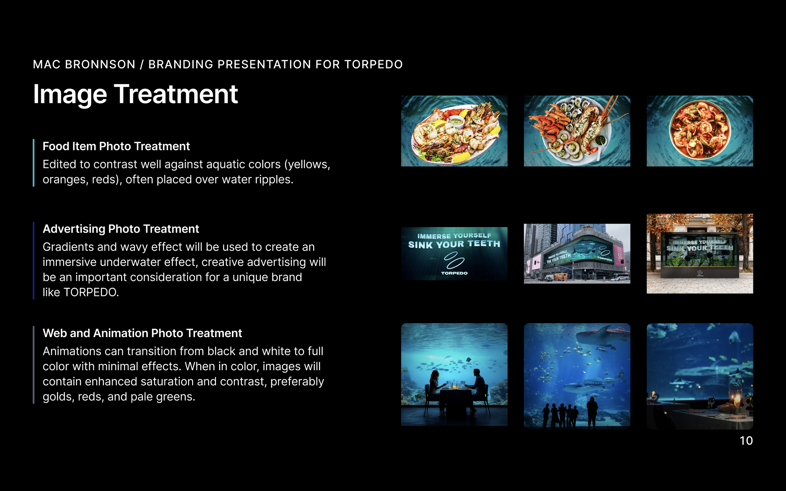
TORPEDO Phot Treatment
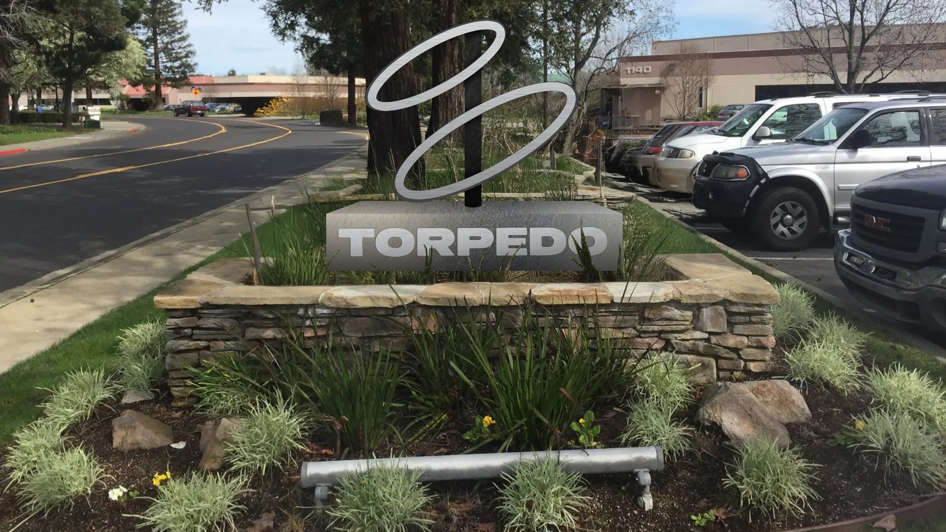
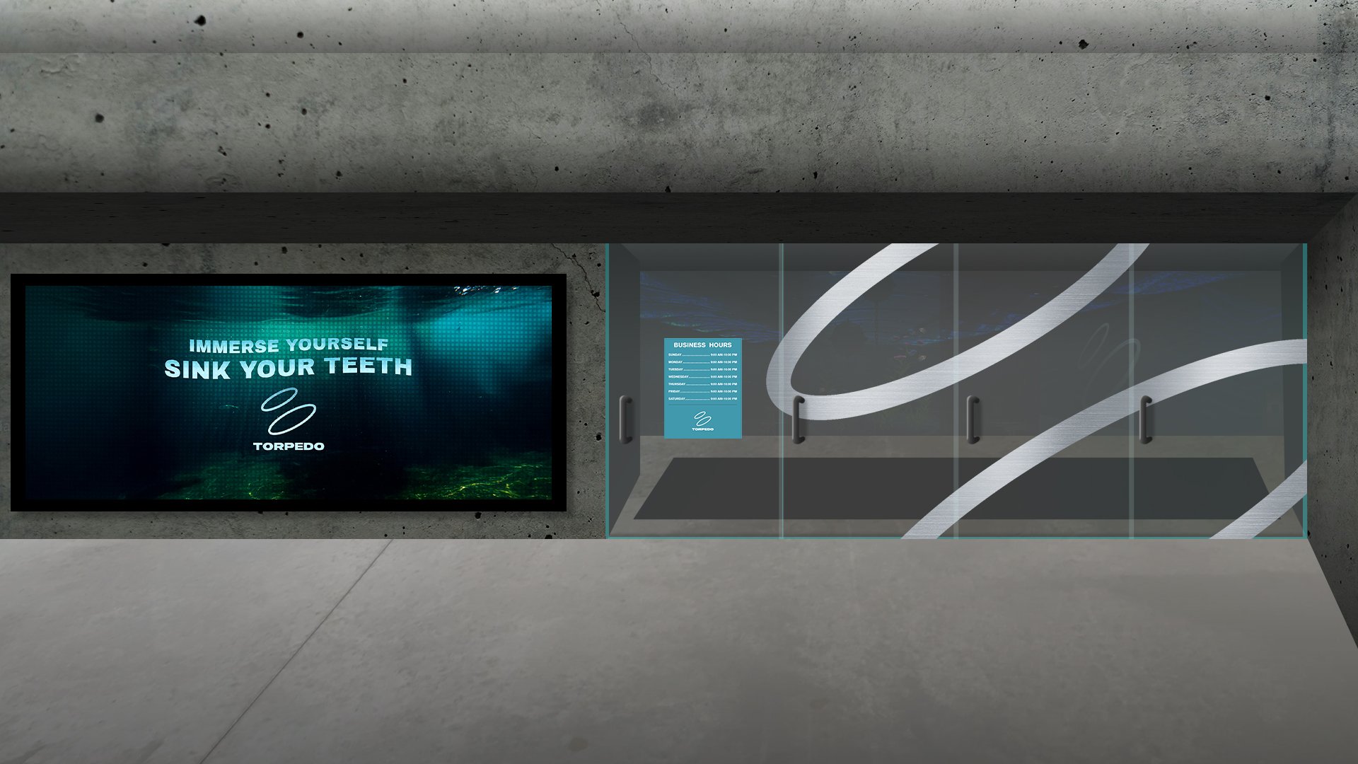
TORPEDO Outdoor Signage
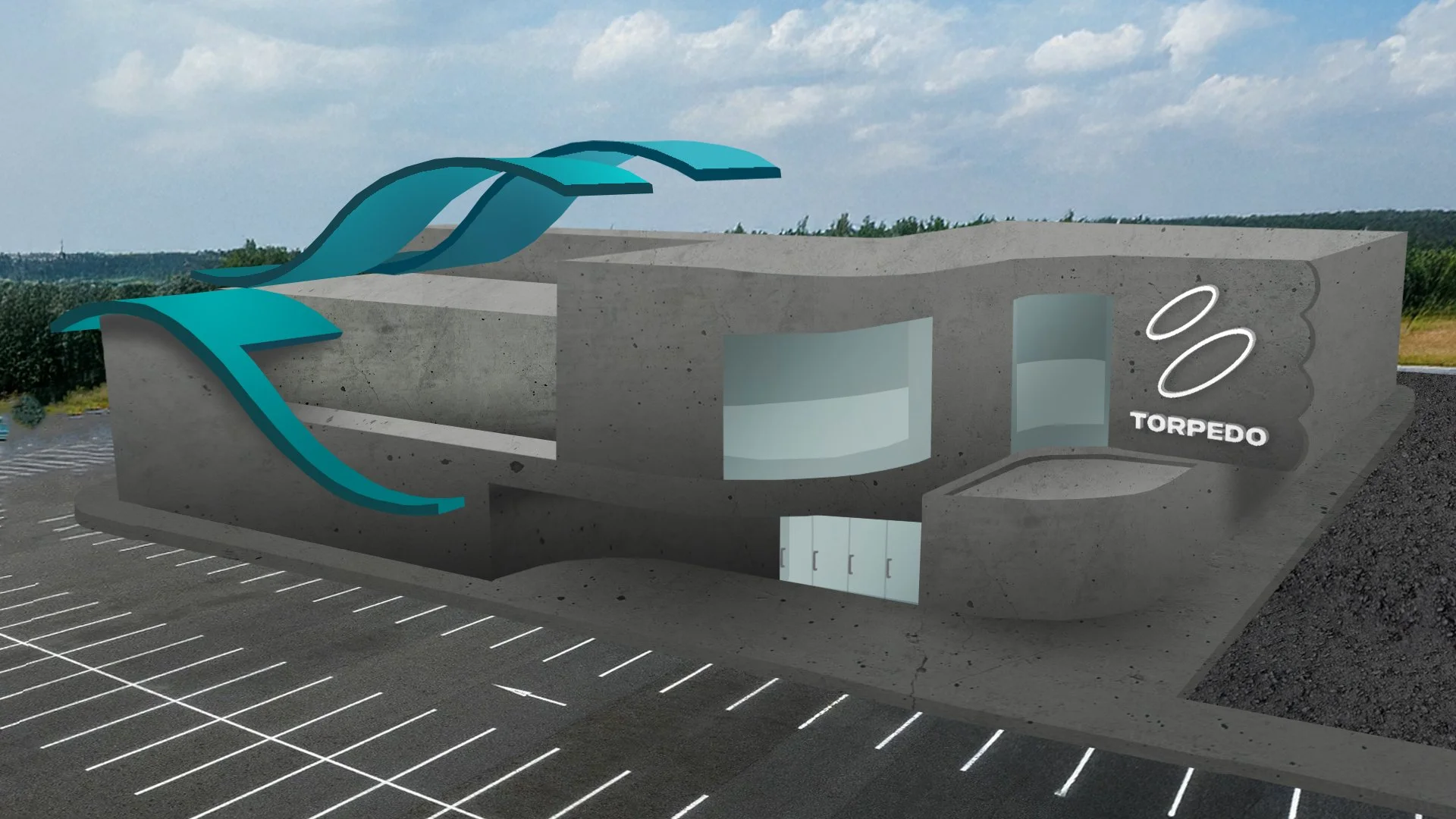
TORPEDO Exterior Concept
TORPEDO Exterior Front
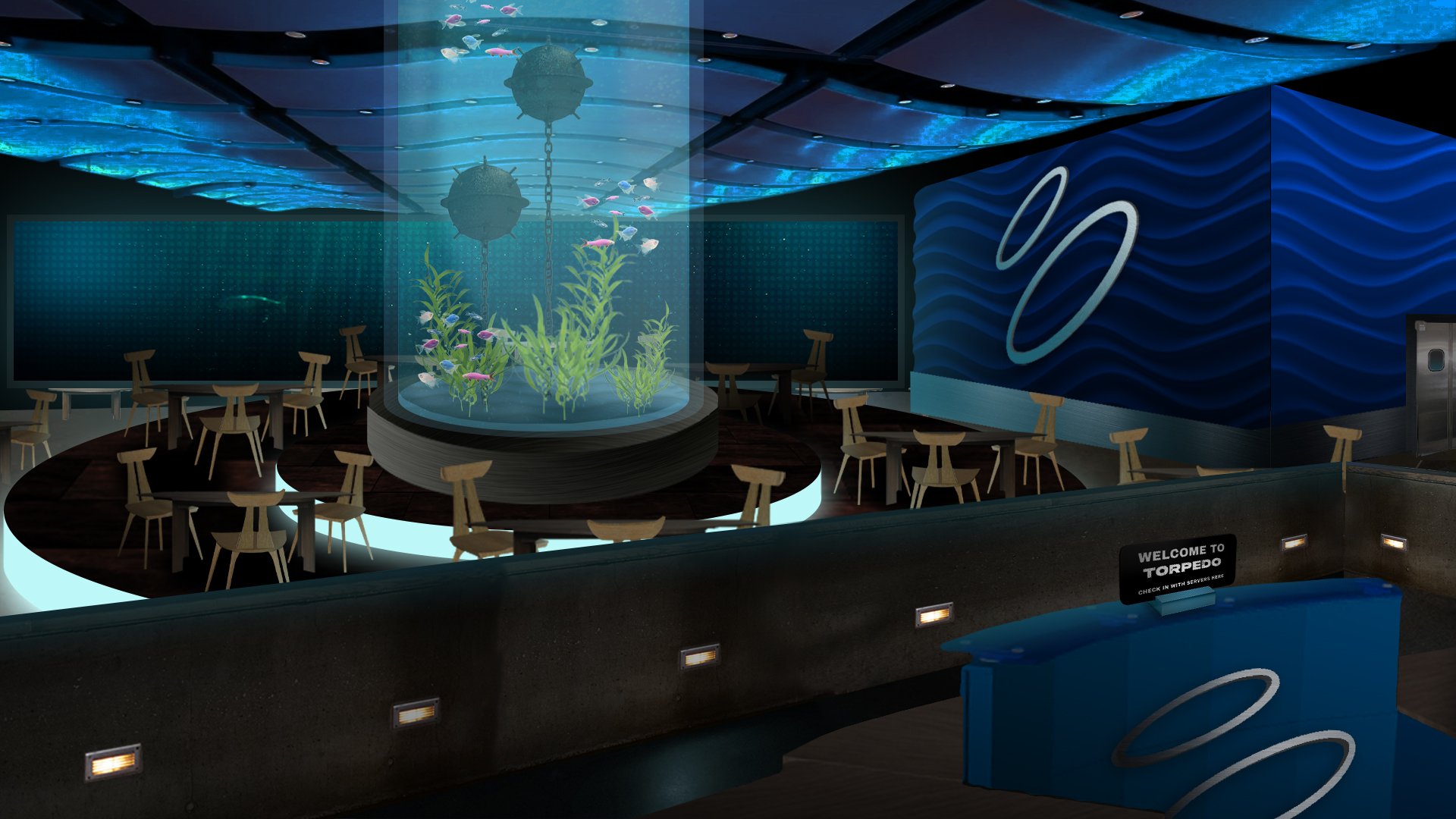
TORPEDO Interior Lobby/Dining Hall
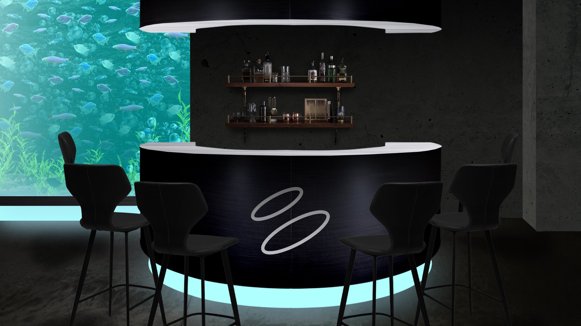
TORPEDO Interior Bar
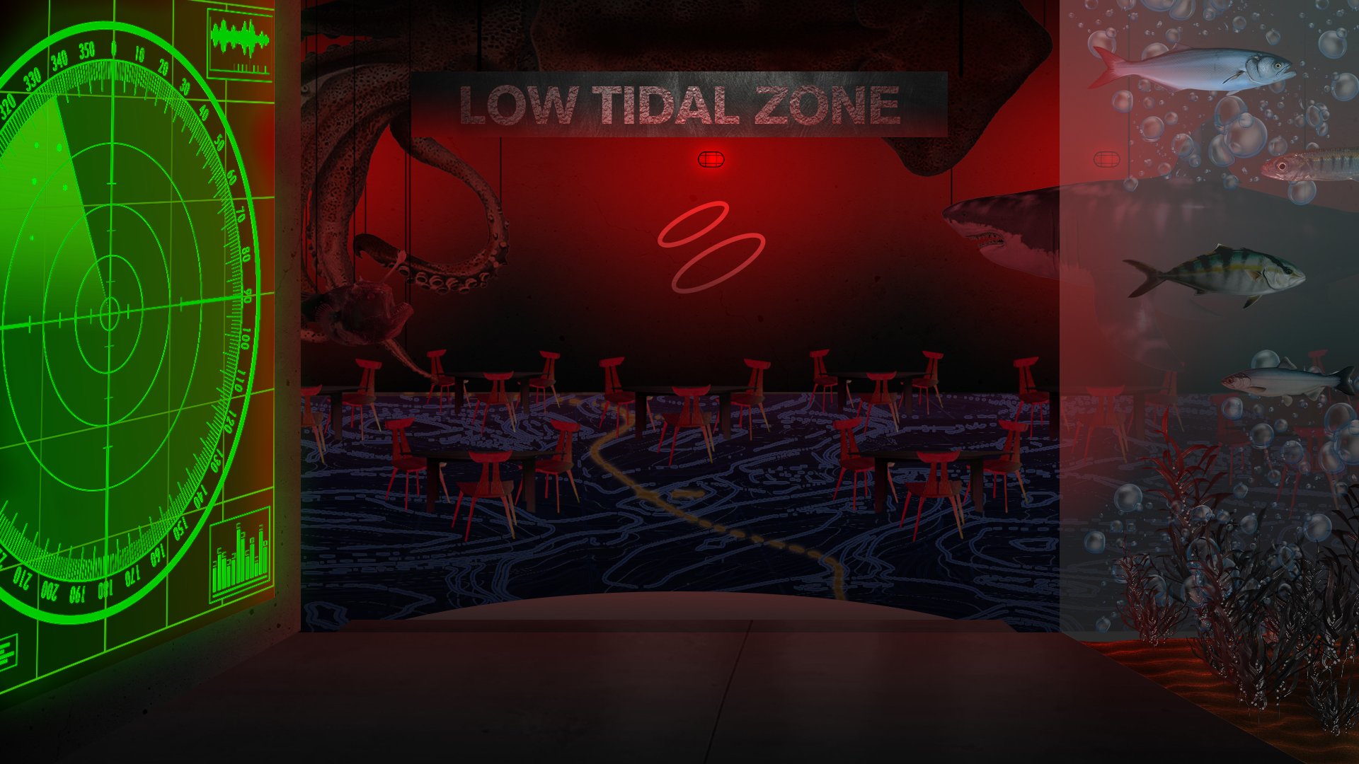
TORPEDO Secondary Dining Hall (Low Tidal Zone)
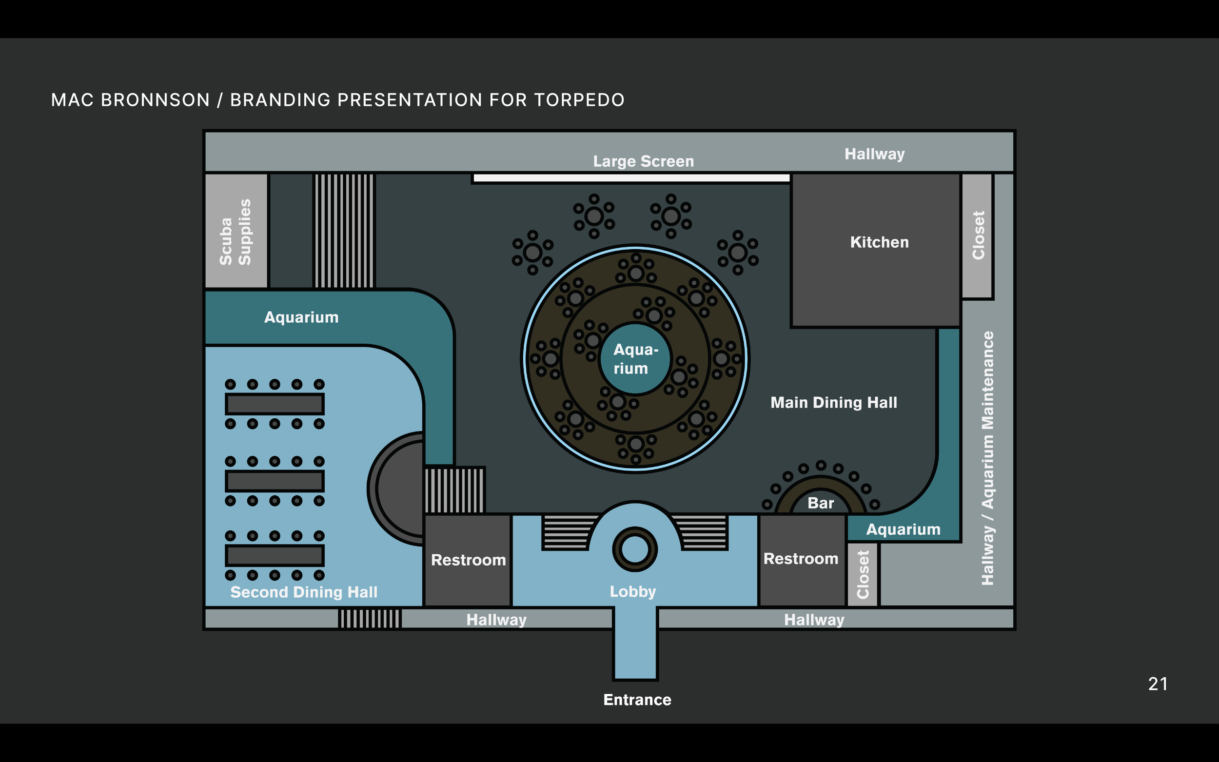
TORPEDO Map Layout
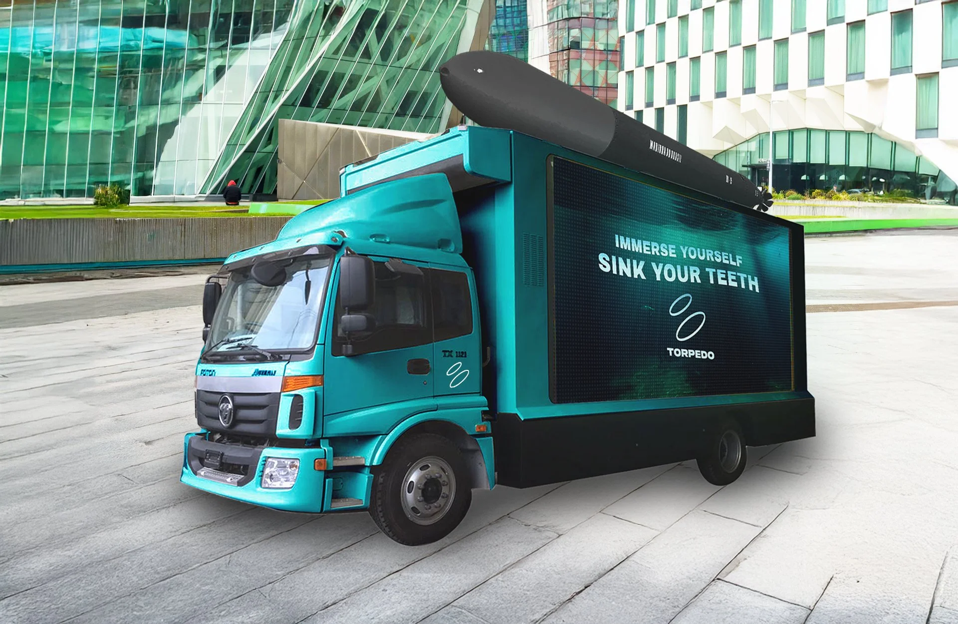
TORPEDO LED Screen Vehicle Mock Up
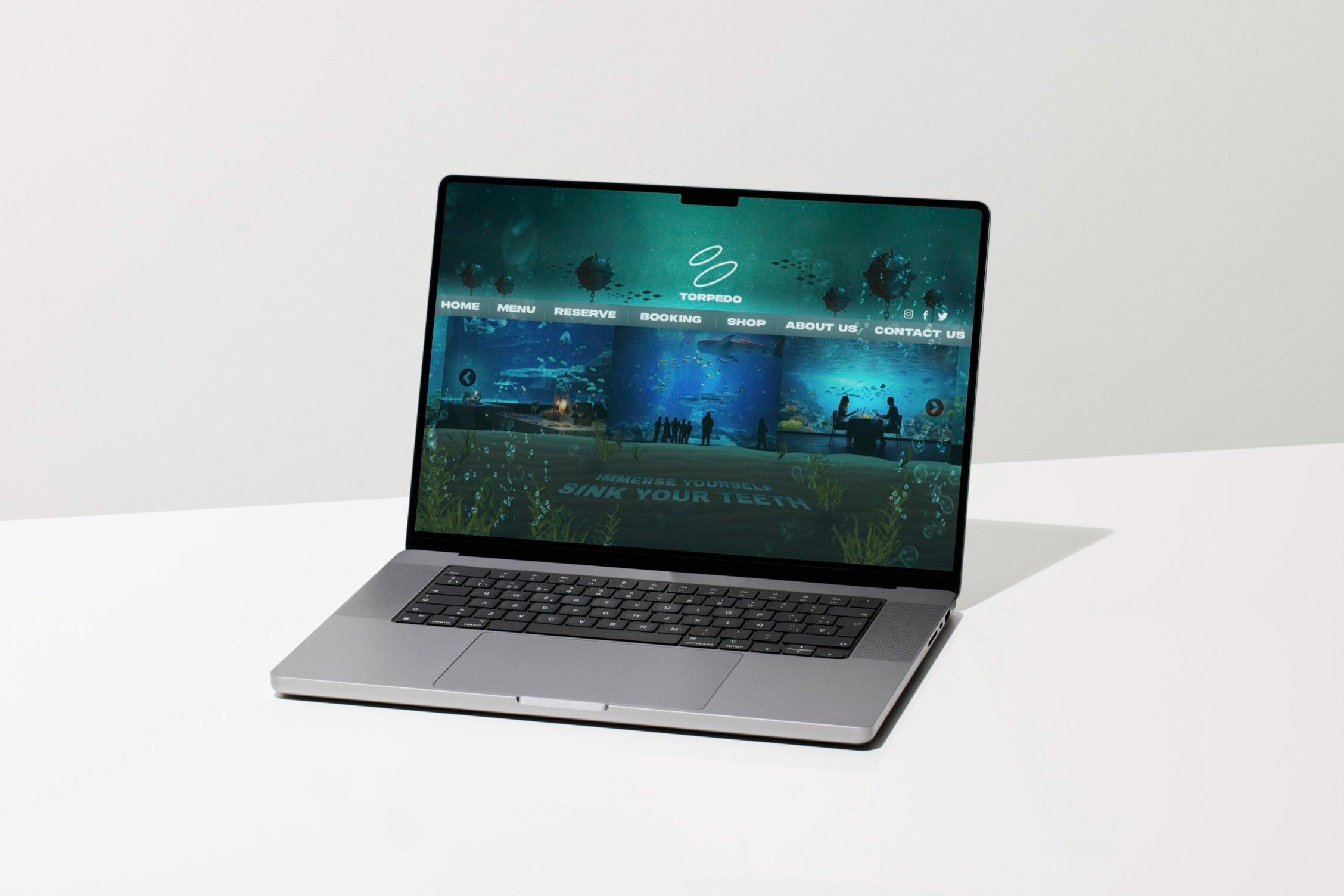
TORPEDO Web Mock Up
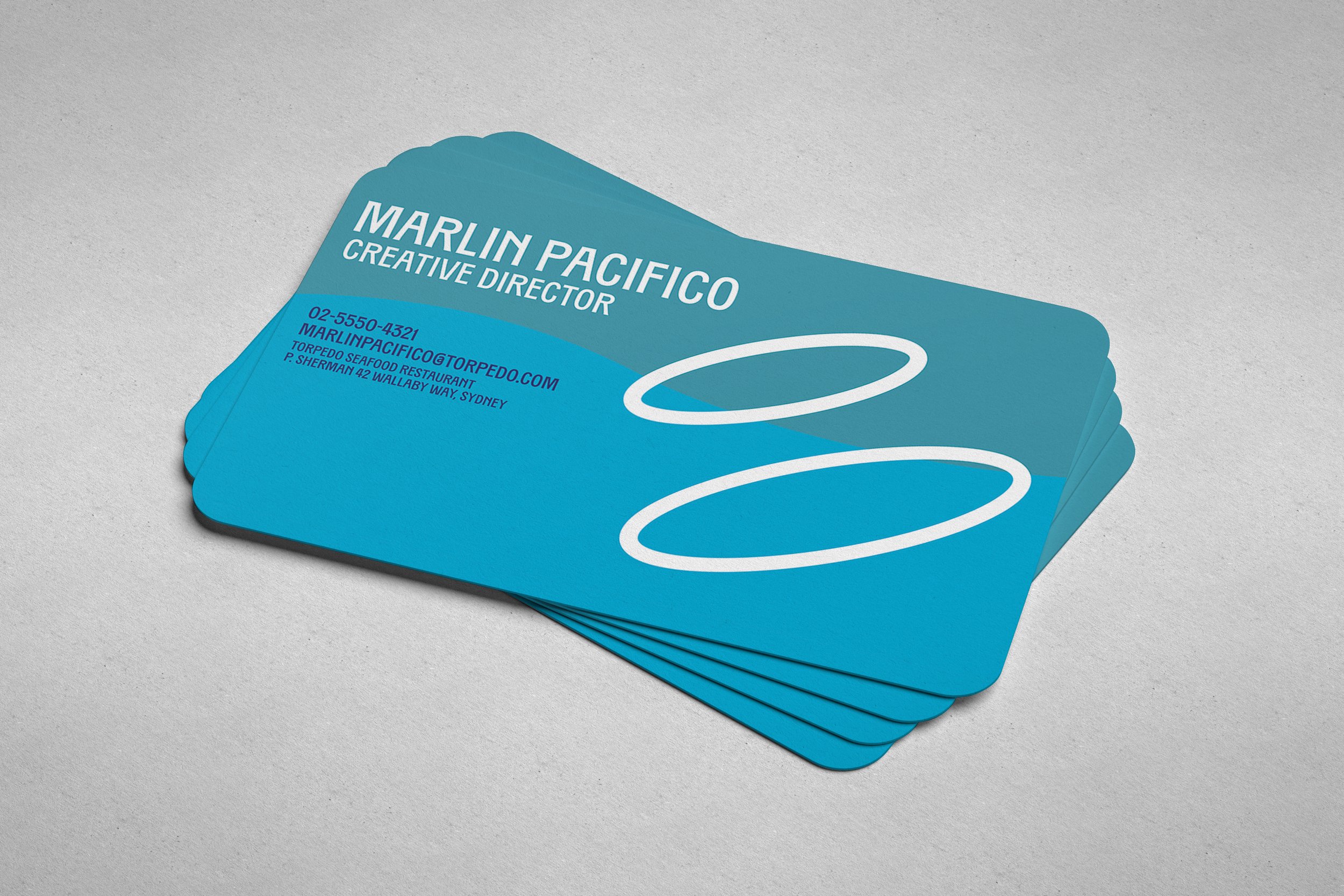
TORPEDO Business Cards
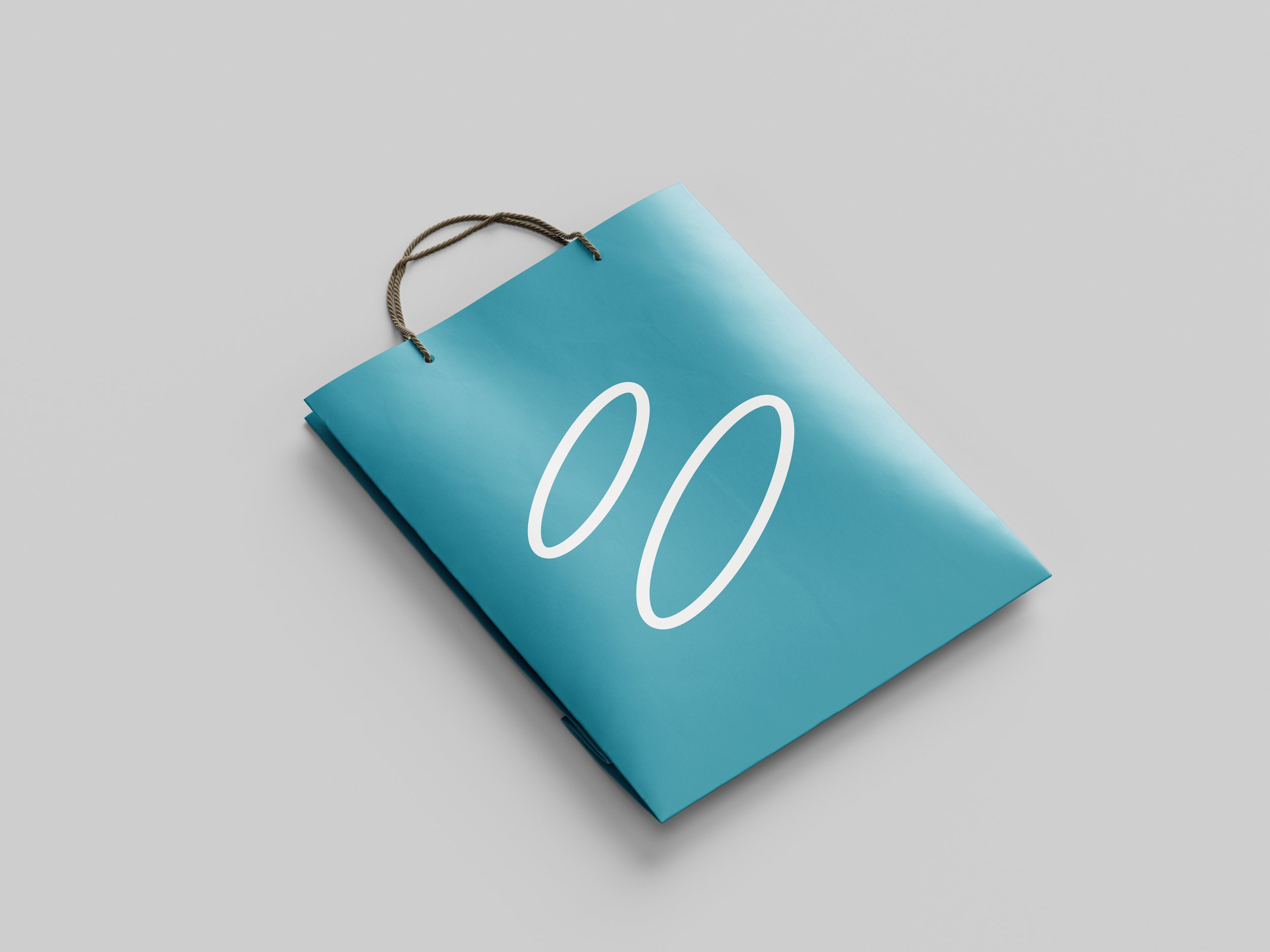
TORPEDO Gift Bag
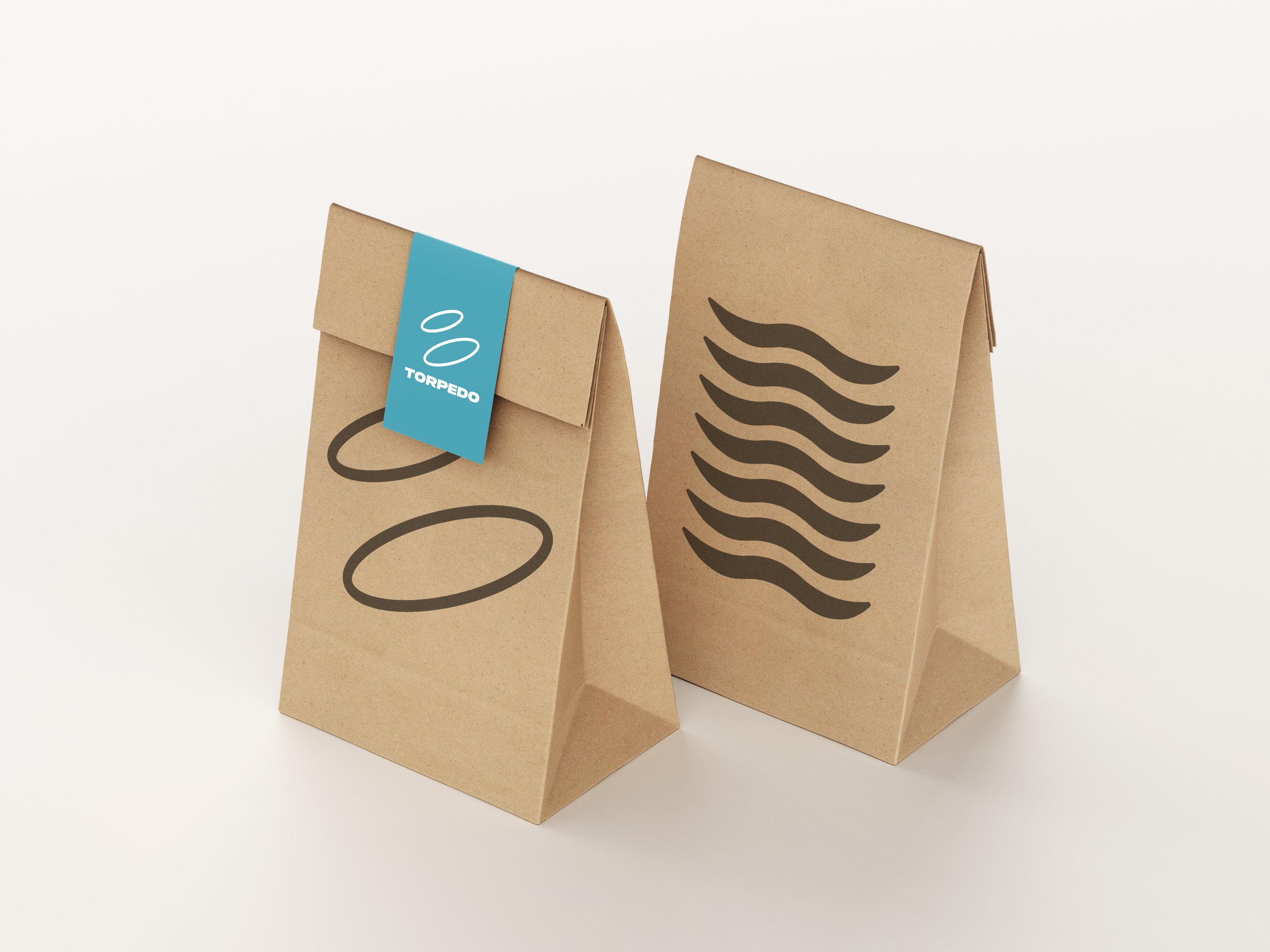
TORPEDO To-Go Bag
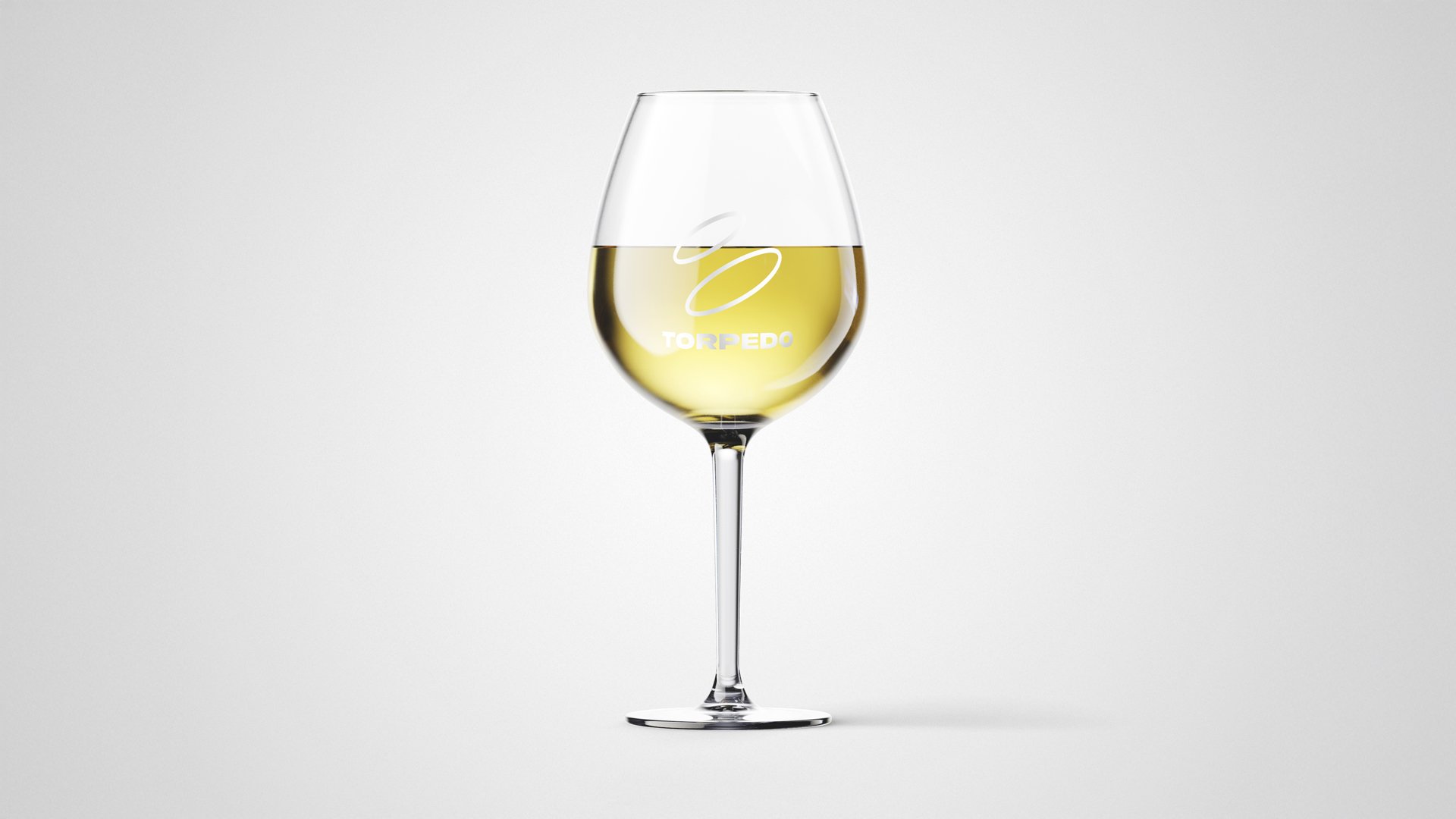
TORPEDO Wine Glass
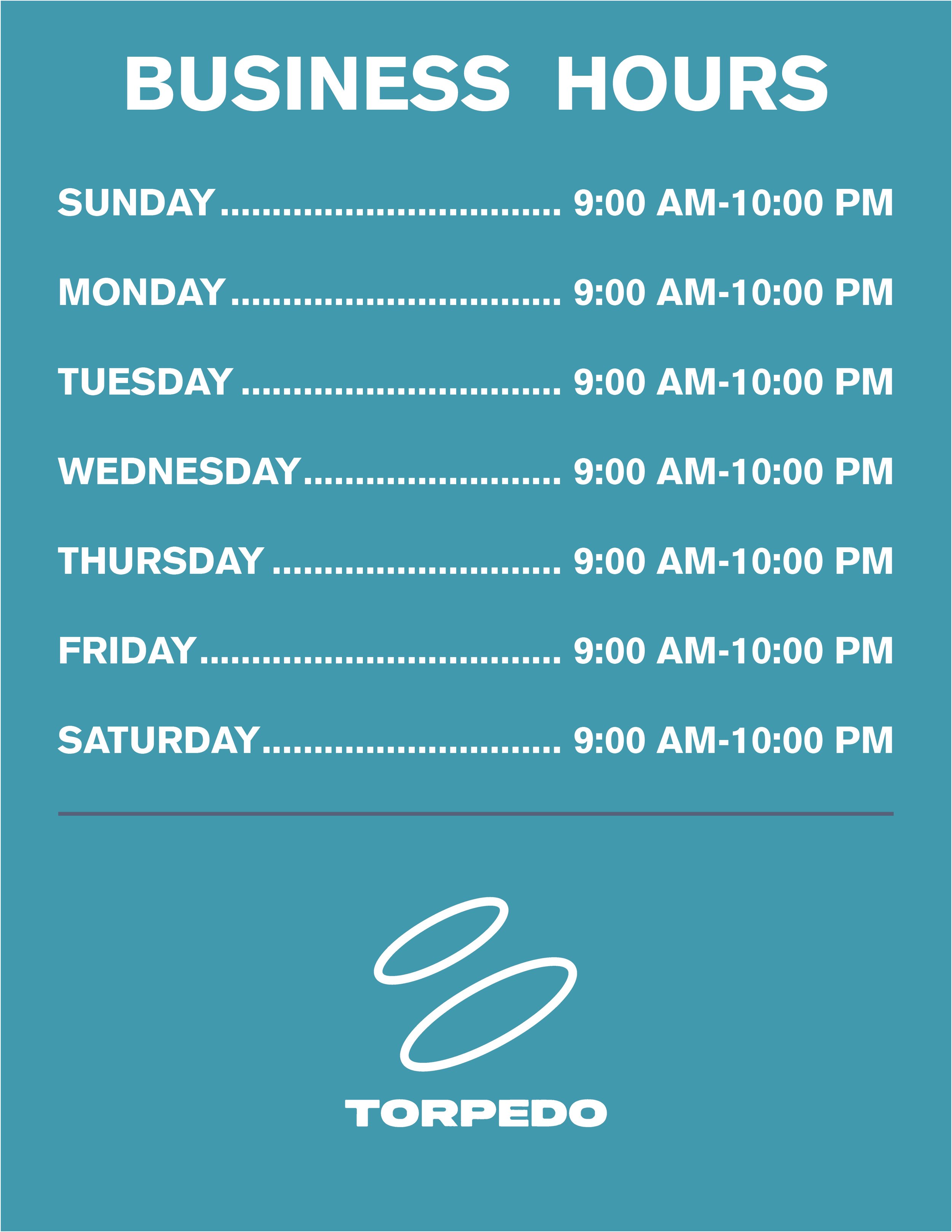
TORPEDO Business Hours Sheet
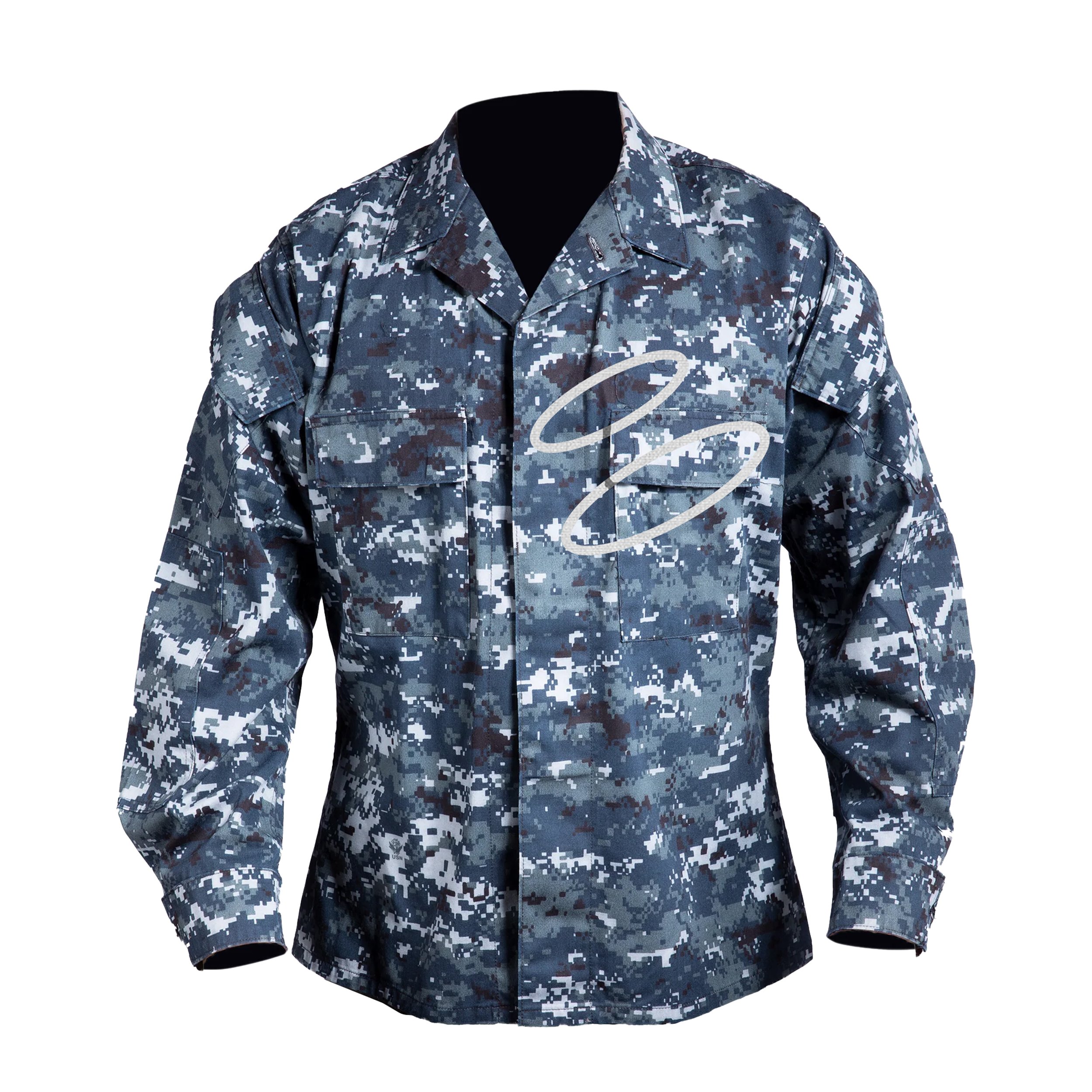
TORPEDO Uniform Top
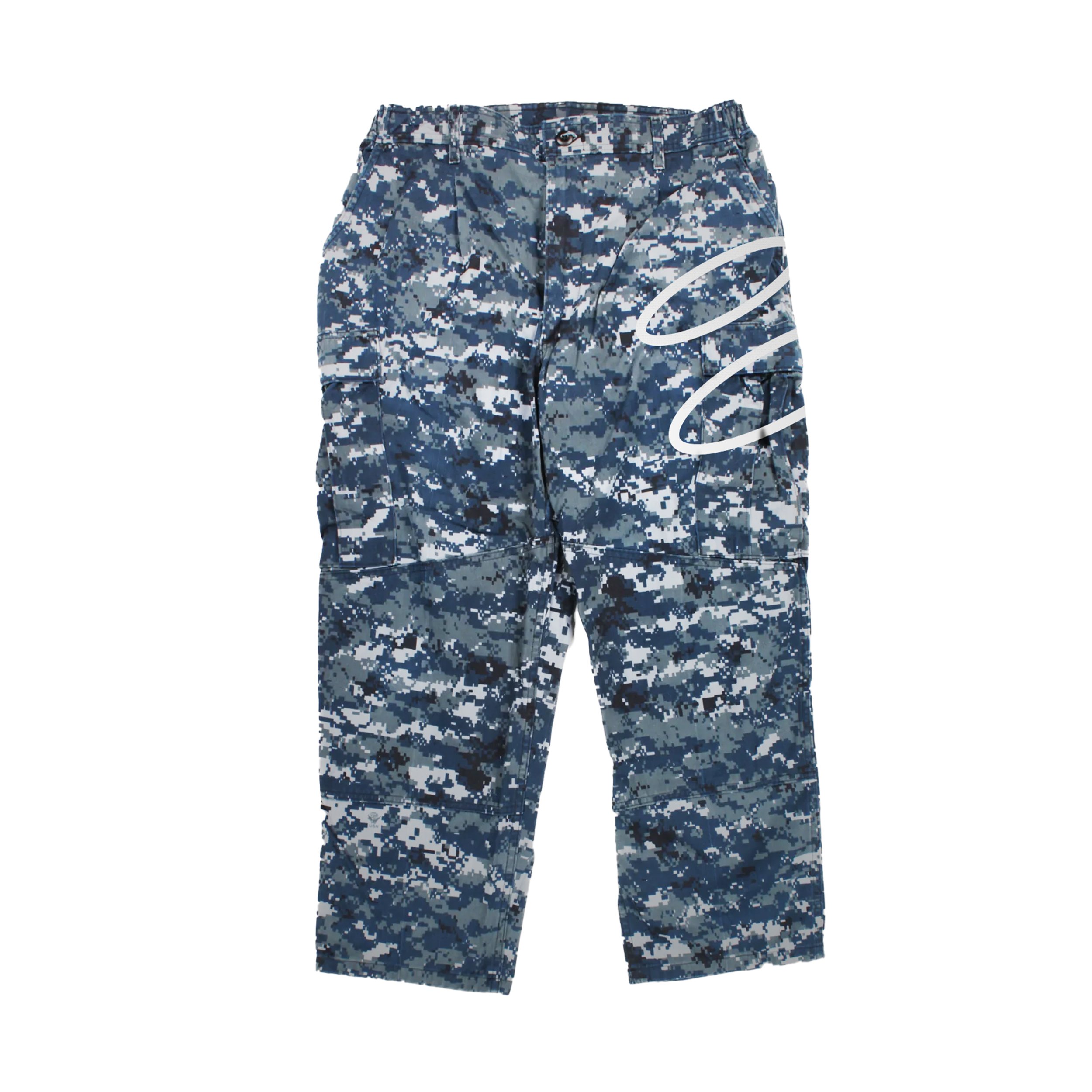
TORPEDO Uniform Bottom
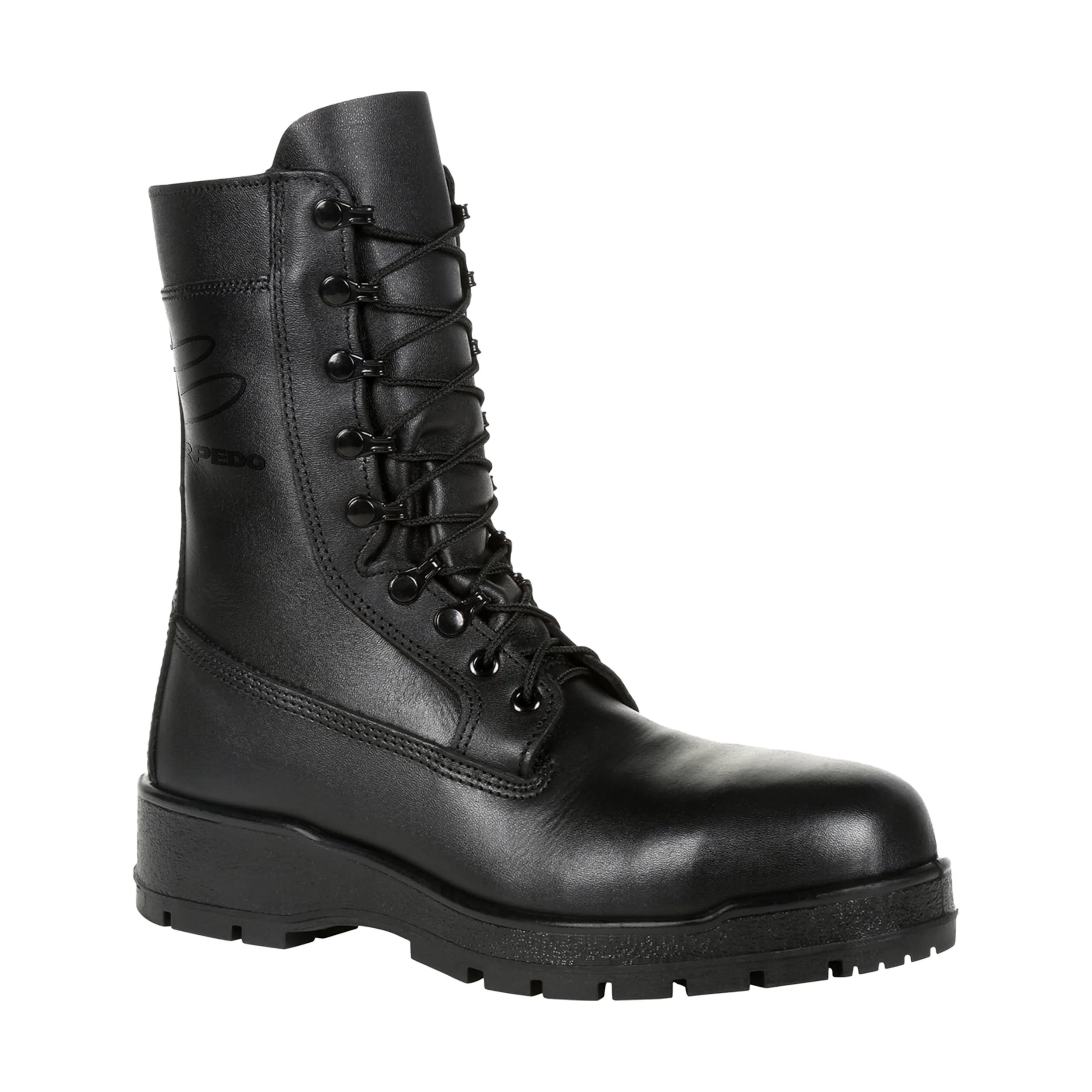
TORPEDO Uniform Boots
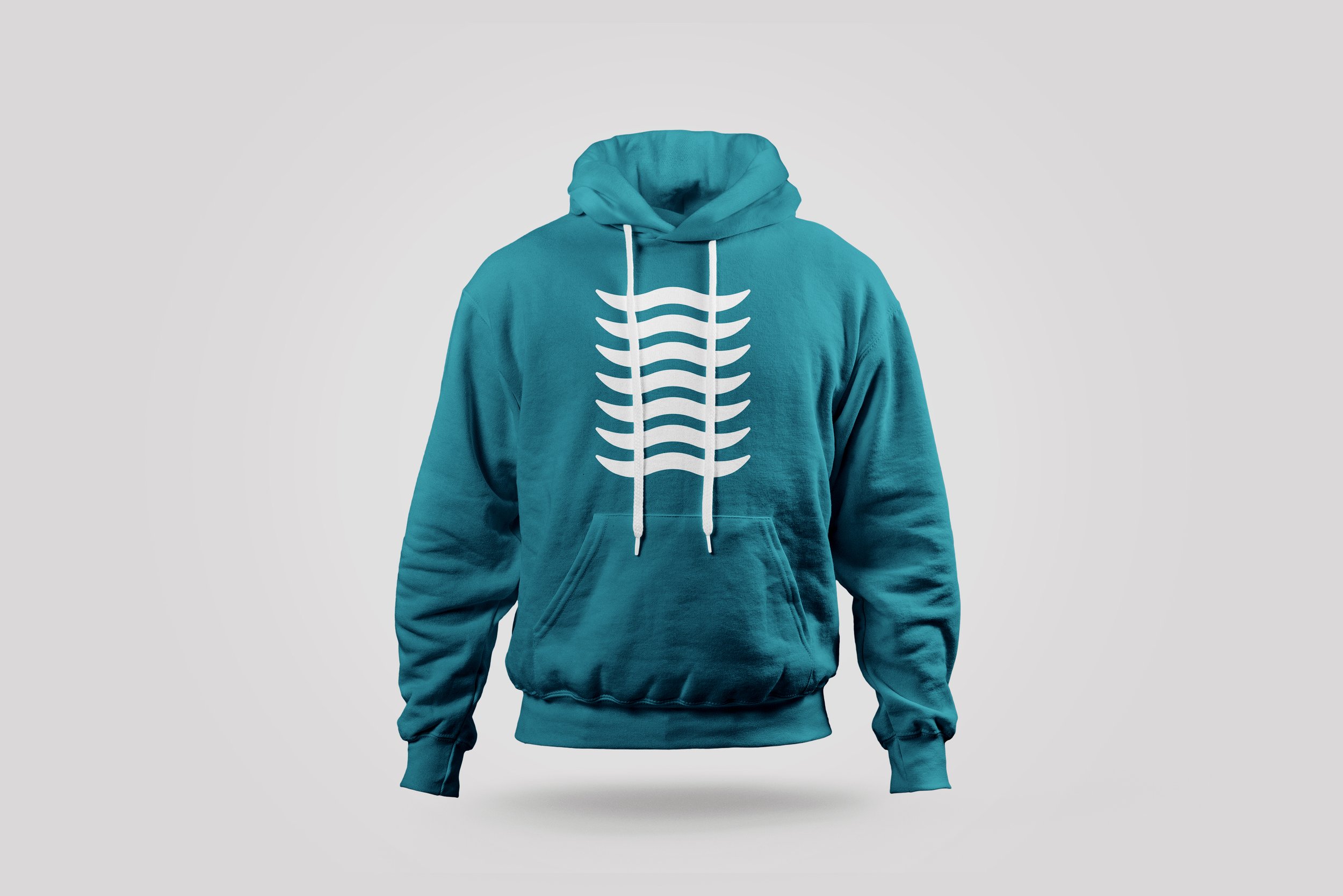
TORPEDO Merchandise Hoodie
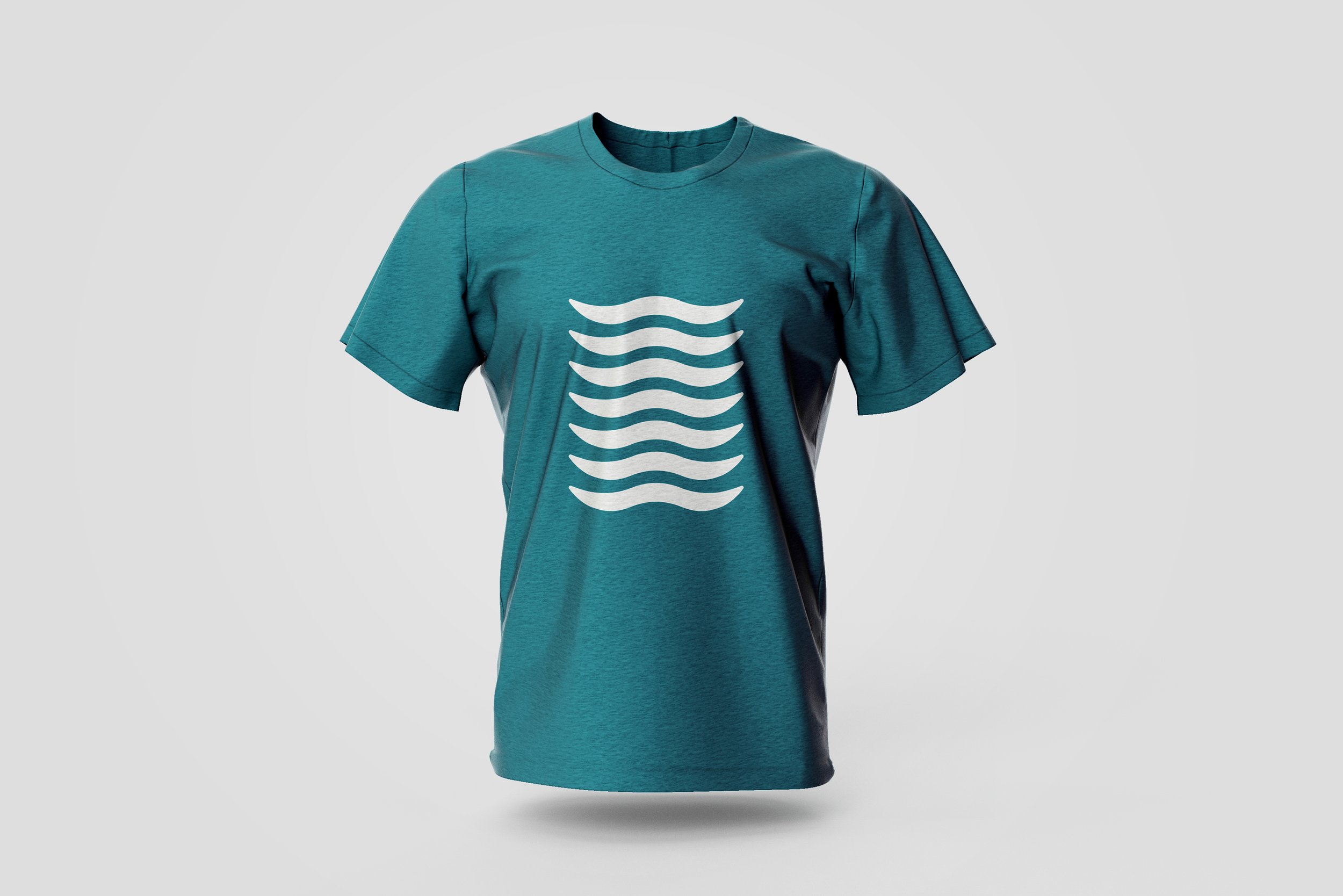
TORPEDO Merchandise Shirt
TORPEDO 3D Advertisement Mock Up
TORPEDO Exhibition Advertisement
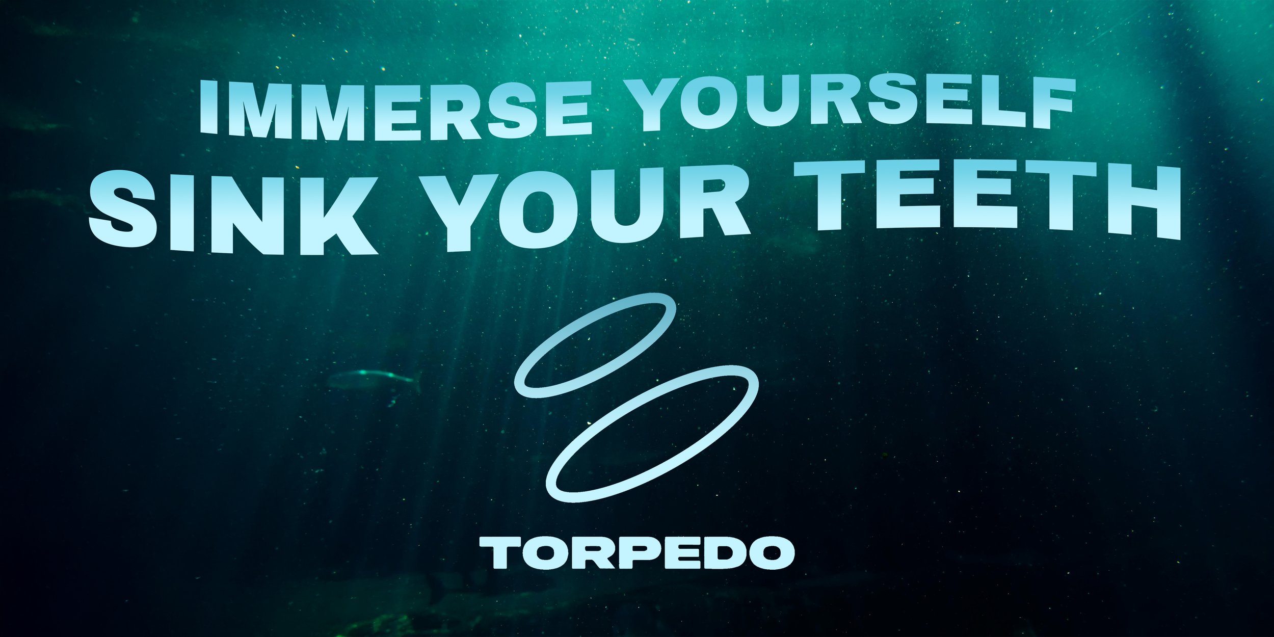
TORPEDO Digital/Poster Ad Design
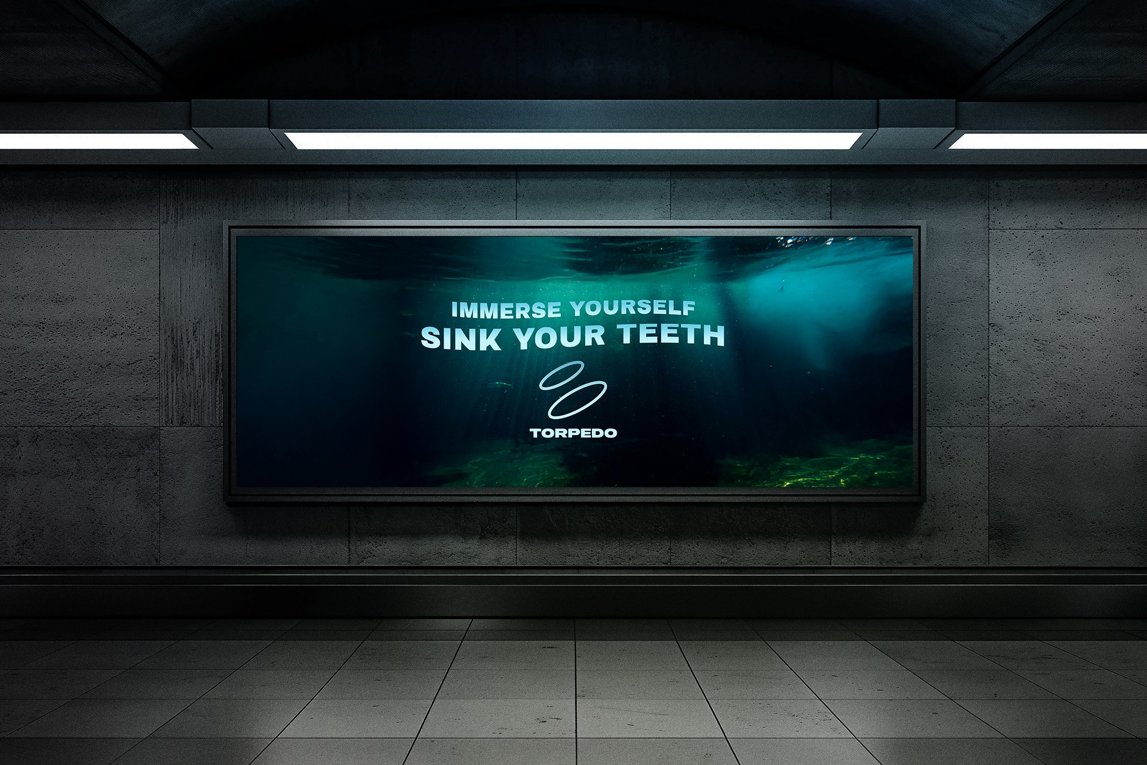
TORPEDO Digital/Poster Ad Mock Up
TORPEDO Social Media Ad
PROCESS WORK
Initial Mind Map
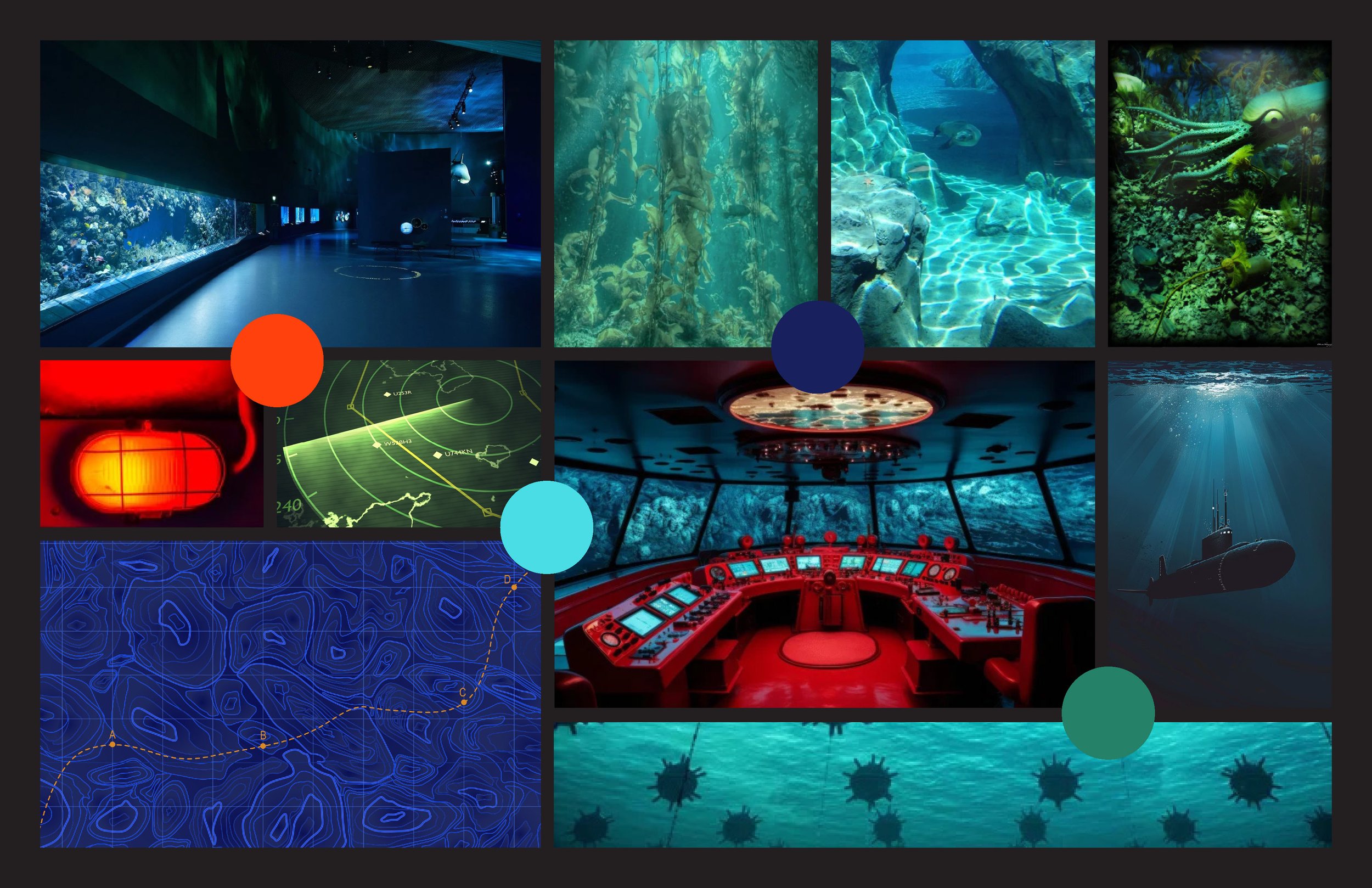
TORPEDO Moodboard 1
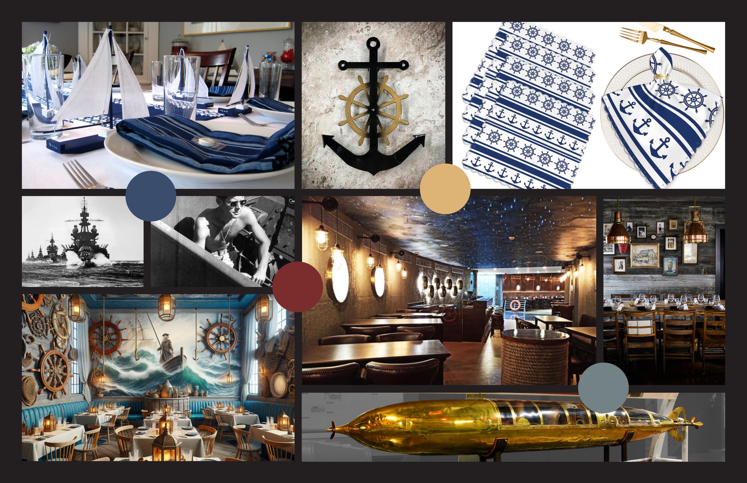
TORPEDO Moodboard 2
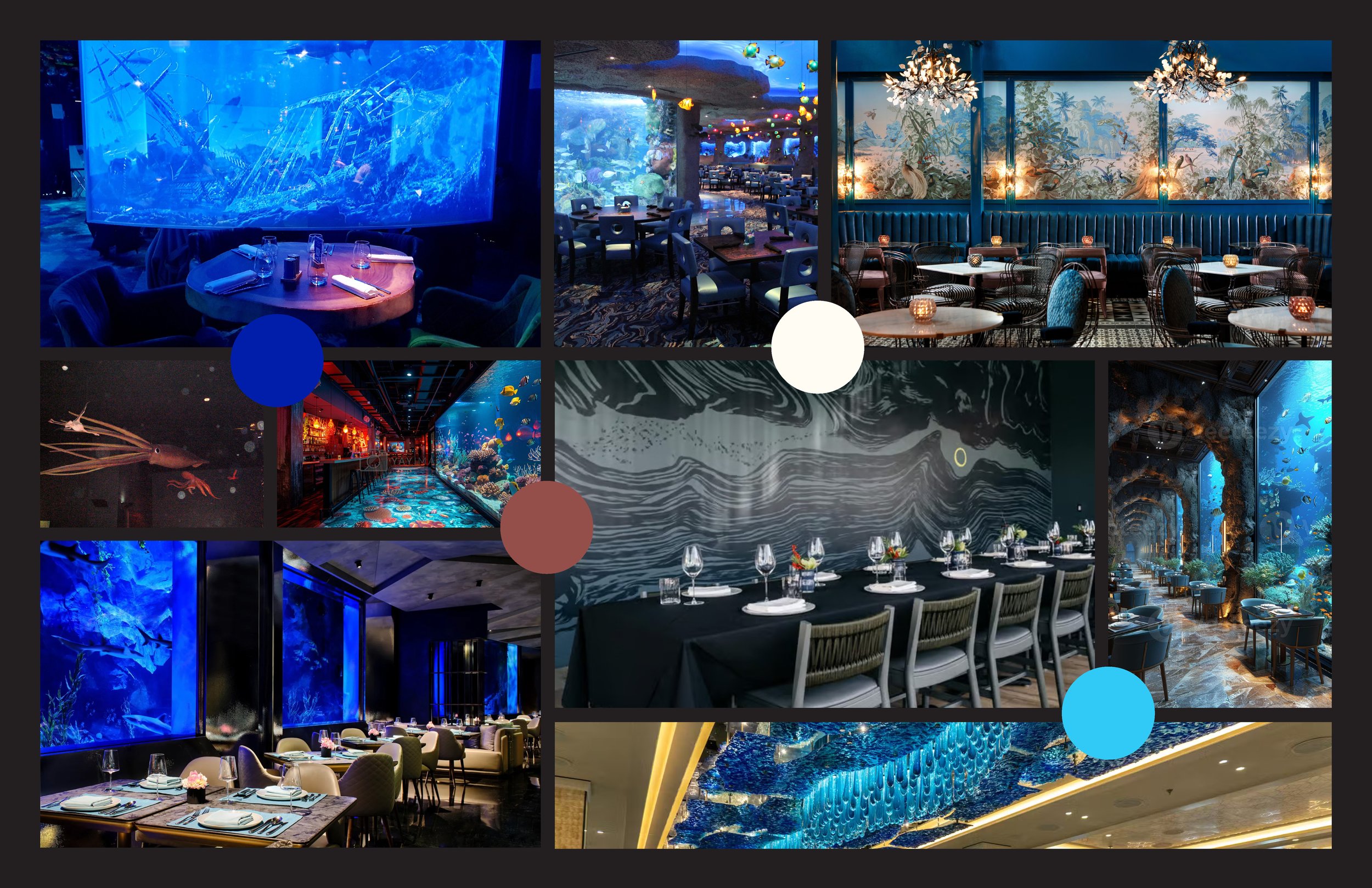
TORPEDO Moodboard 3
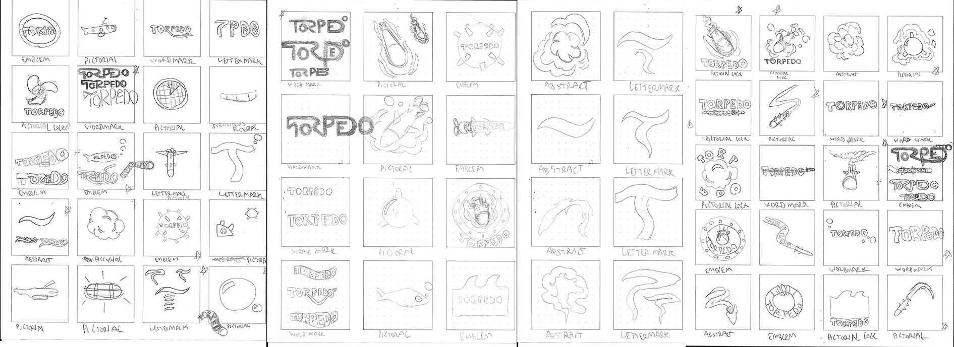
Initial Logo Sketches
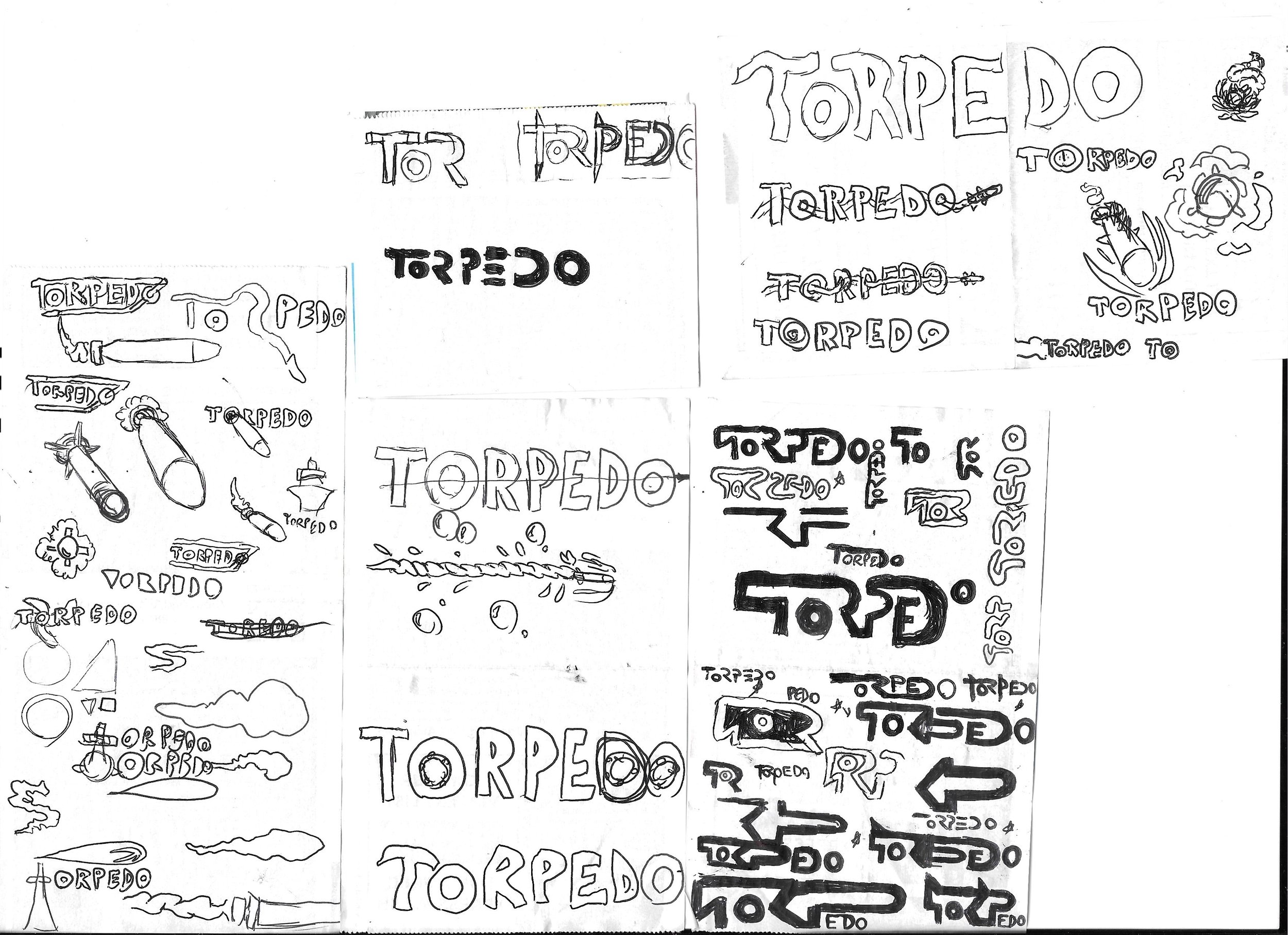
Extra Sketches (Drawn at my current job on receipt paper)
Initial Digitized Drafts
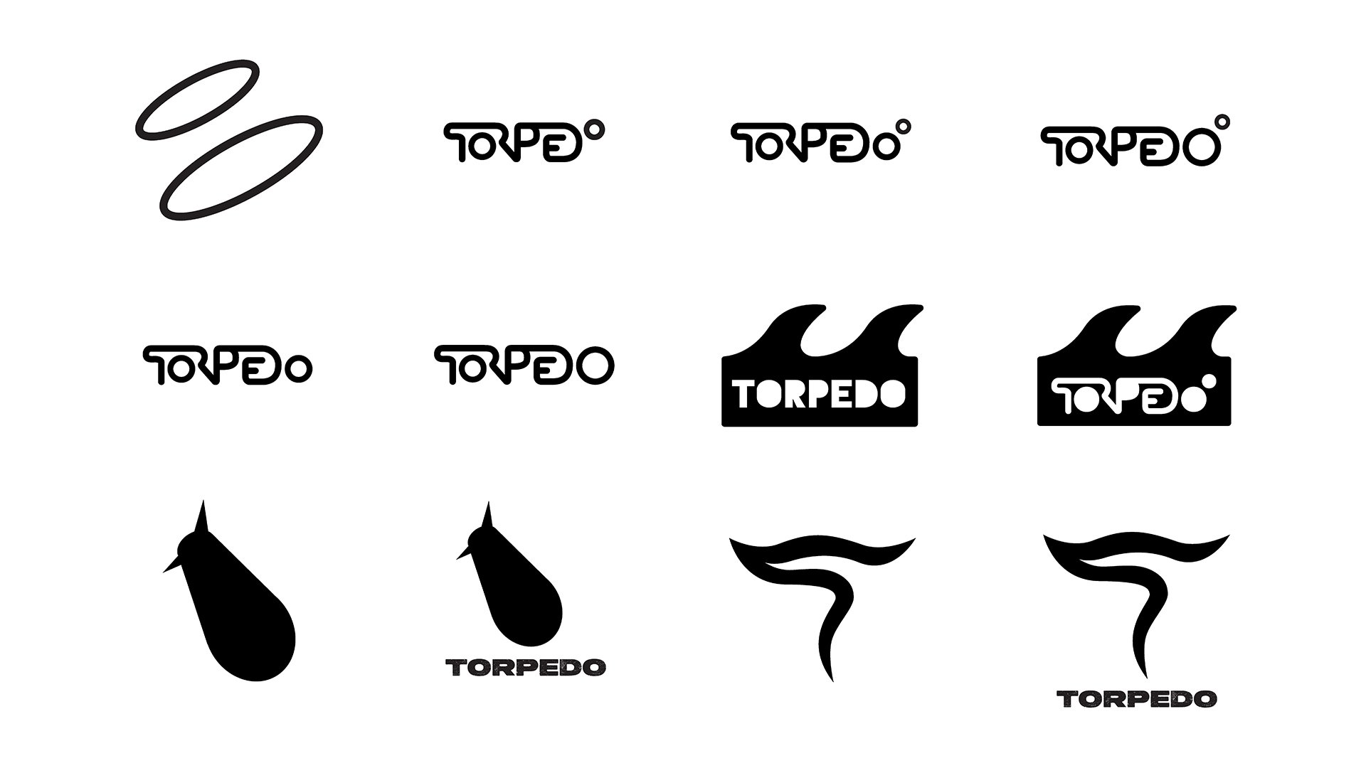
Digitized Draft Revisions
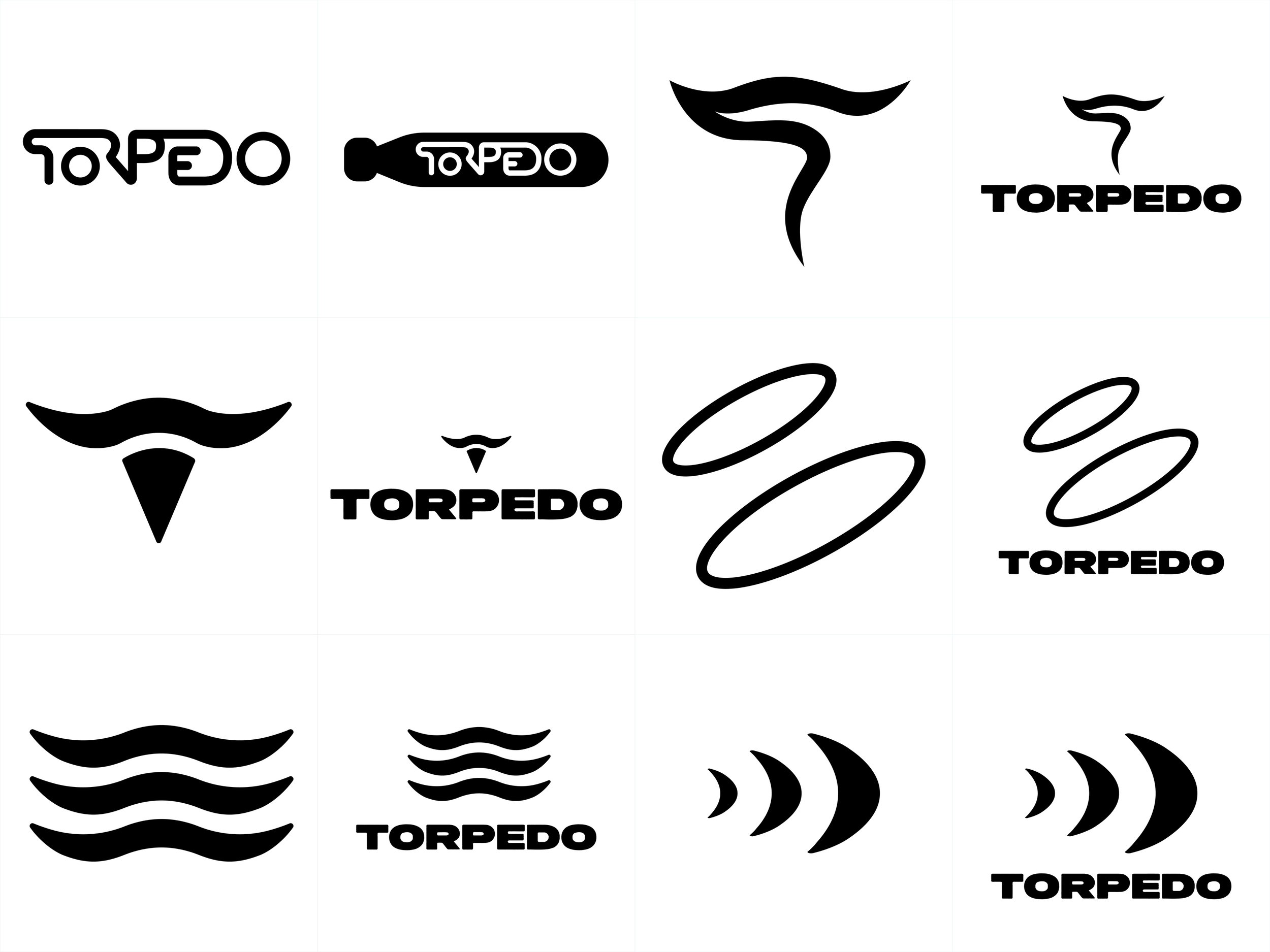
Final Logos
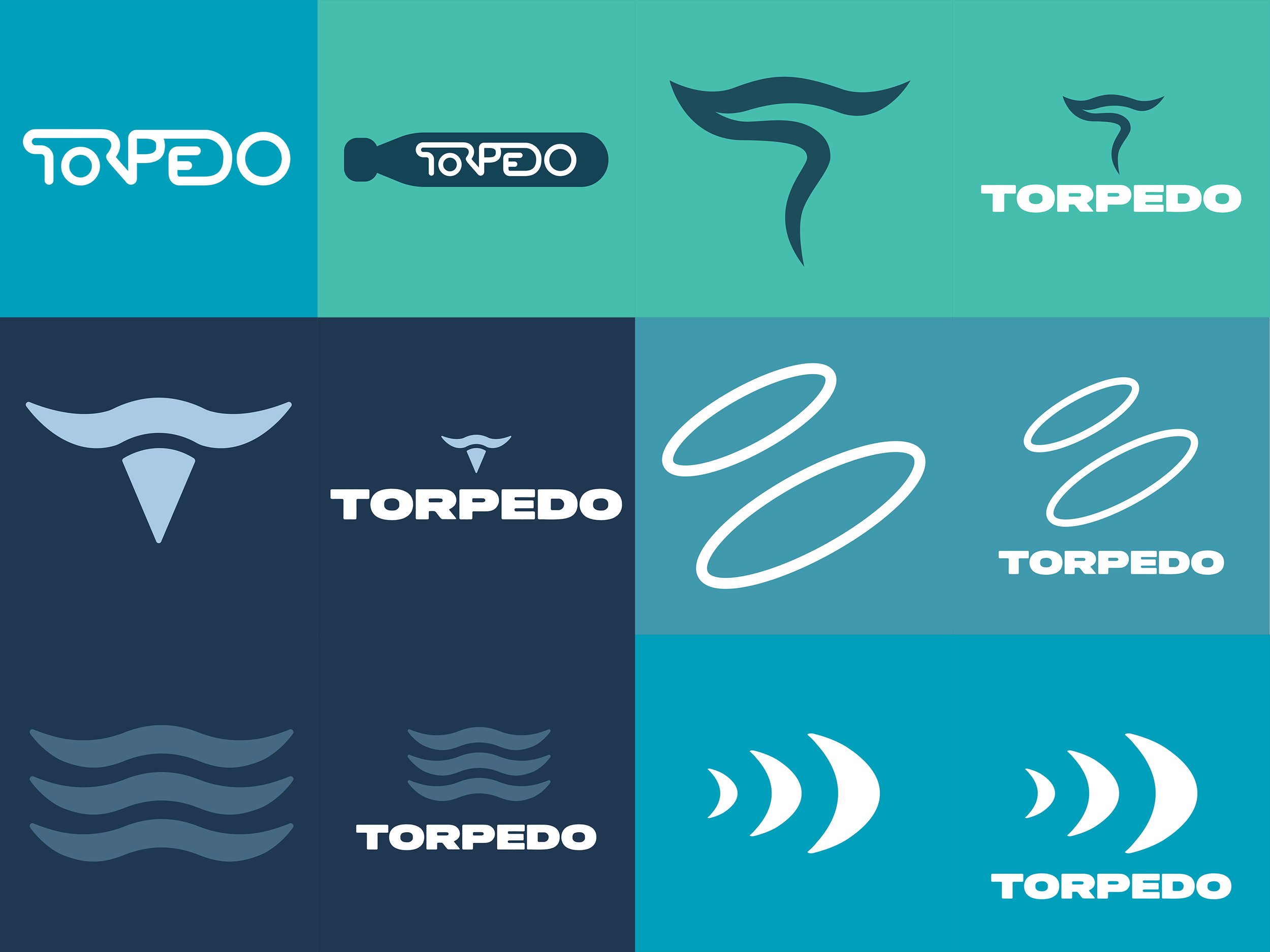
Final Logos (Colored)
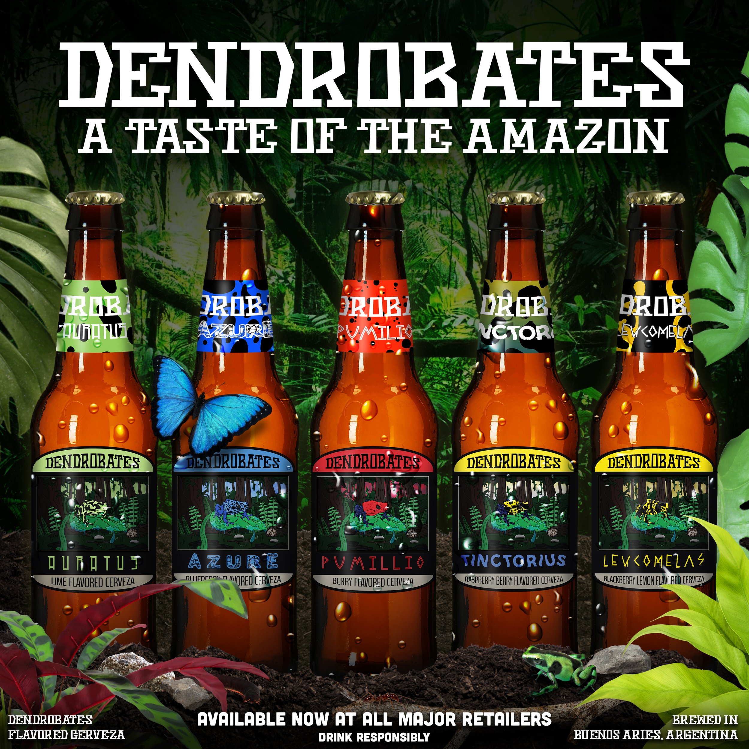
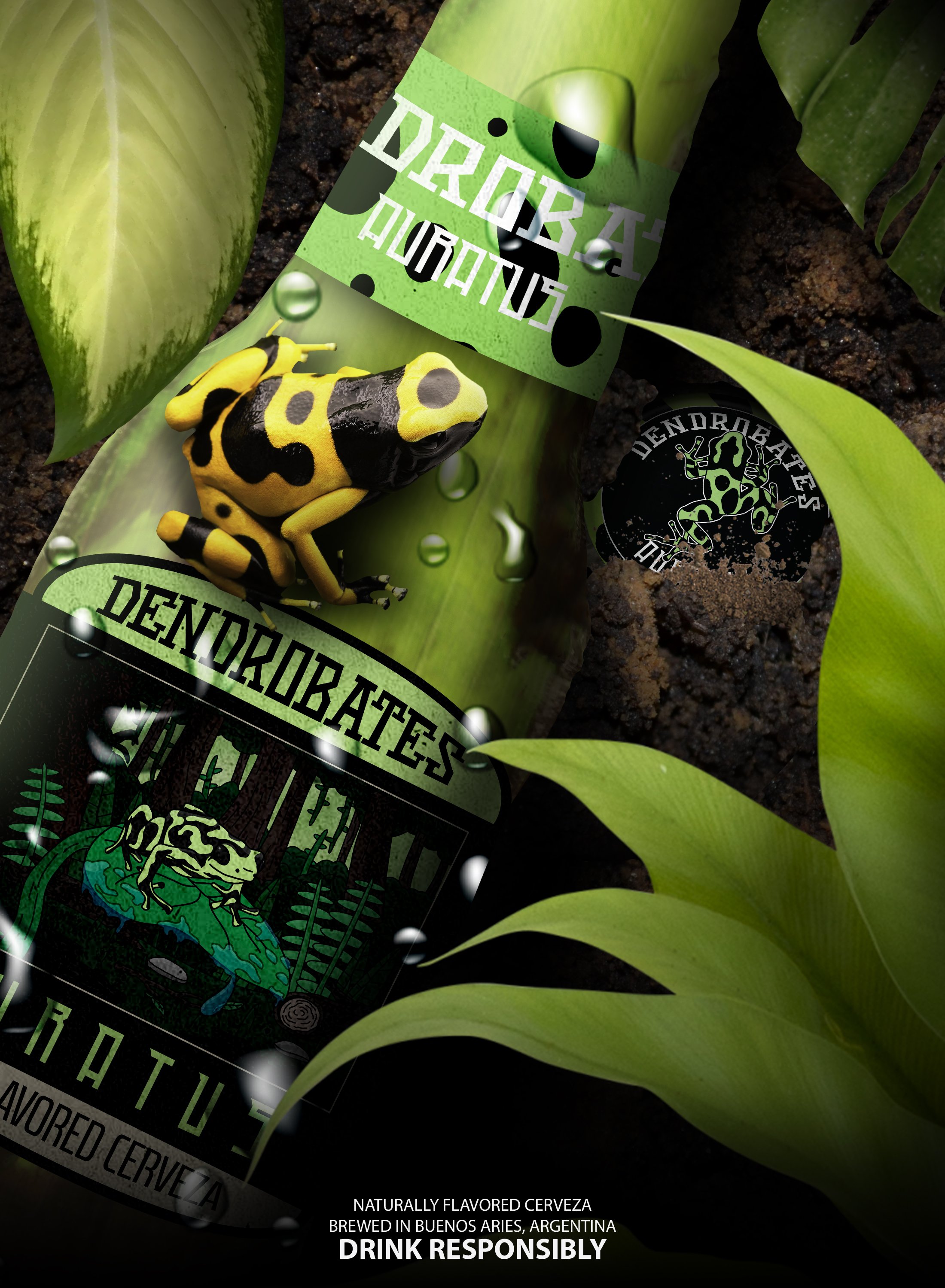
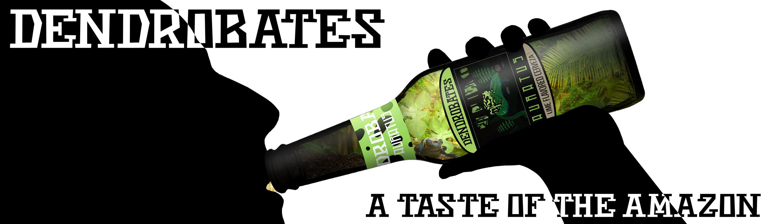
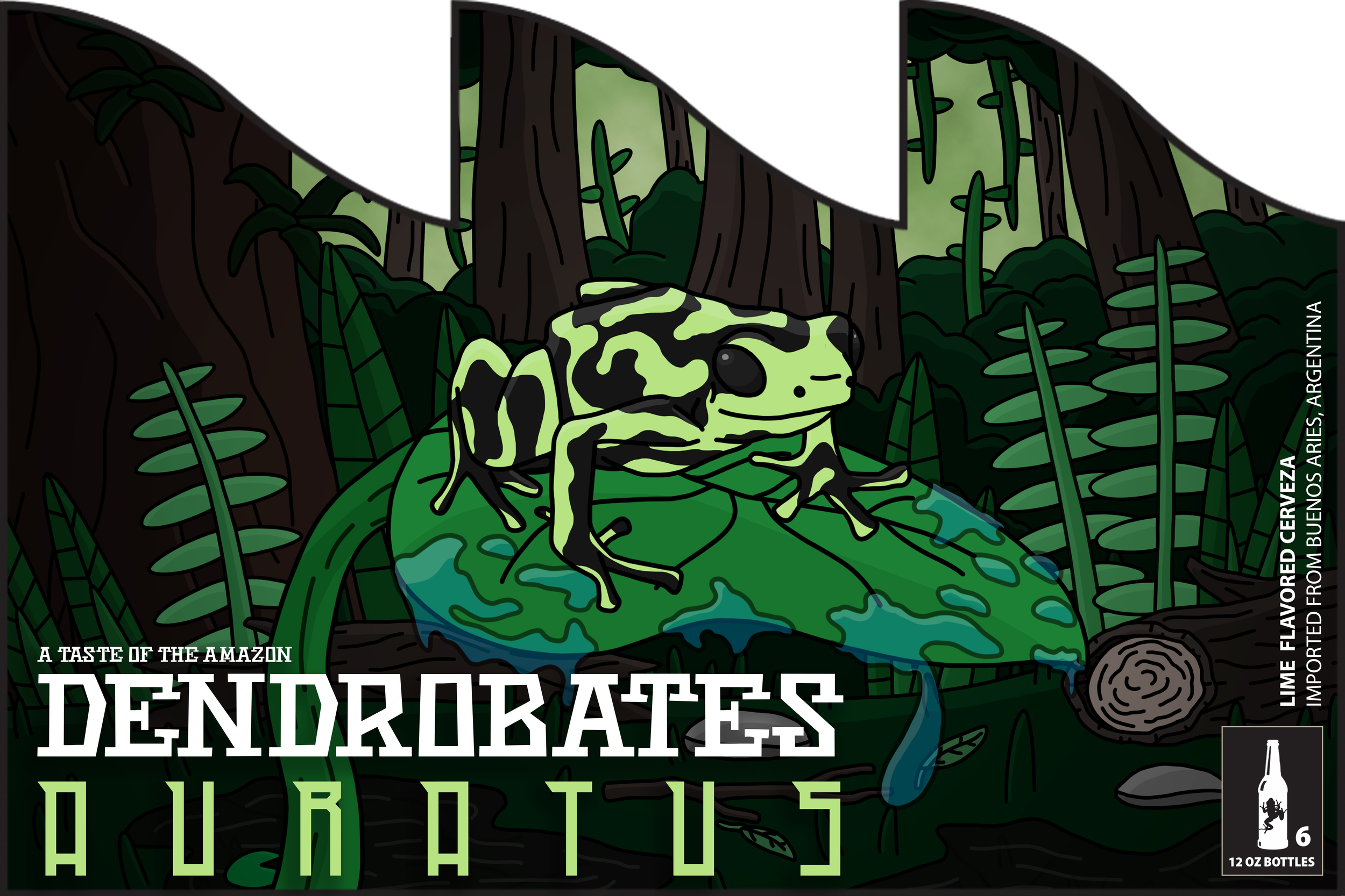
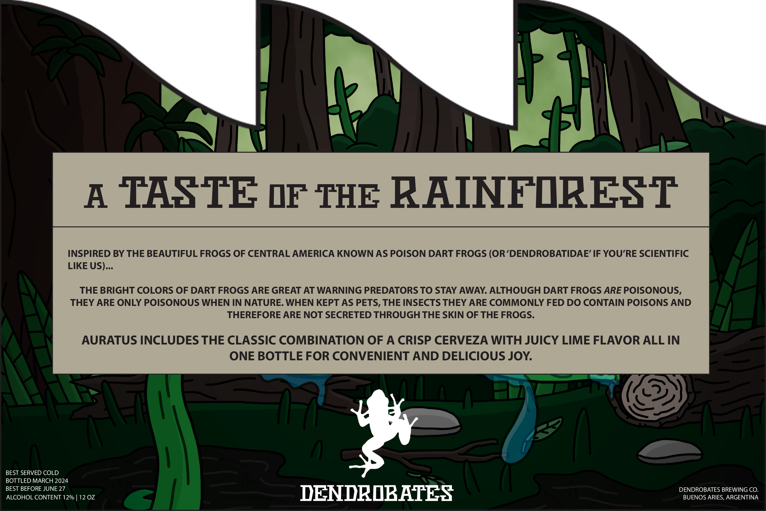
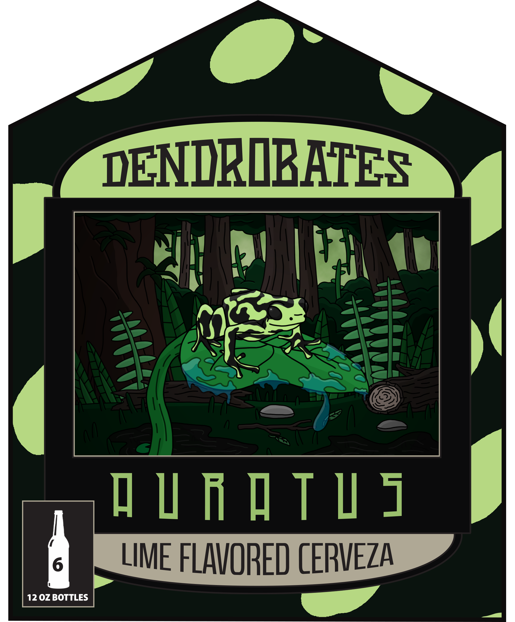
DENDROBATES FLAVORED CERVEZA
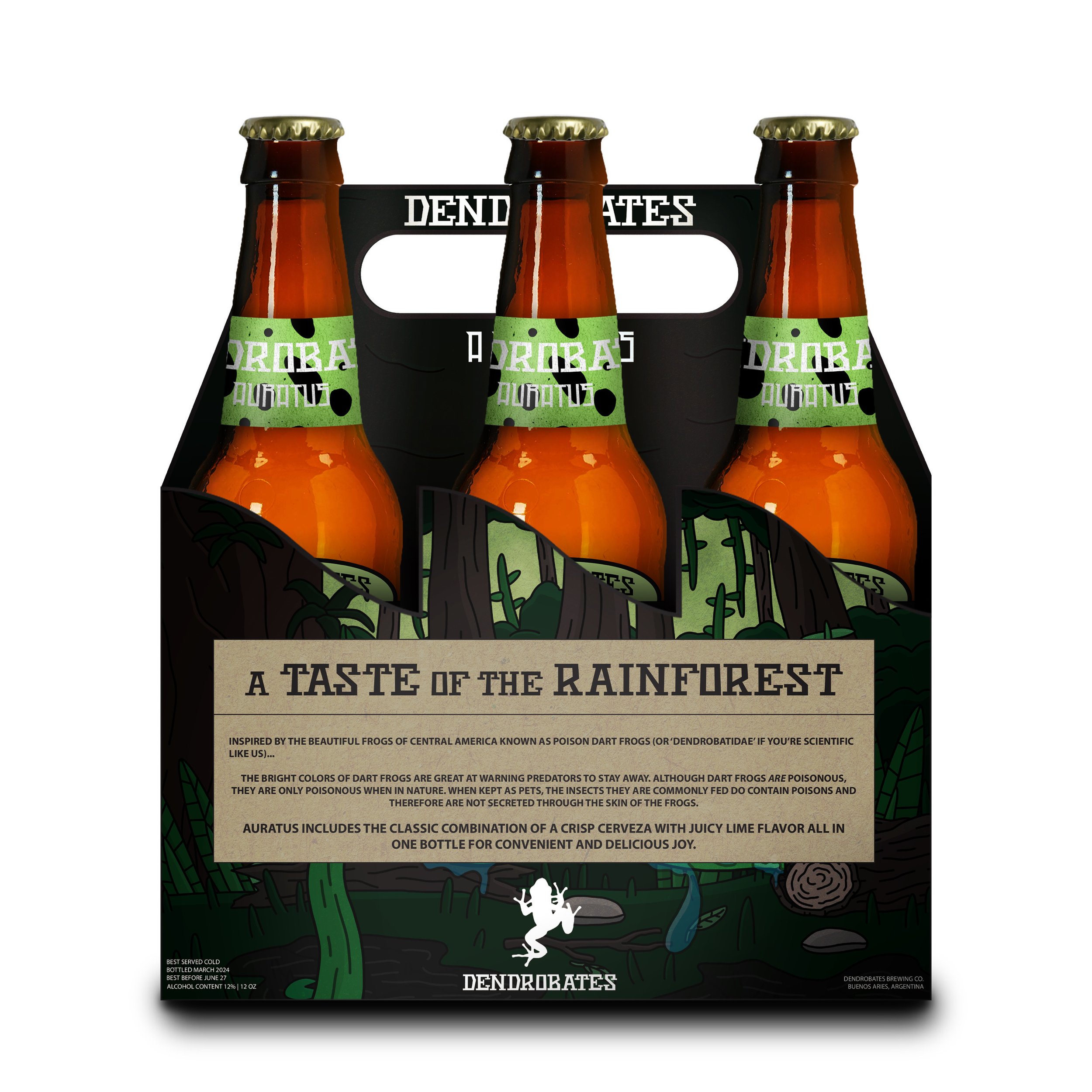
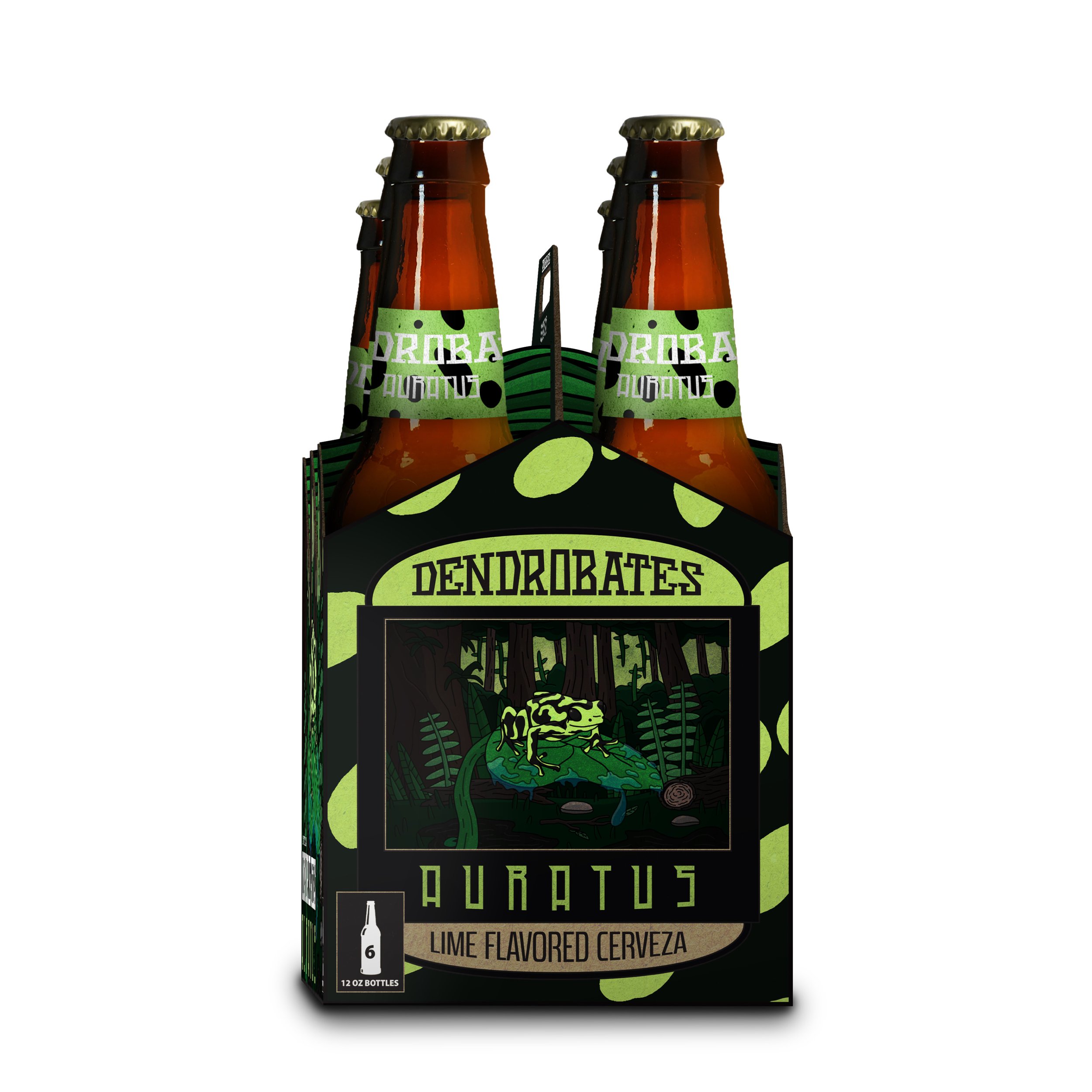
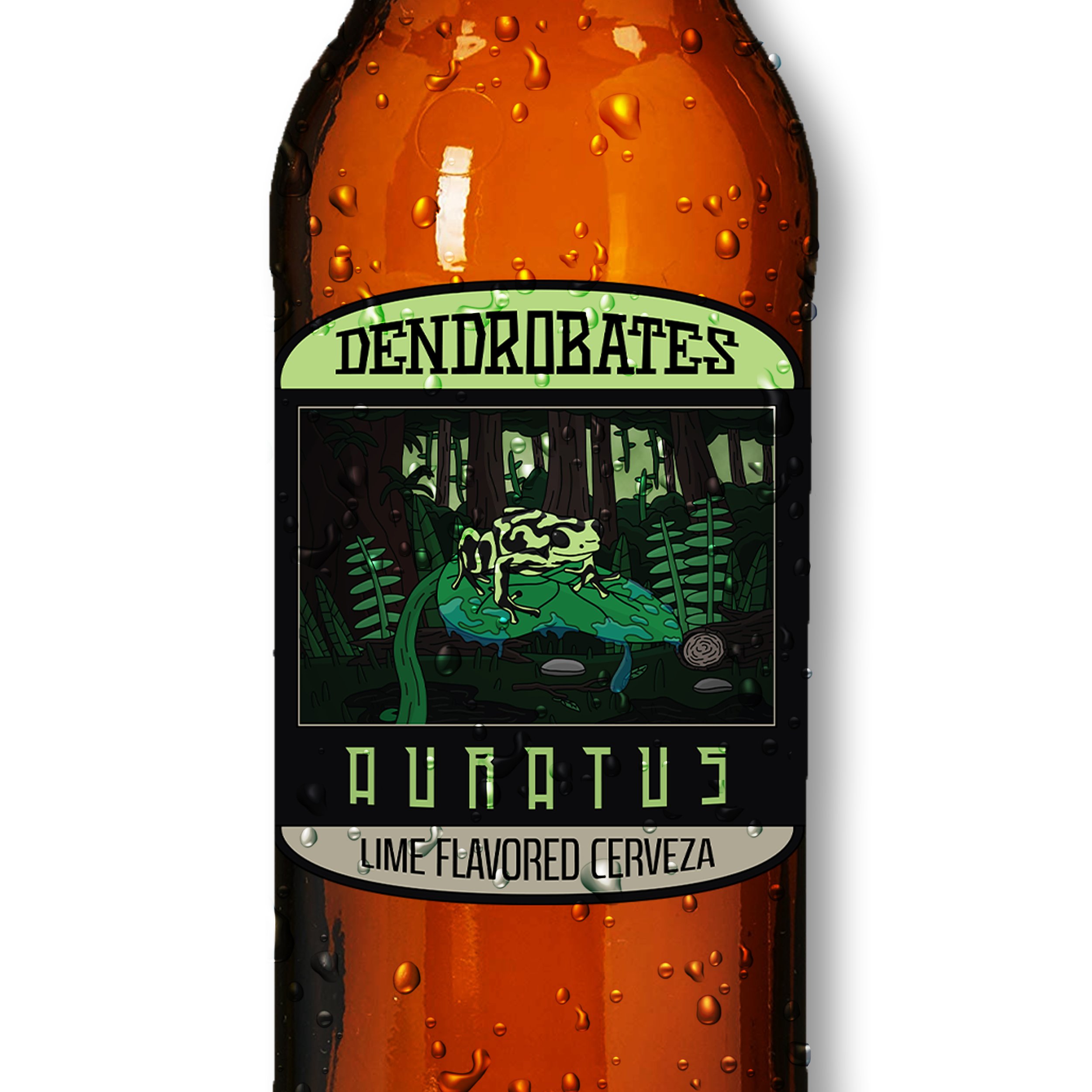
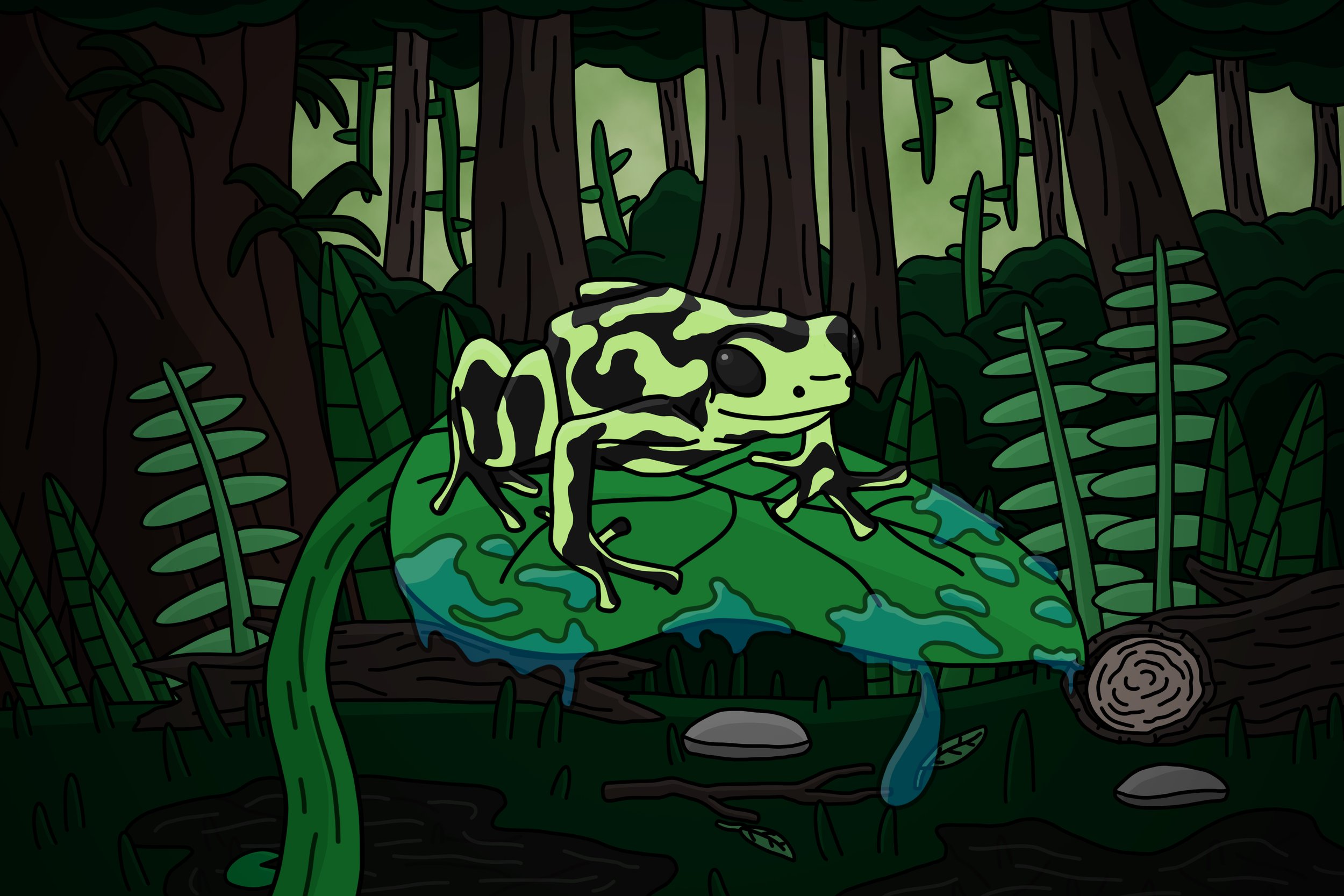
Dendrobates Flavored Cerveza is a fictional brand that I created to practice my branding skills, packaging design skills, and Photoshop and Illustrator skills. It started with some prior knowledge on poison dart frogs, knowing various species of dart frog come in many different colors.
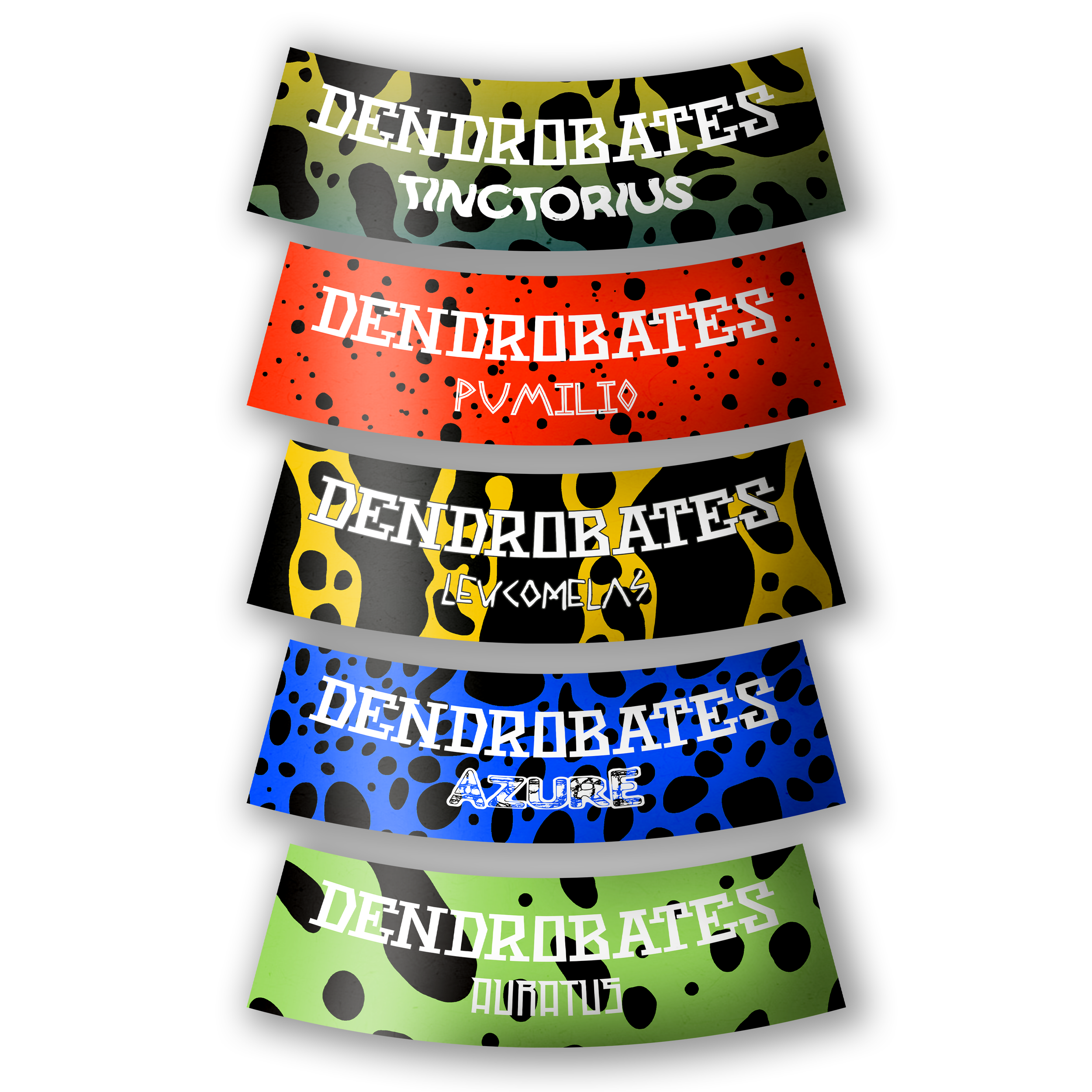
I started by creating the illustration present on the bottle label in Photoshop and then designing the rest of the label in Illustrator. I then did further research on various dart frog species and assigned flavors to my favorite species. Once I idealized the flavors, I created the packaging design layout and created more elements for each of the panels, made designs for each of the bottle caps and neck labels, and mocked up each of these assets onto bottles and 6-pack packaging.
From there I created various advertisements showcasing the brands products and identity and then created mock ups for each of those.
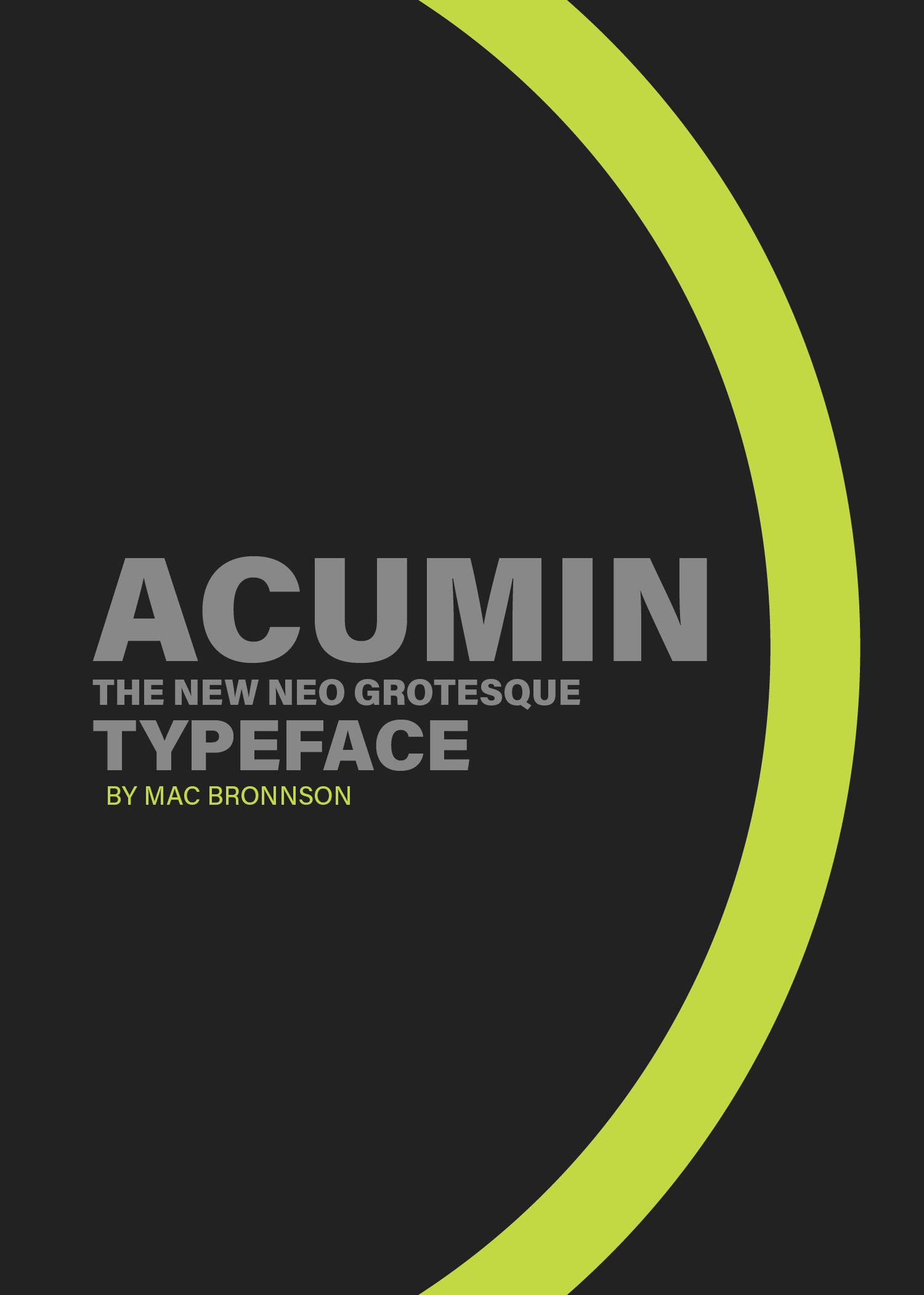
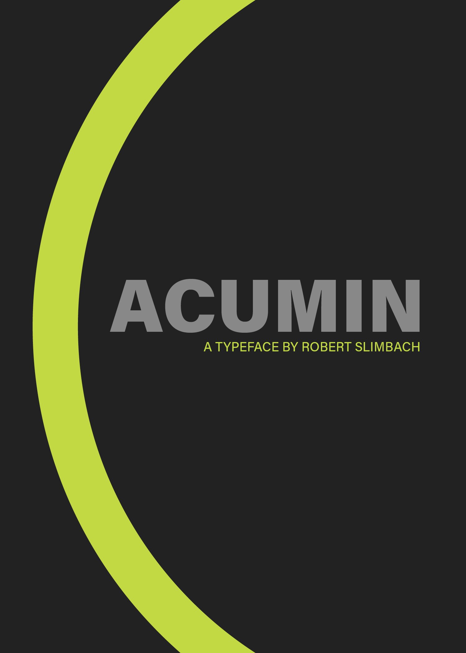
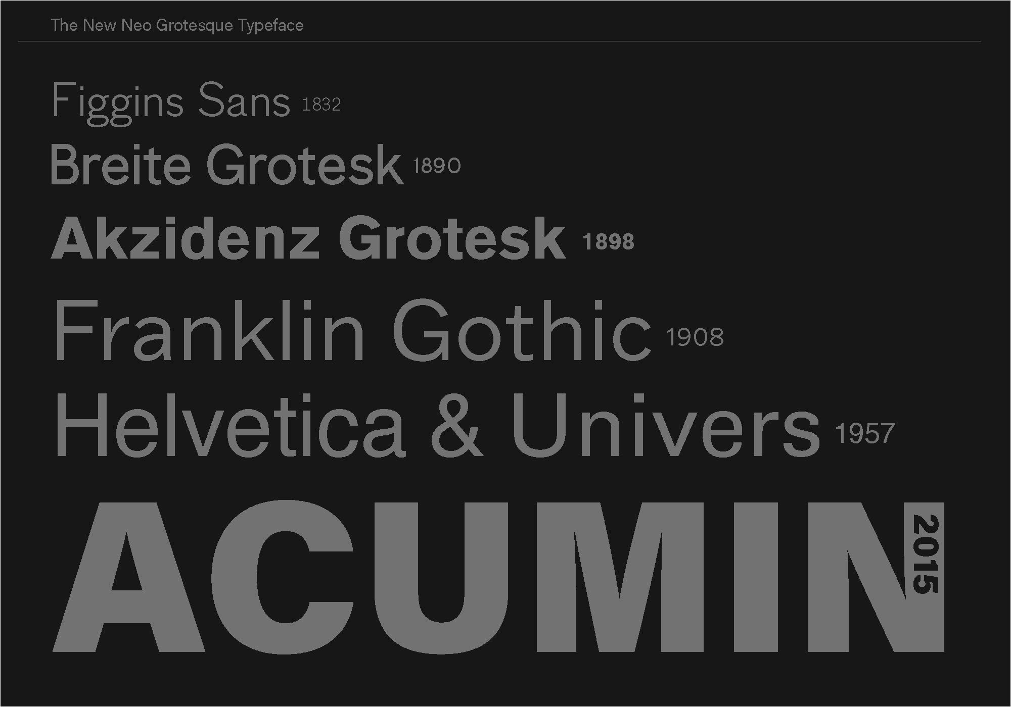
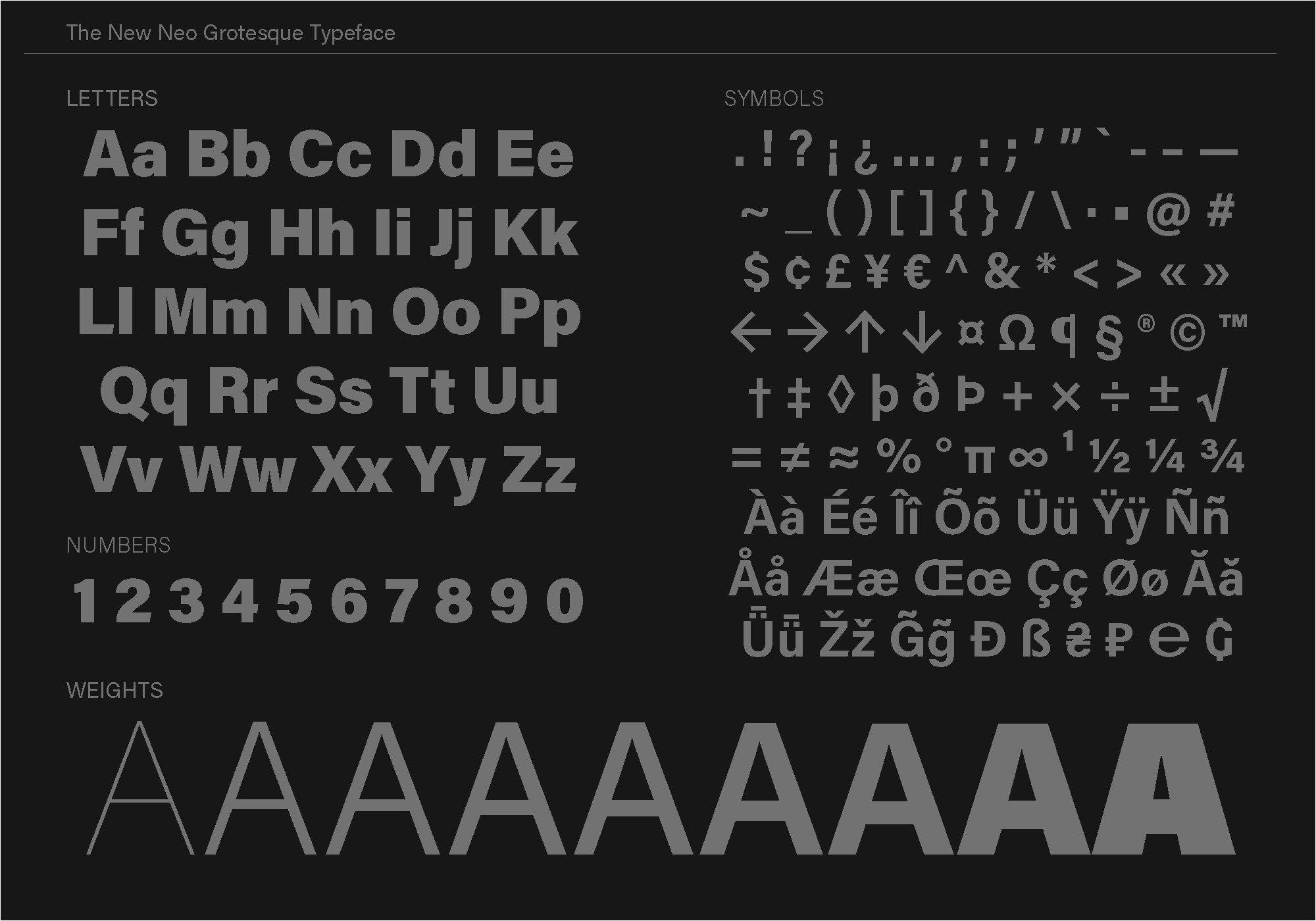
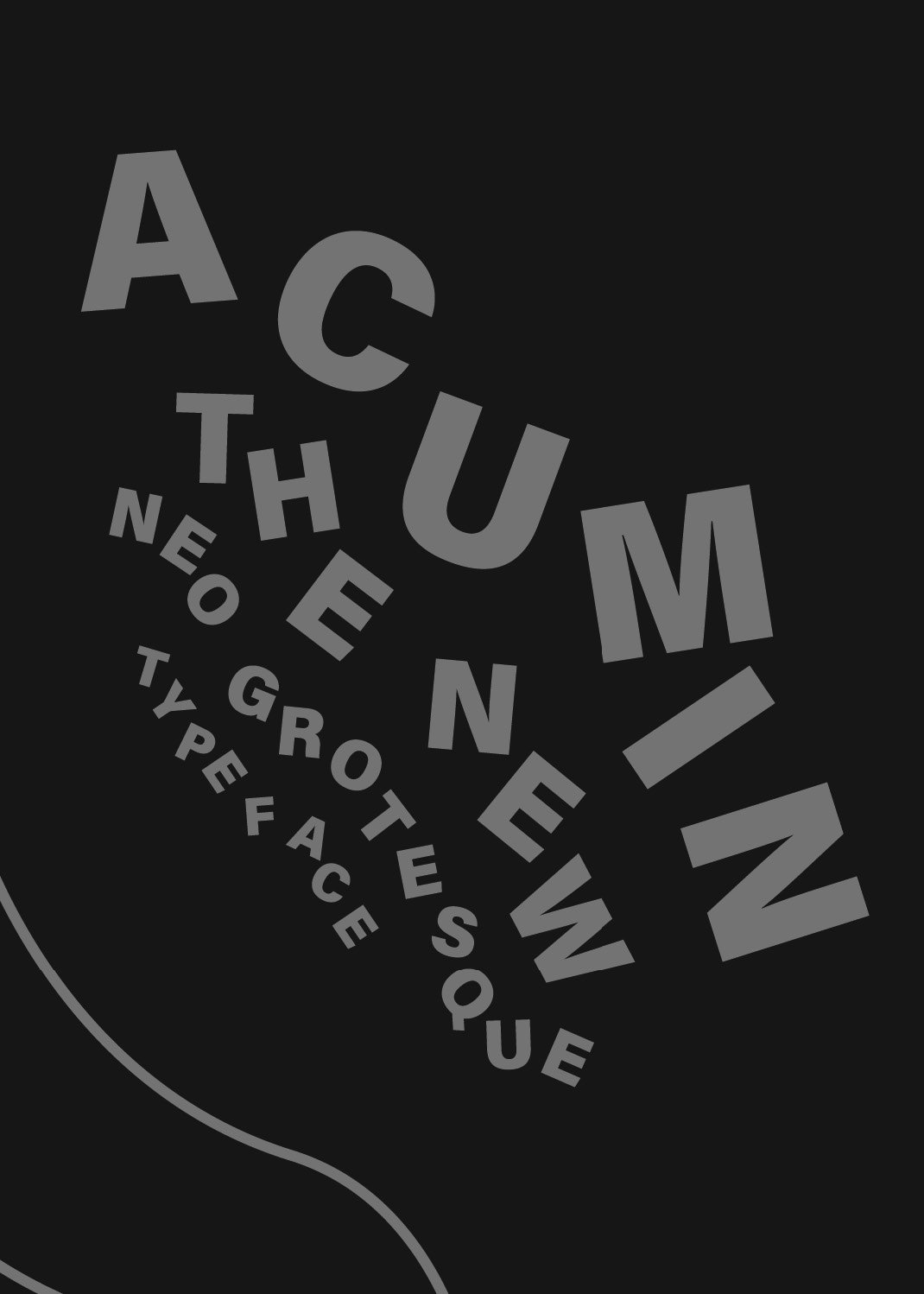
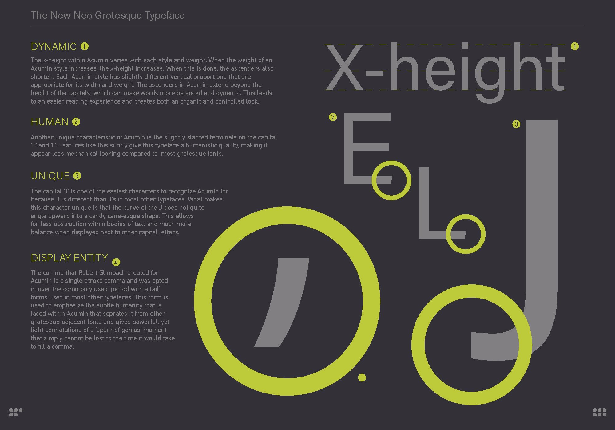
ACUMIN TYPE SPECIMEN BOOK
(SCHOOL PROJECT)
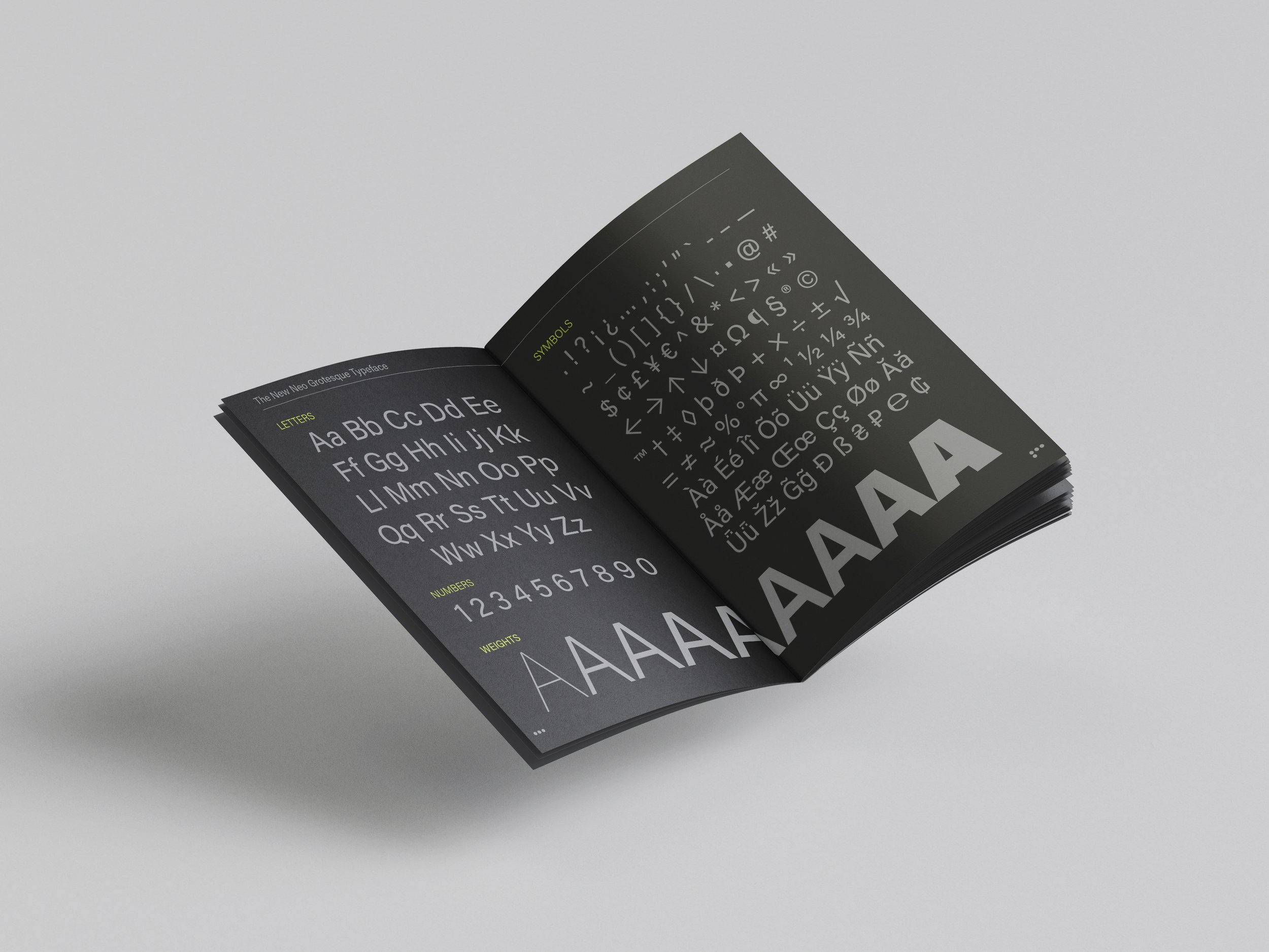
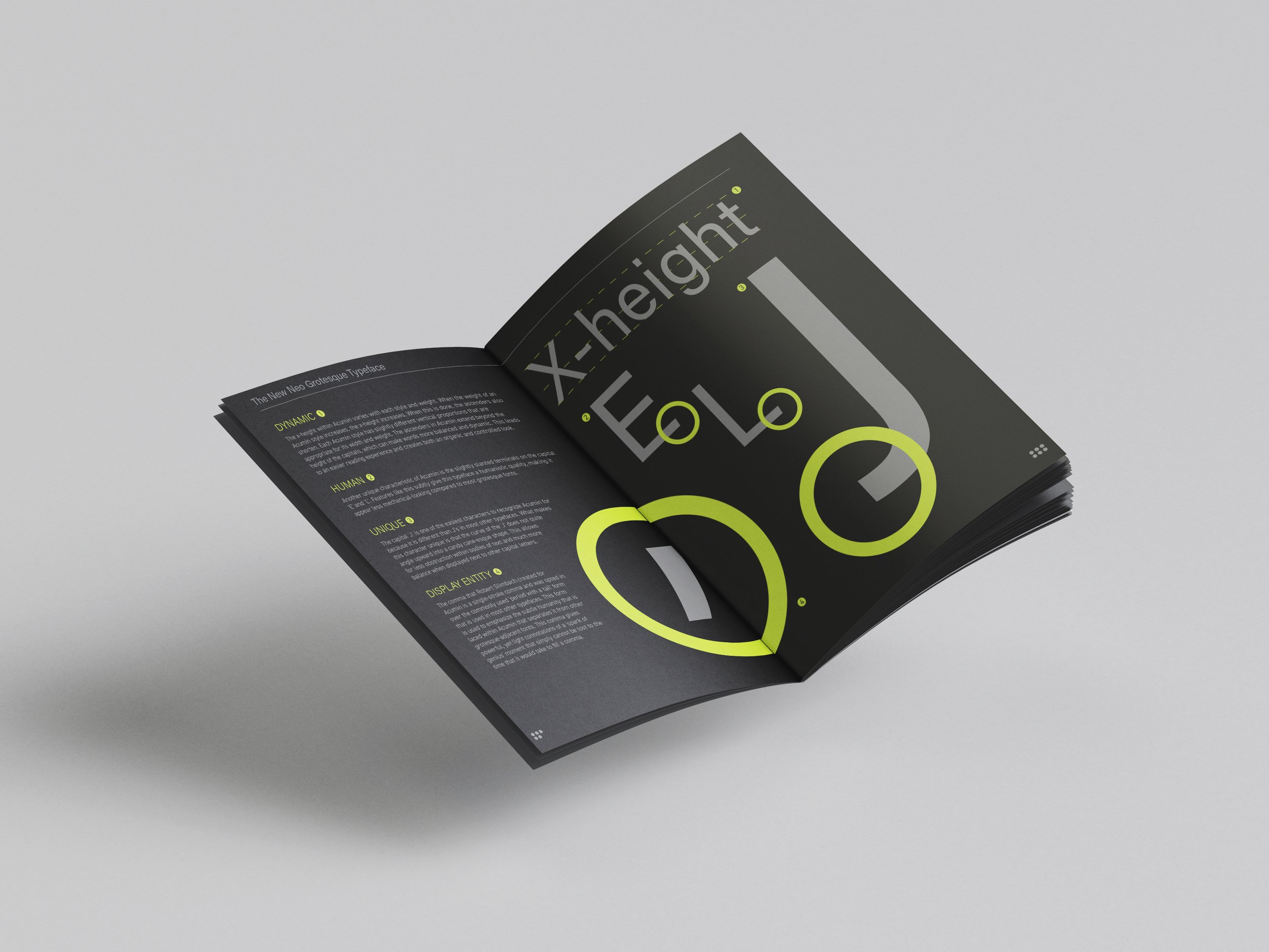
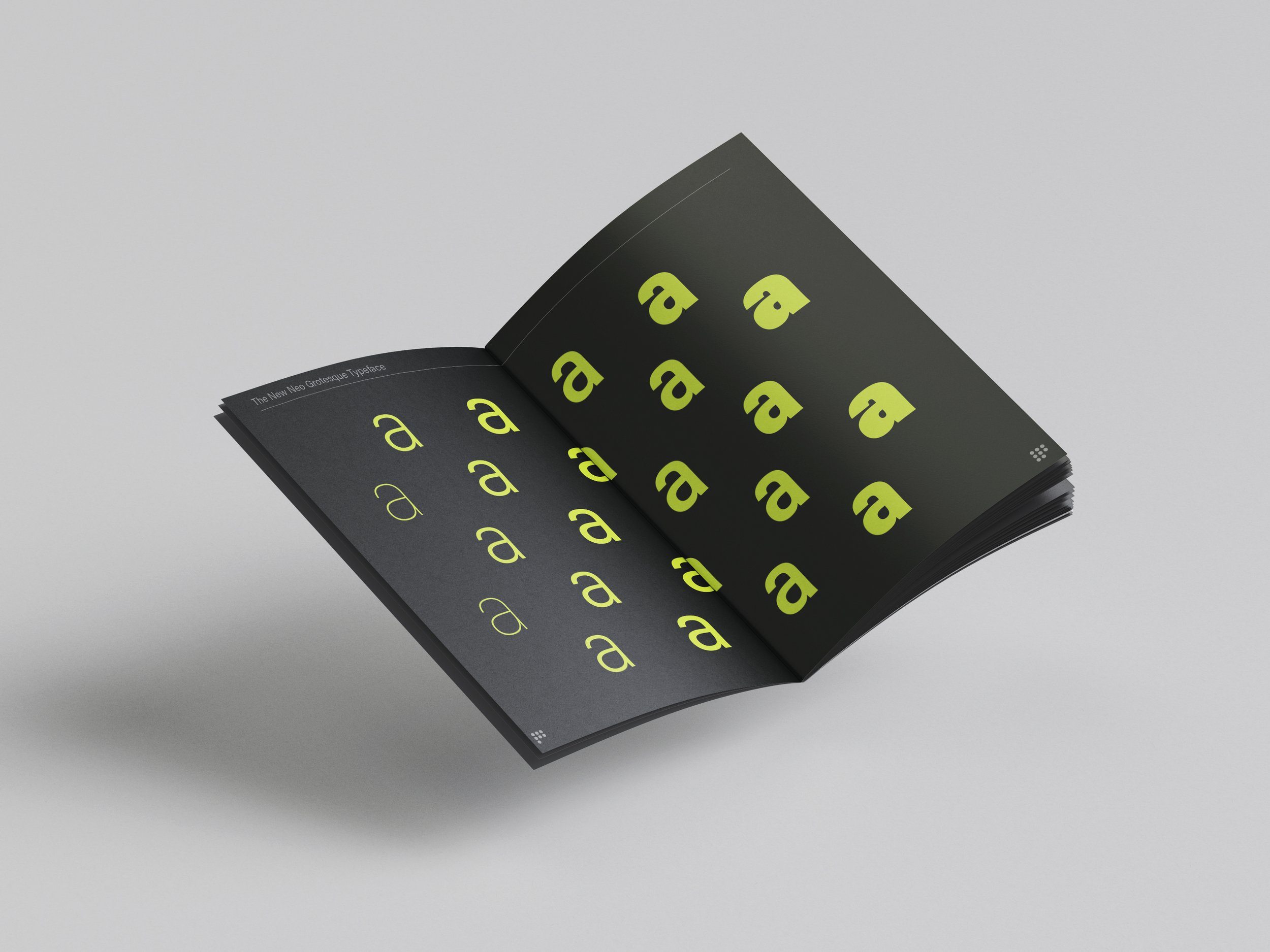
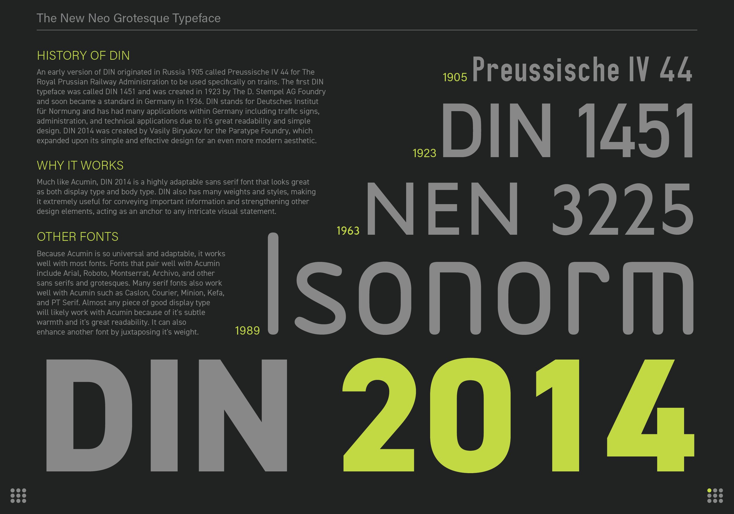
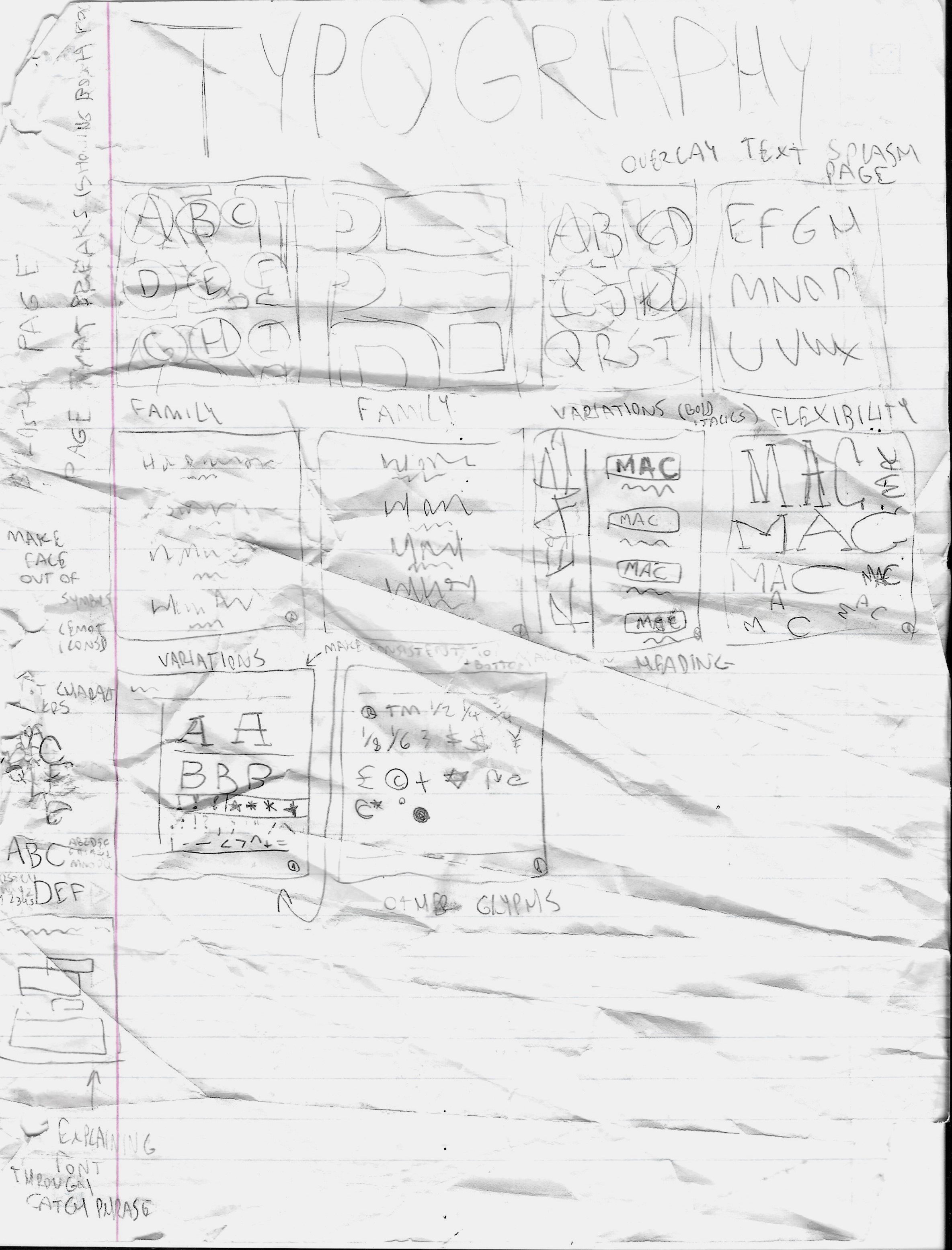
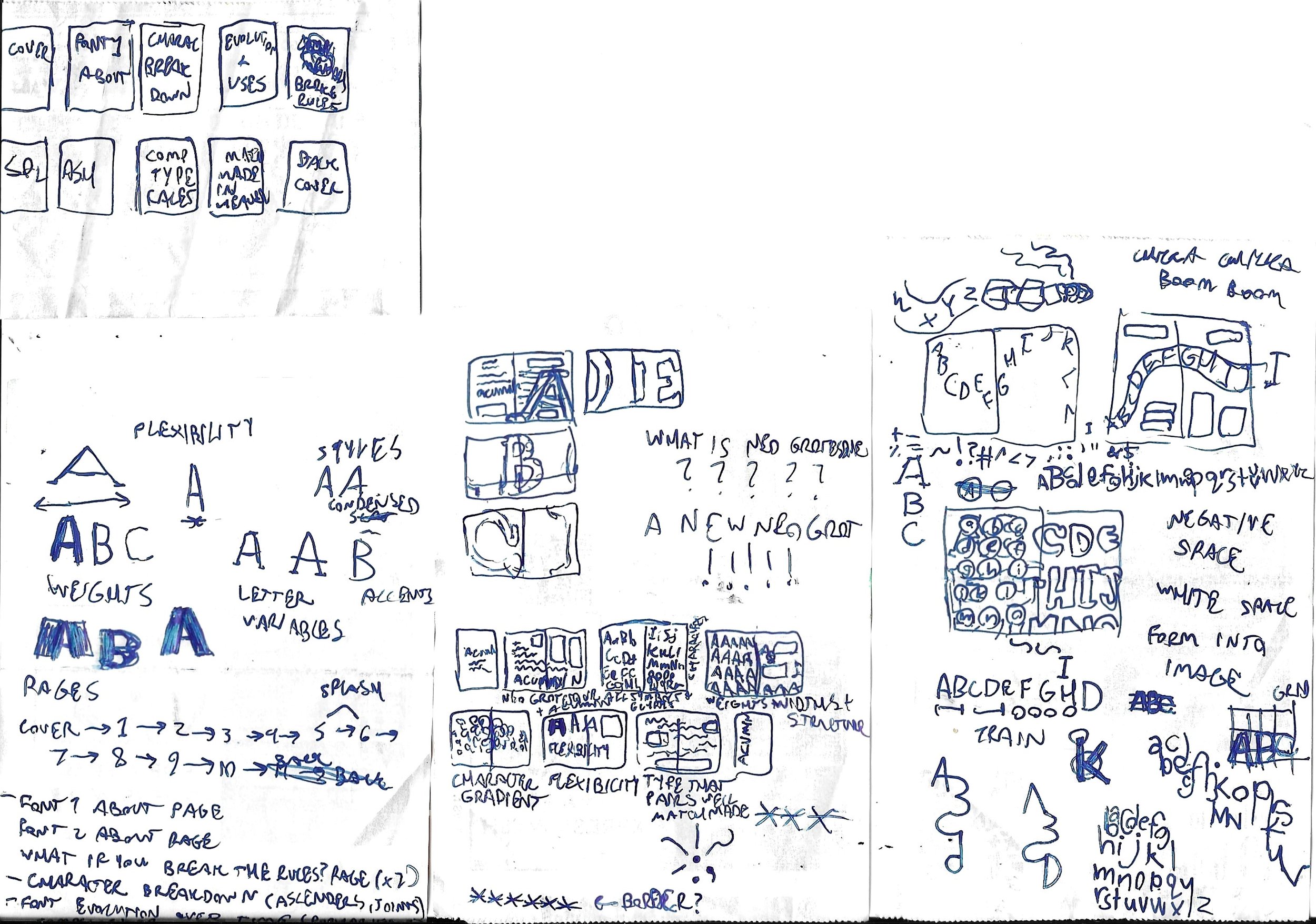
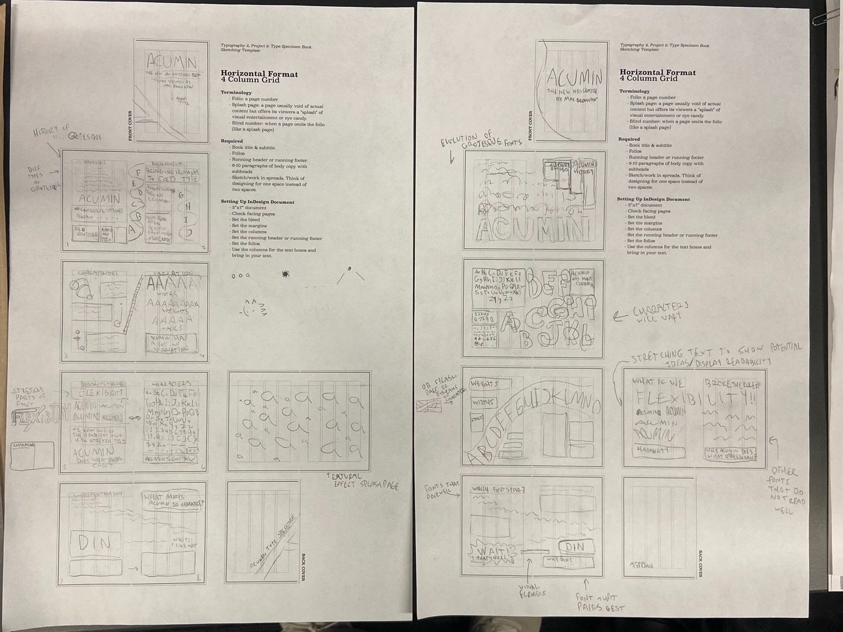
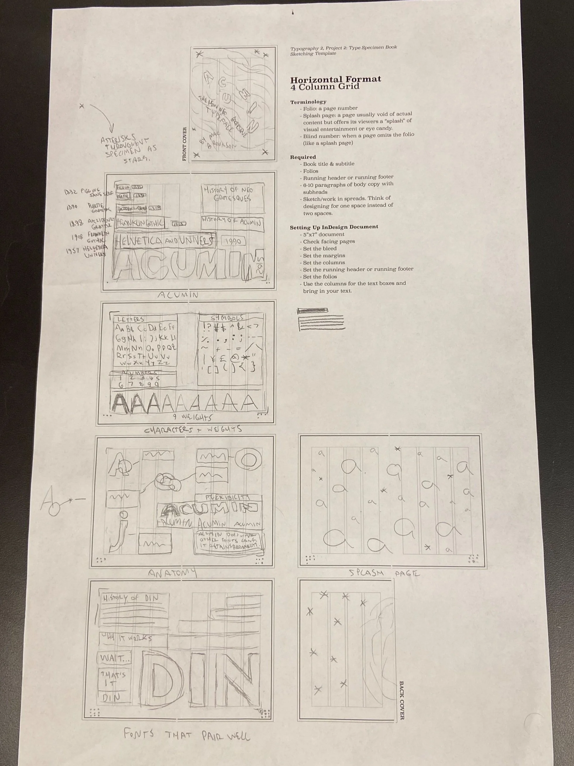
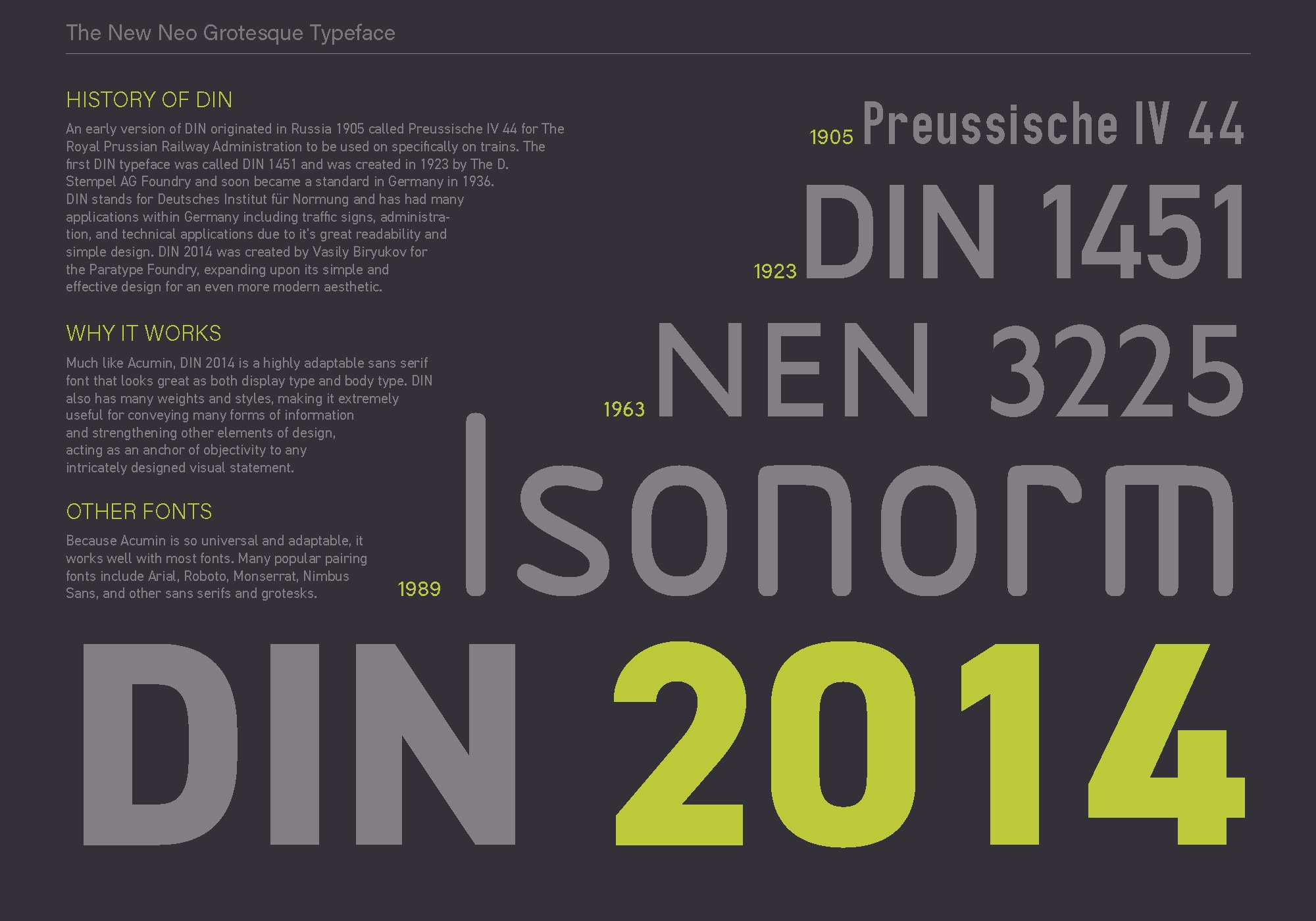
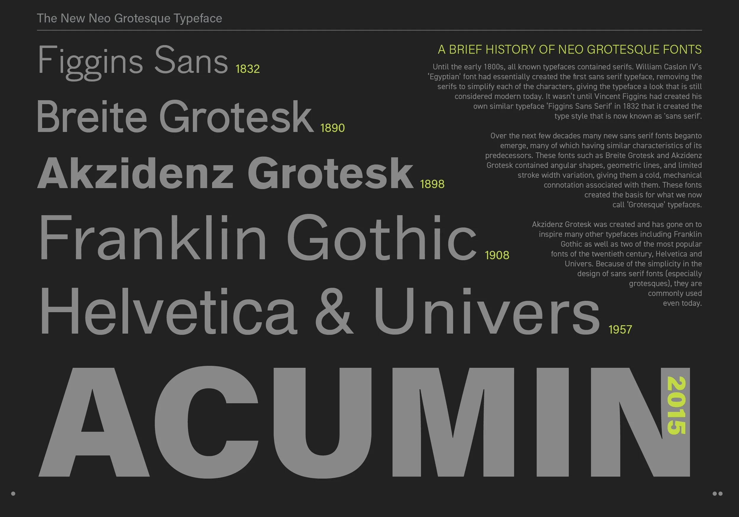
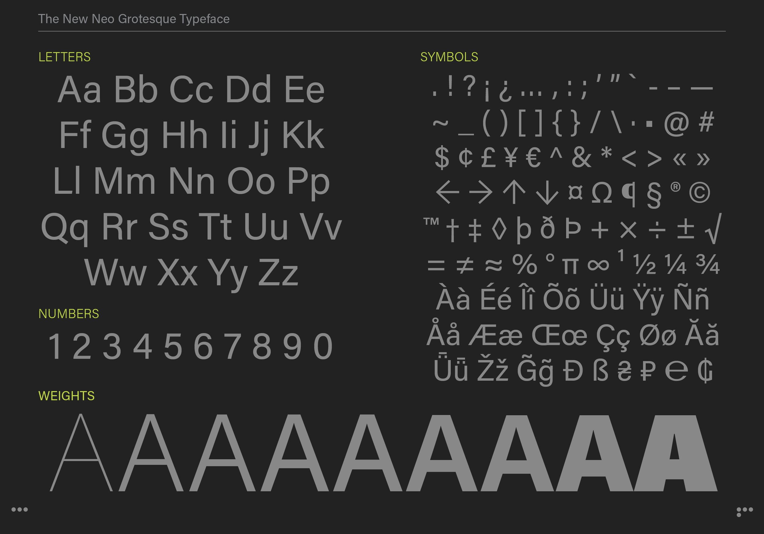
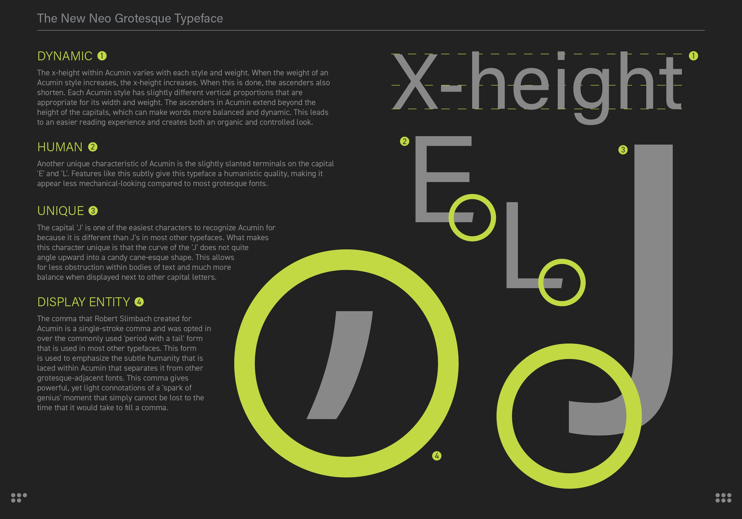
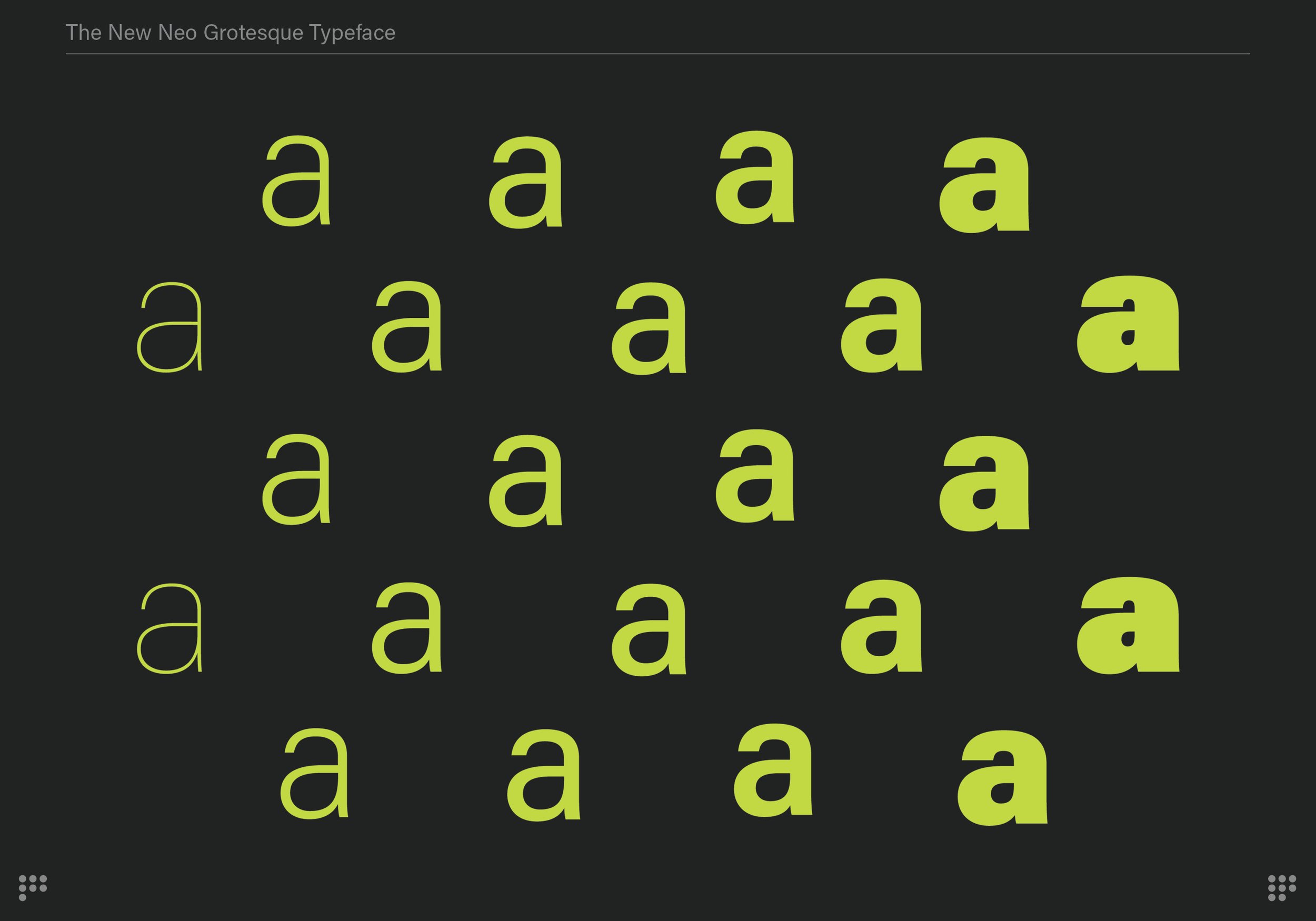
This was a project for my Typography 2 class at Milwaukee Institute of Art and Design and my task was to create a type specimen book that contained two different fonts that pair well together and communicate the qualities of each through text and design. Our booklets had to contain five spreads (or ten pages) and a cover system and be type-dominant.
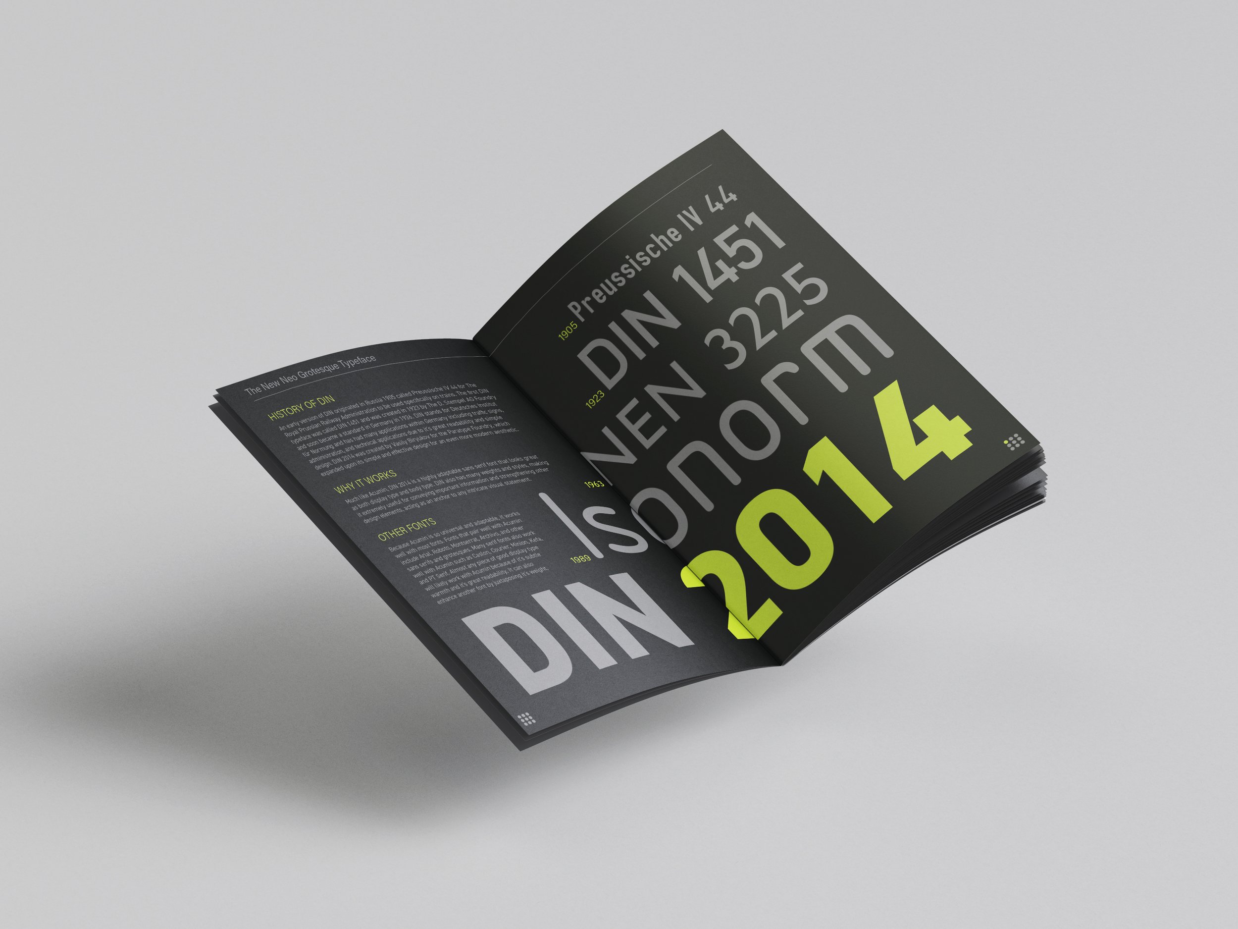
The process began with creating a mood board to reference throughout the project, pairing fonts, and gathering information related to each typeface we used. The two typefaces I chose were Acumin and DIN 2014 and I chose to highlight the dynamic elements of each of the fonts as well as explaining their evolution. Key elements of the piece were to make free-flowing spreads that brought both of the pages together naturally, make all designs cohesive, and be mindful of all potential grammatical errors. This project was created almost entirely in InDesign with only the splash page (pages 7 and 8) being designed in Illustrator.
Once the book was fully designed, we each had to properly print and trim the books down to the correct size.
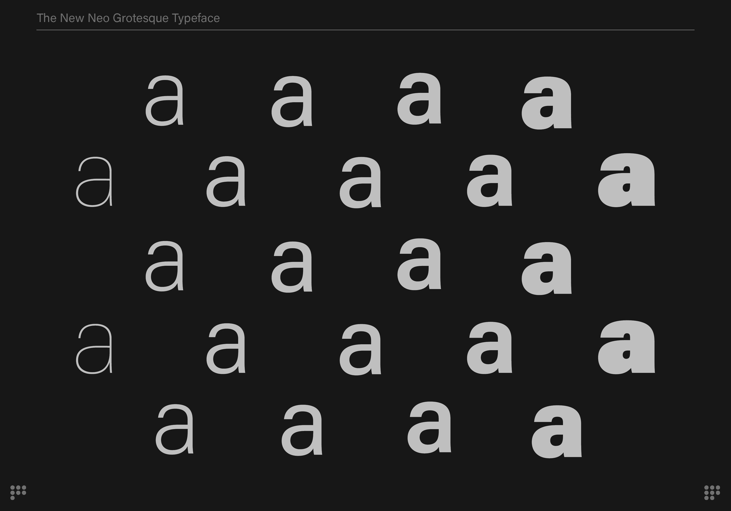
Design Philosophy: I used a circle motif throughout the piece, using it to highlight different design elements such as headings, dates, text anatomy, and page numbers. I also used a pop of lime green to highlight certain features which contrasted very well against the shades of gray that were used for the background and text. I chose to use shades of gray instead of black and white to make this piece easier on the eyes and more nuanced and I wanted there to be large amounts of space between different elements for easy reading and a clean aesthetic. Finally, I made sure that the text felt organic in contrast to the more structured elements to emphasize the human-like and cold Neo Grotesque qualities of Acumin. This was done by creating dynamic text boxes that formed around shapes and larger pieces of text.
Dendrobates Social Media Ad
Dendrobates Poster Ad
Dendrobates Billboard Ad
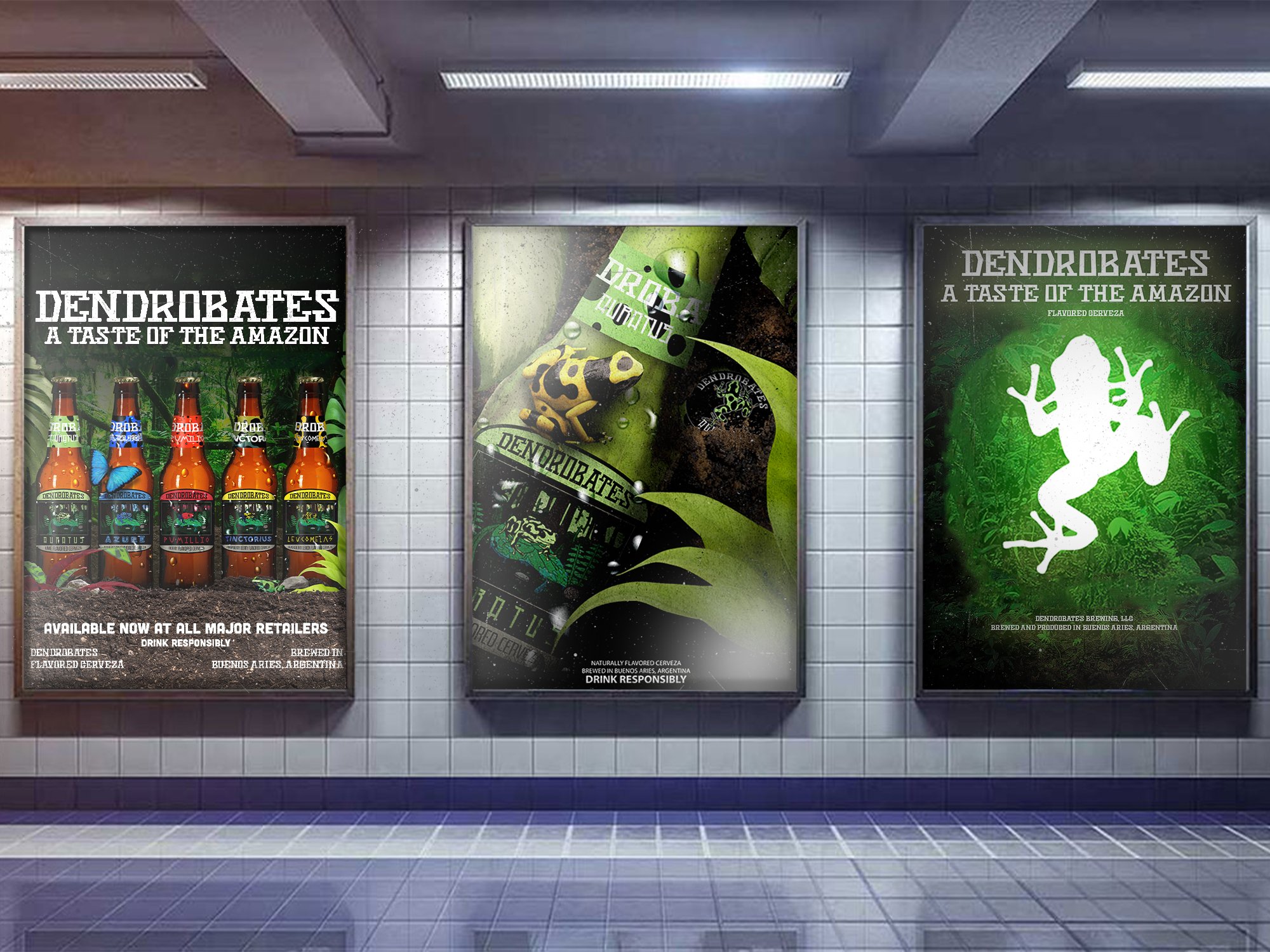
Dendrobates Poster Ad Mockups
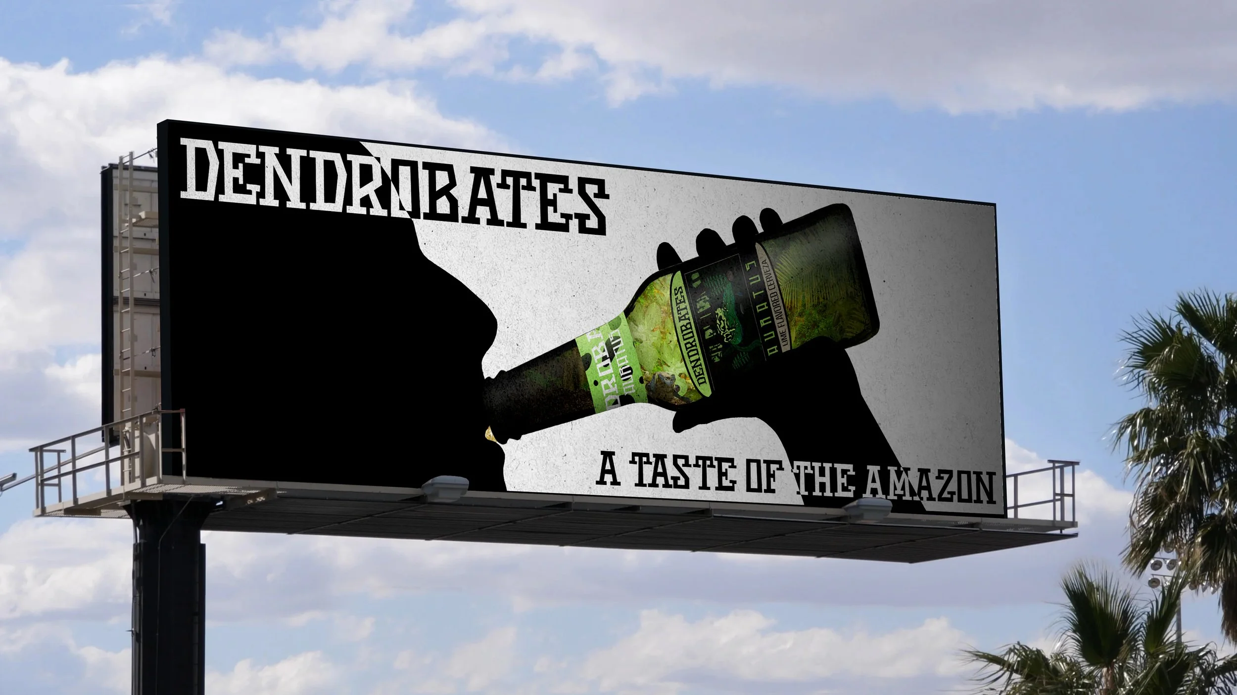
Dendrobates Billboard Ad Mockup
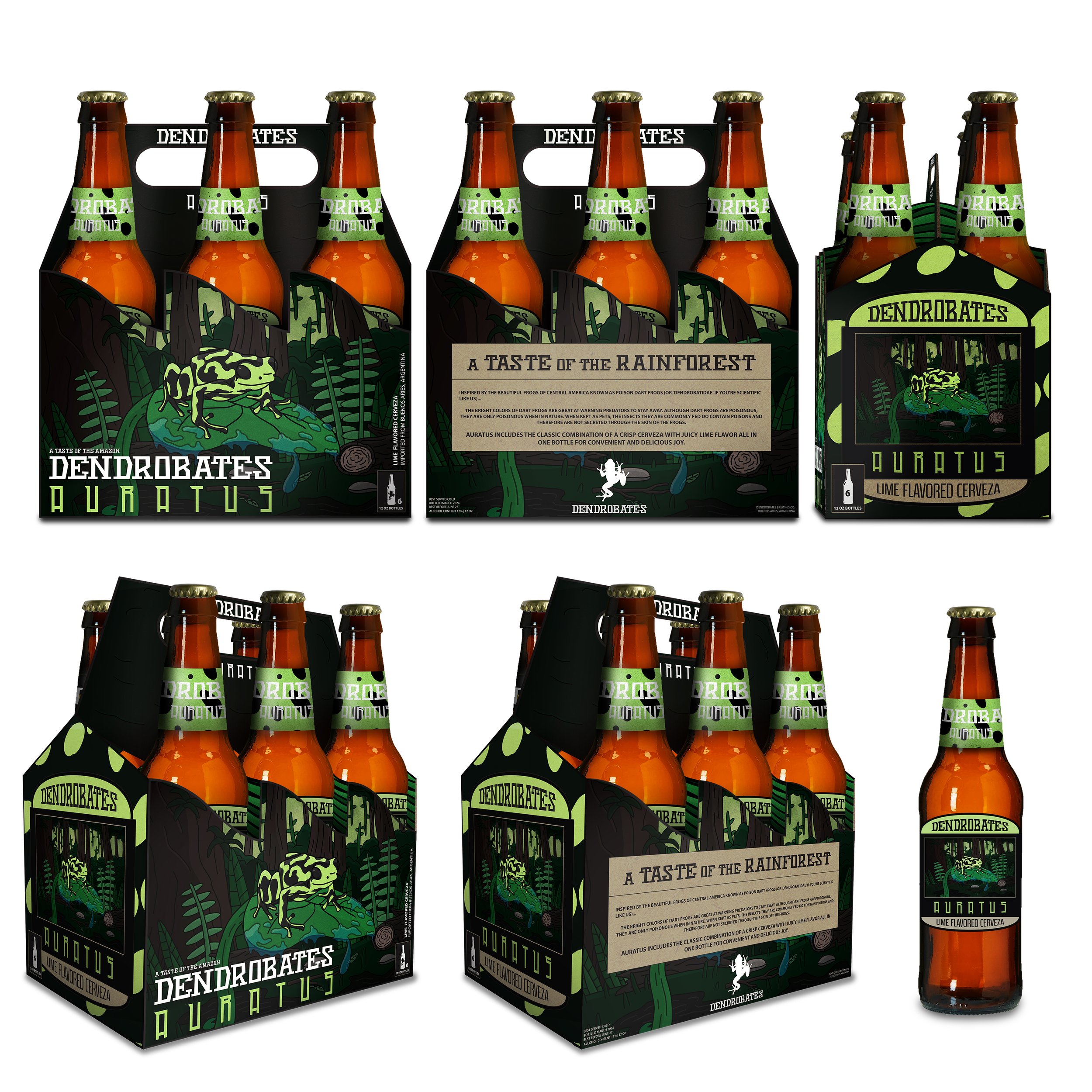
Dendrobates 6-Pack Mockups
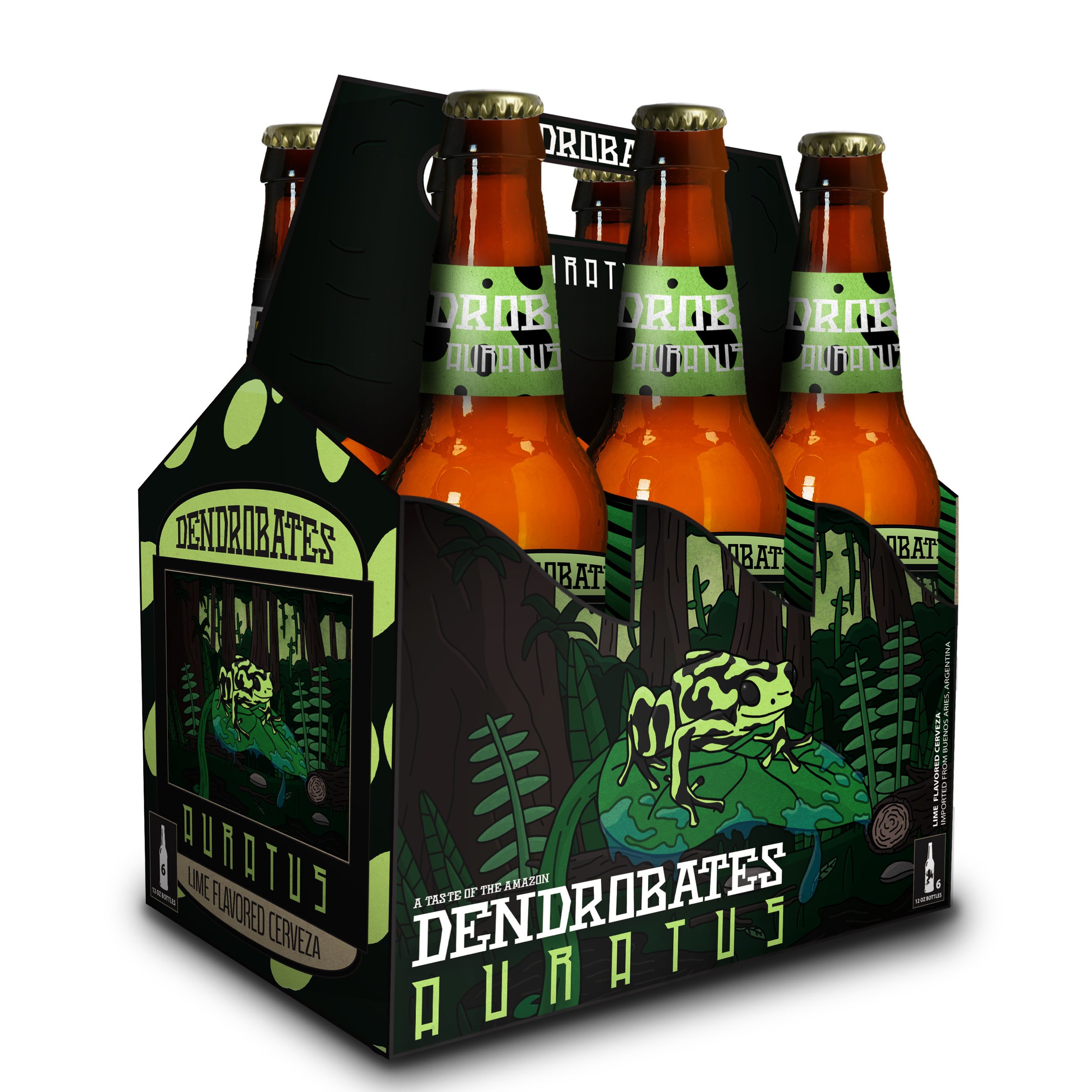
Dendrobates 6-Pack Mockup 3/4 View
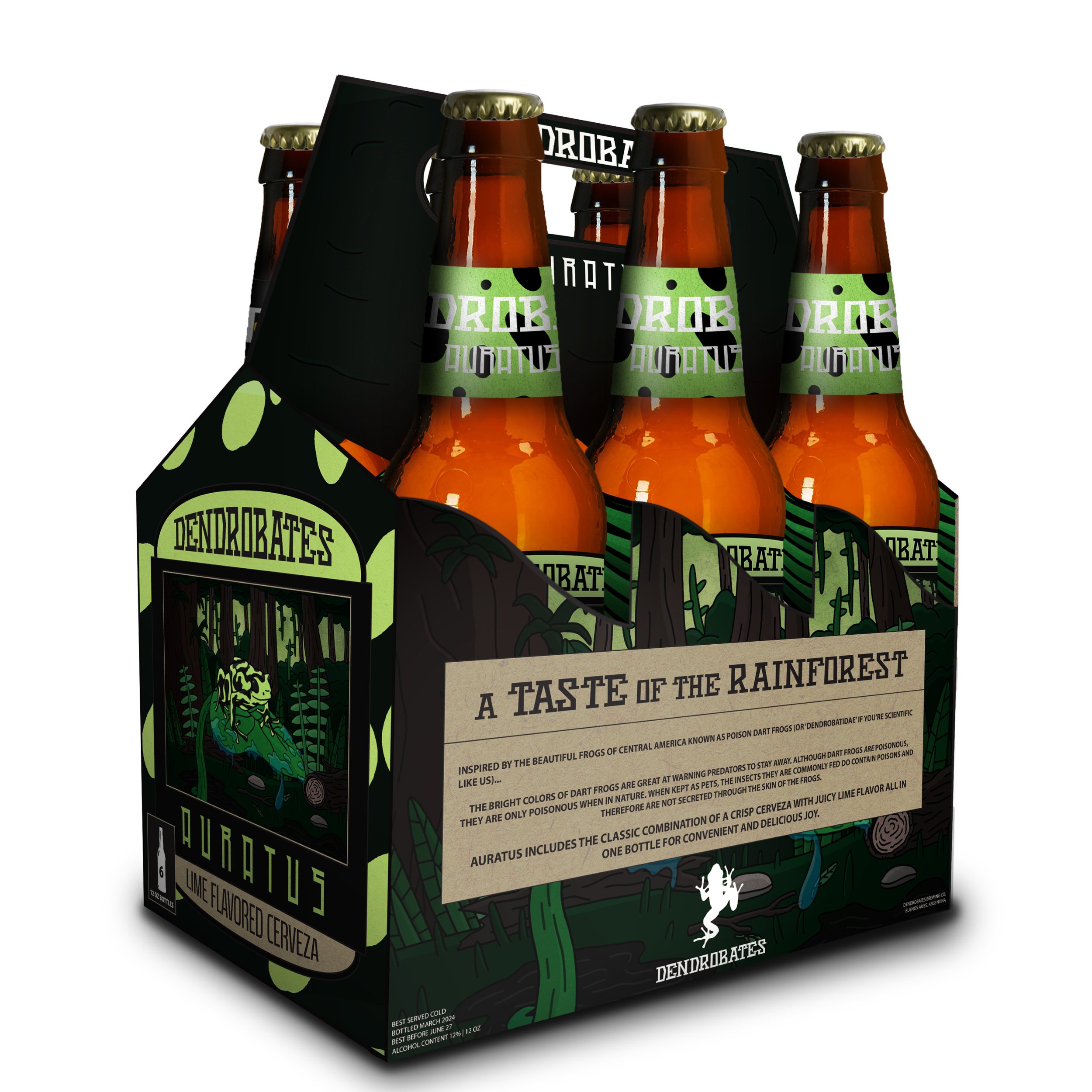
Dendrobates 6-Pack Mockup 3/4 Back View

Dendrobates 6-Pack Mockup Front View
Dendrobates 6-Pack Mockup Back View
Dendrobates 6-Pack Mockup Side View
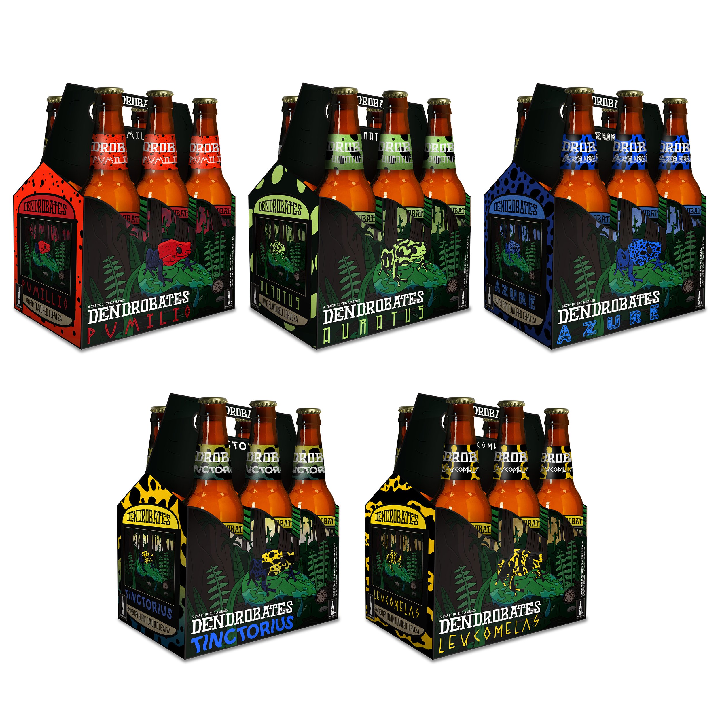
Dendrobates 6-Pack Mockups (Each Flavor)
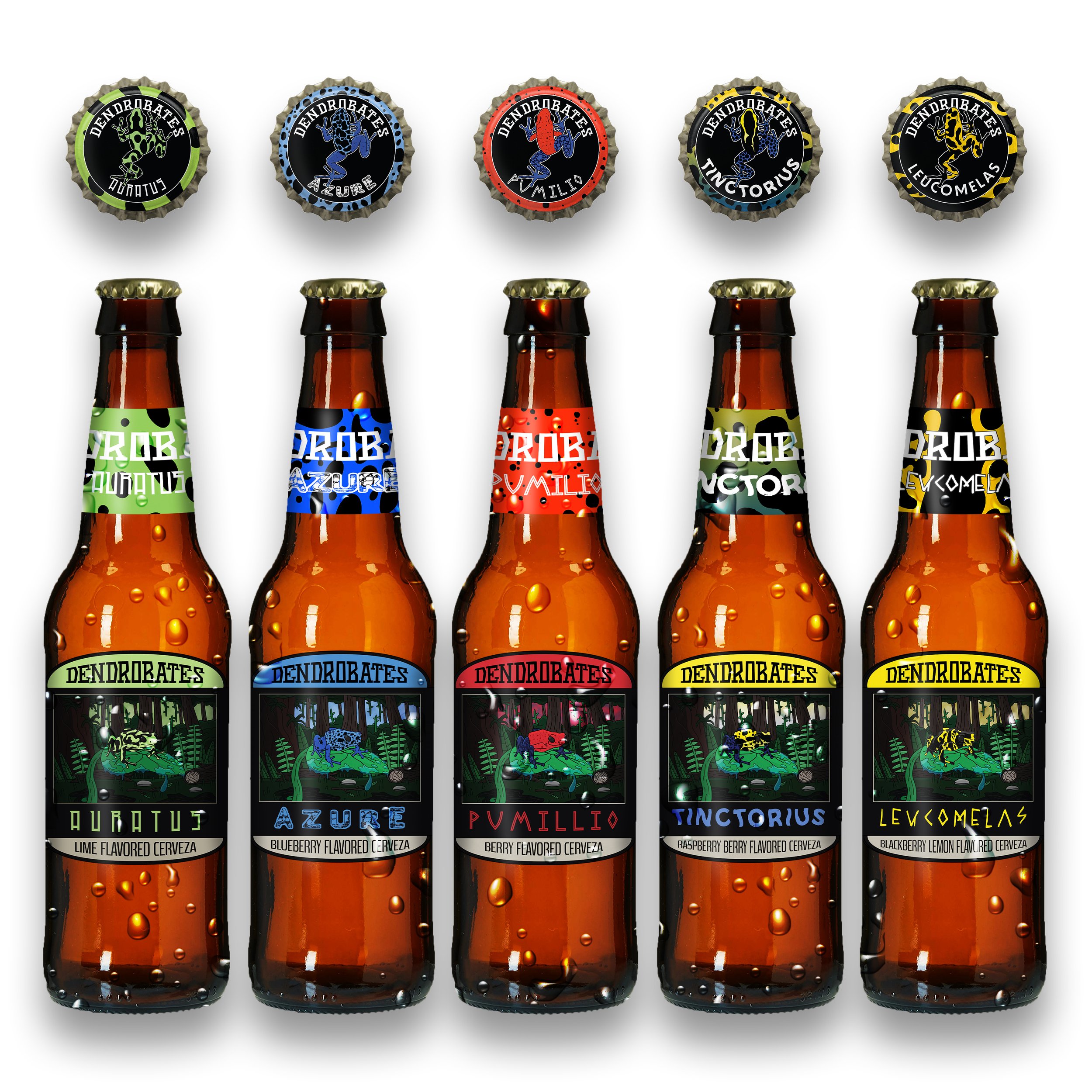
Dendrobates Bottle and Bottlecap Mockups (Each Flavor)
Dendrobates Bottle Mockup (Auratus)
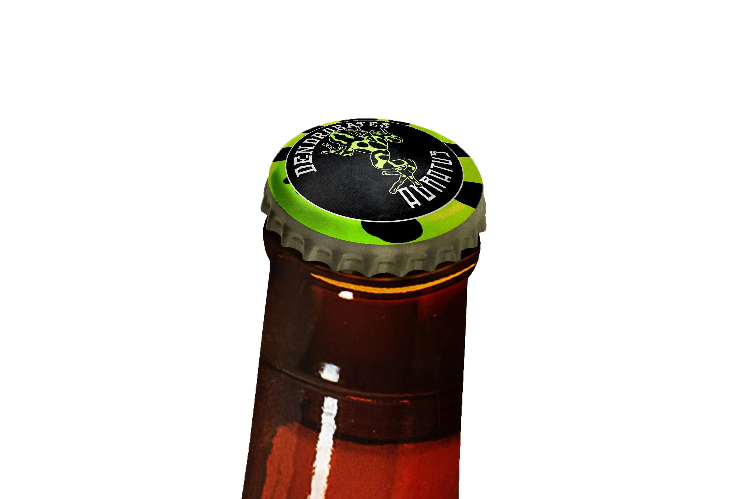
Dendrobates Bottle Cap Mockup (Auratus)
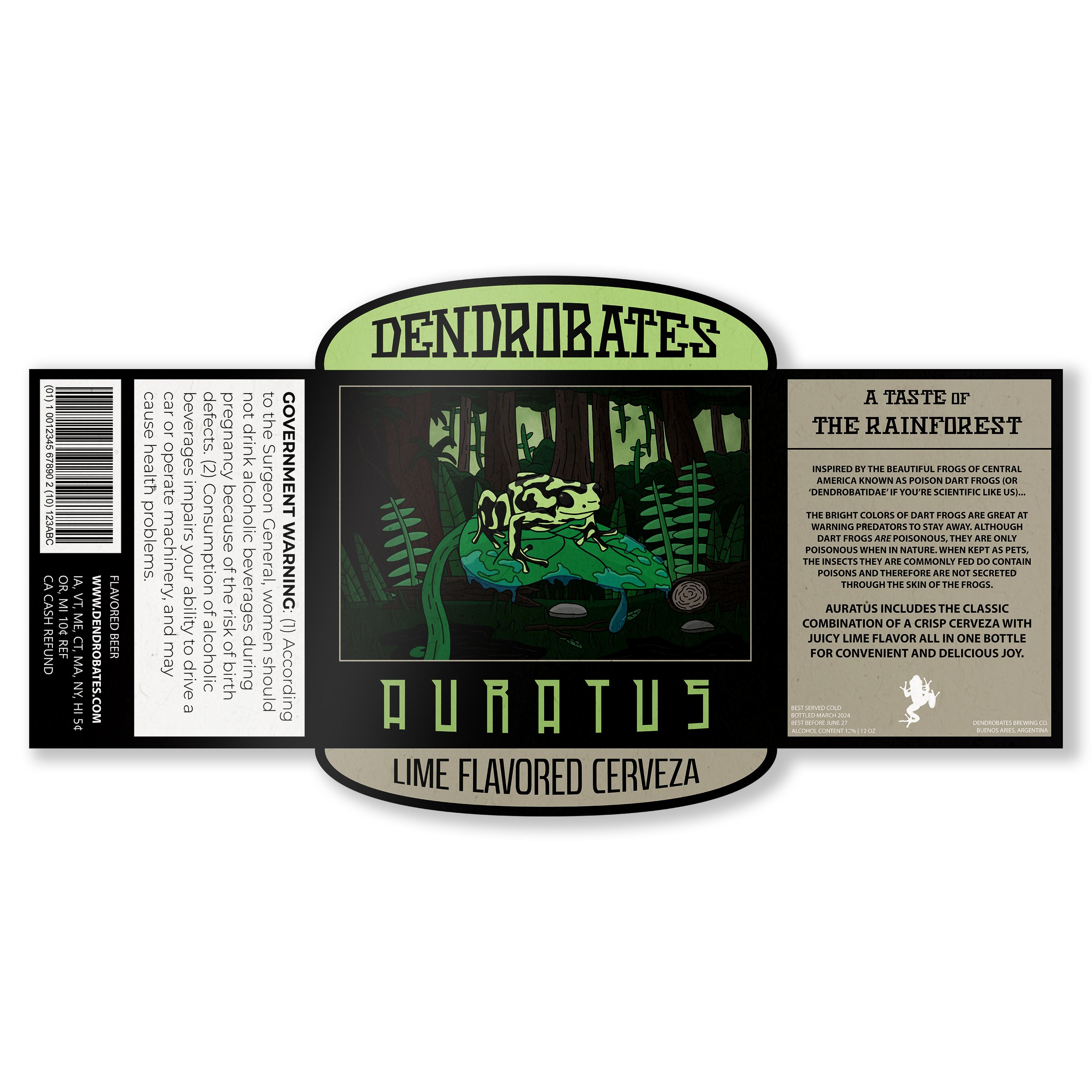
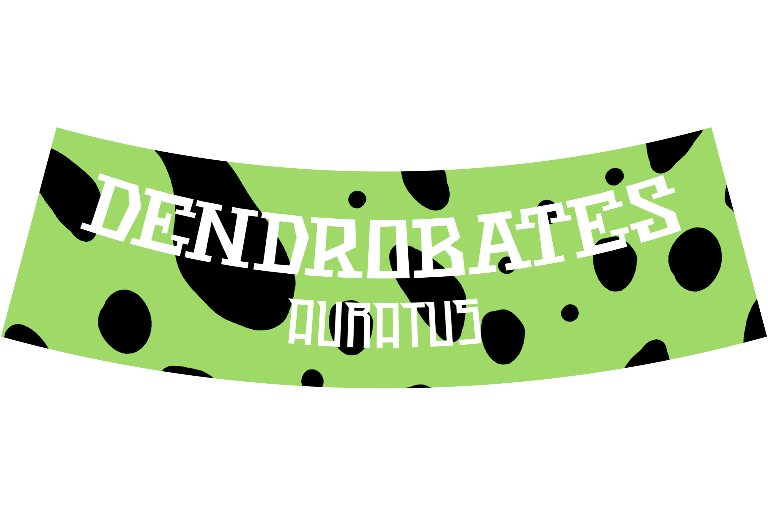
Dendrobates Label Mockup (Auratus)
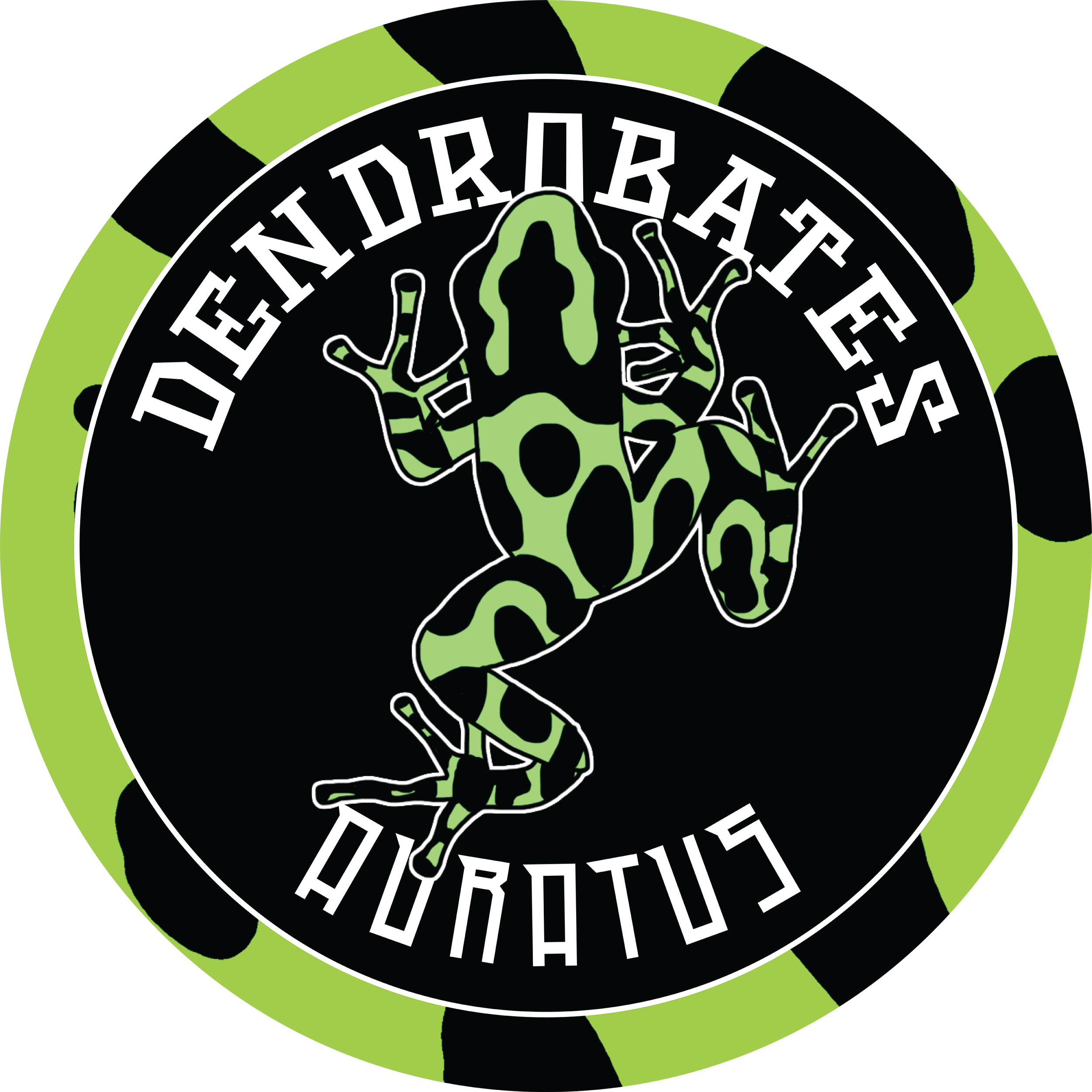
Dendrobates Neck Label Mockup
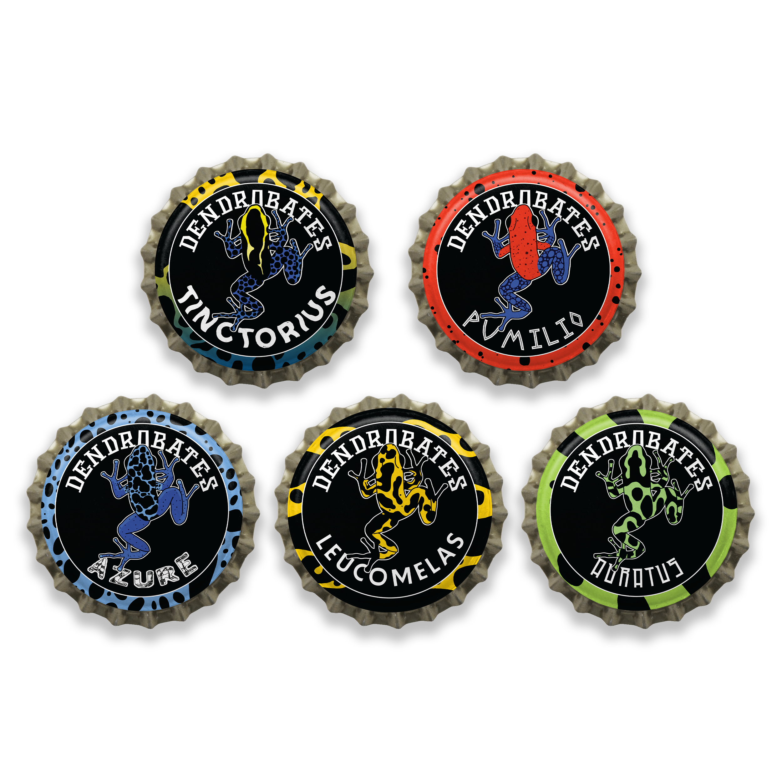
Dendrobates Bottle Cap Mockup
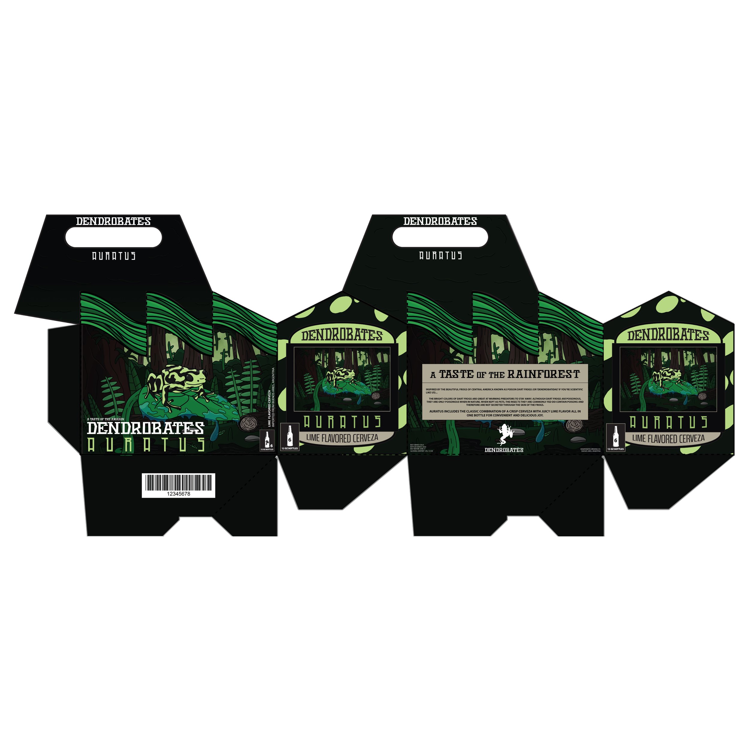
Dendrobates 6-Pack Packaging (Auratus)
PROCESS WORK
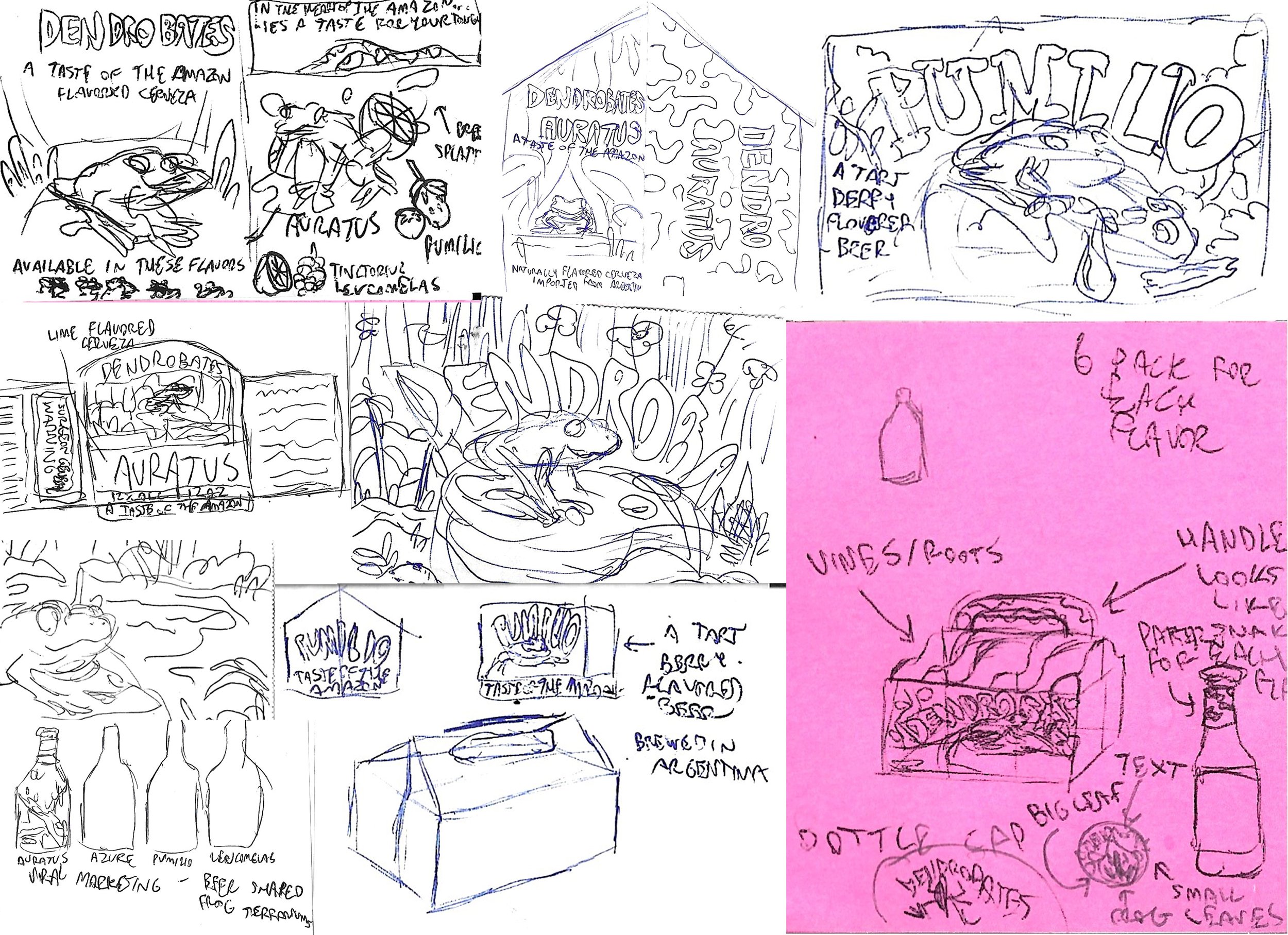
Illustration and Packaging Sketches
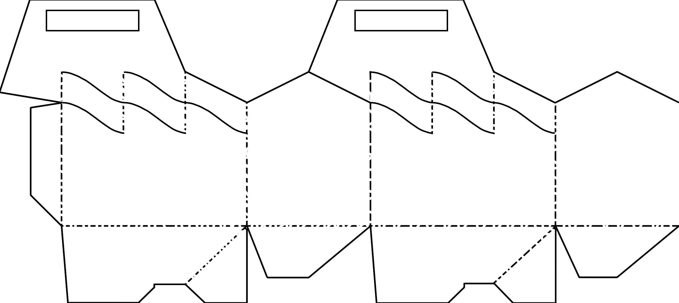
6 Pack Die Cut Rough Drawing
Digital Illustration For 6 Pack Packaging
6 Pack Front Design
6 Pack Back Design
6 Pack Side Design

Pattern Made For Various Design Pieces
Neck Label Design
Bottle Cap Design
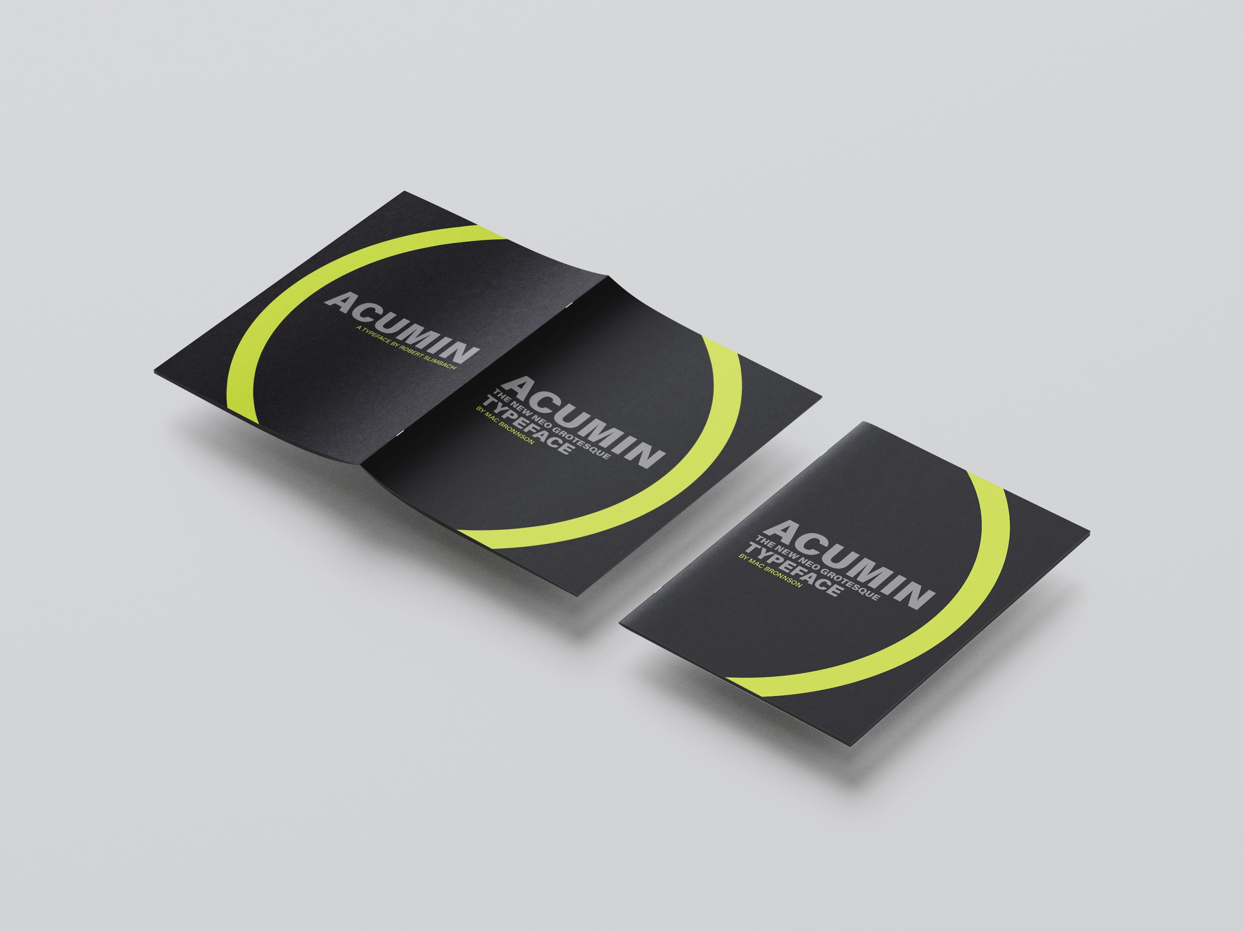
Cover System
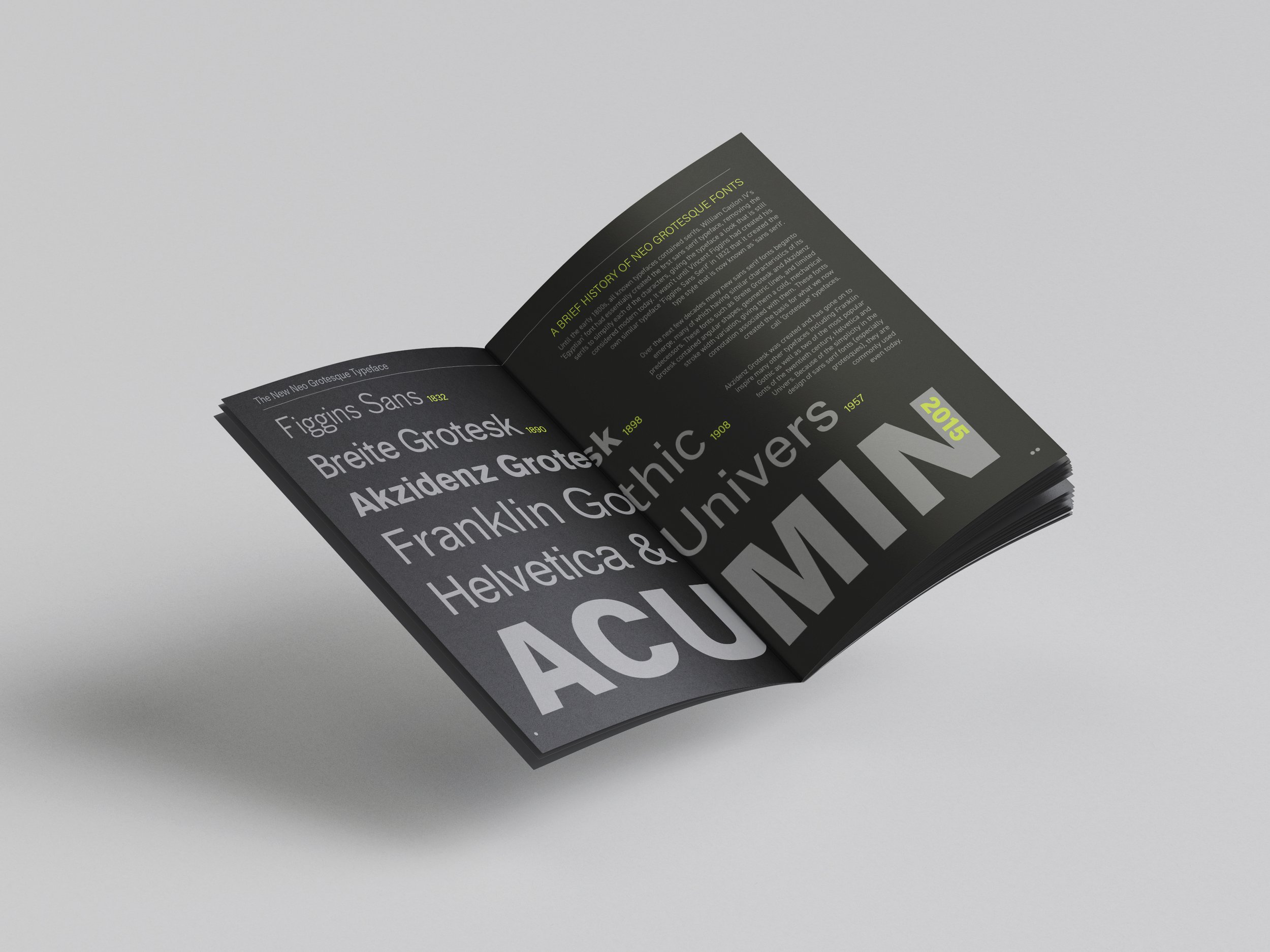
Spread 1
Spread 2
Spread 3
Spread 4
Spread 5
Front Cover

Spread 1

Spread 2

Spread 3

Spread 4
Spread 5
Back Cover
Moodboard
Rough Sketch 1
Rough Sketch 2
Revised Sketch
Final Sketch
Spread 1 Digital Draft 1
Spread 2 Digital Draft 1
Front Cover Digital Draft 1
Spread 3 Digital Draft 1
Spread 4 Digital Draft 1
Spread 5 Digital Draft 1

Back Cover Digital Draft 1

Front Cover Digitized Draft 2
Spread 1 Digitized Draft 2
Spread 2 Digitized Draft 2
Spread 3 Digitized Draft 2
Spread 4 Digitized Draft 2

Spread 5 Digitized Draft 2

Back Cover Digitized Draft 2
PROCESS WORK
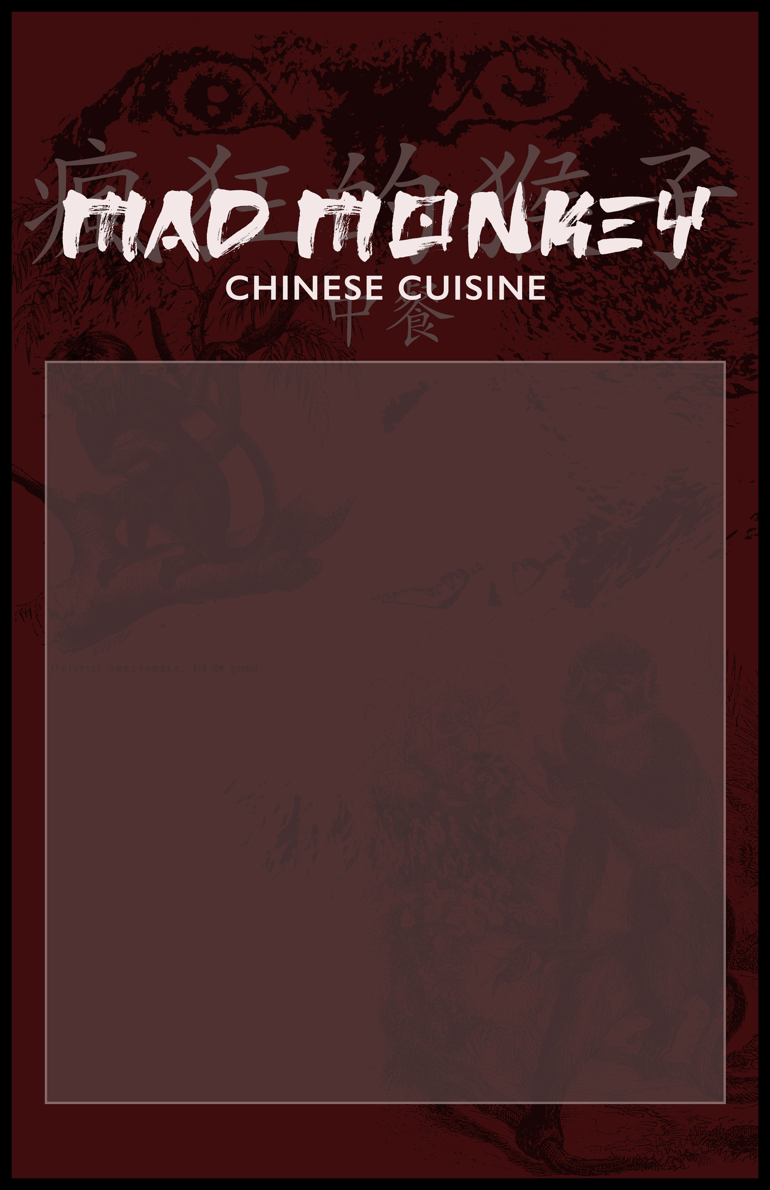
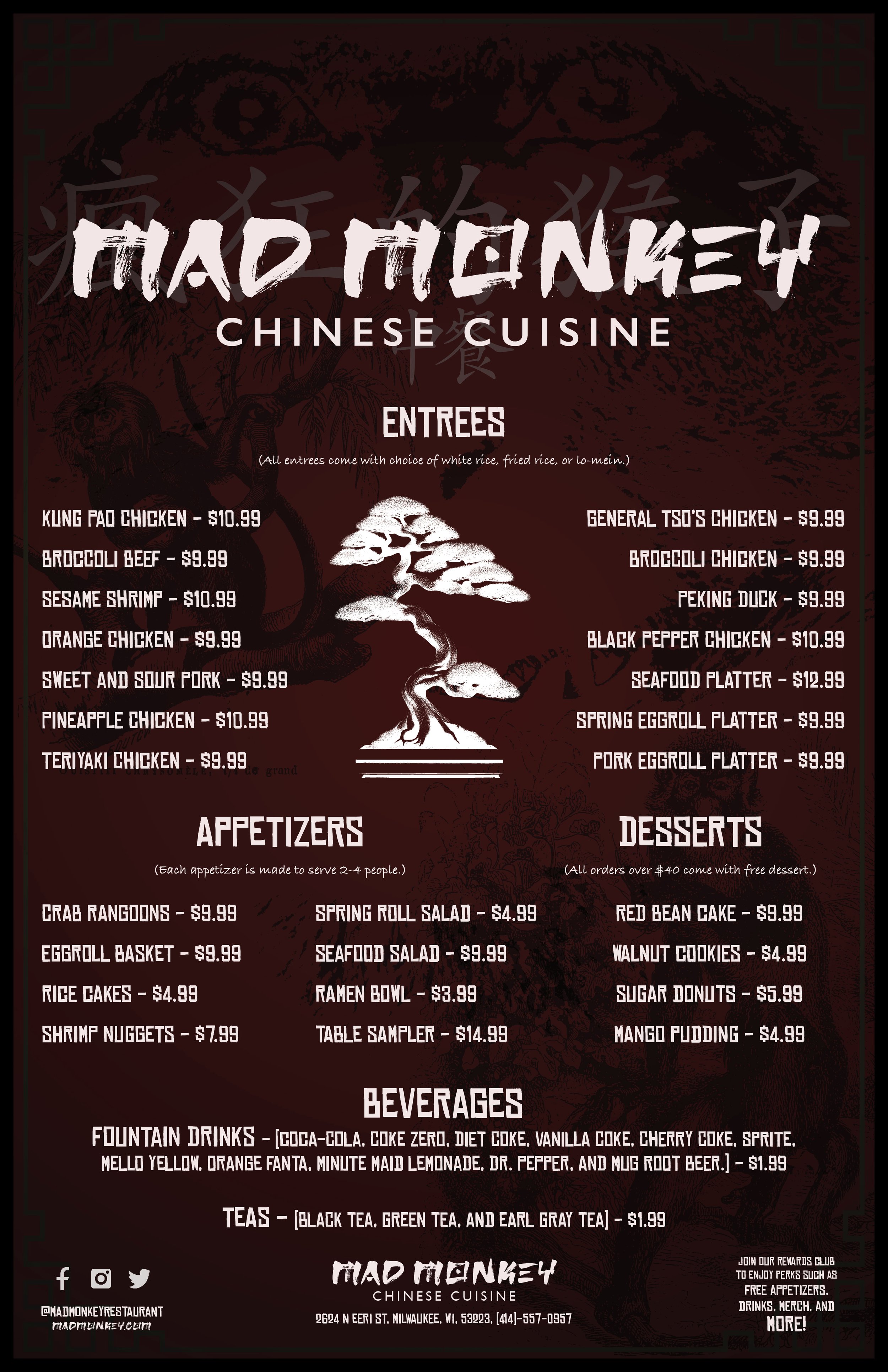
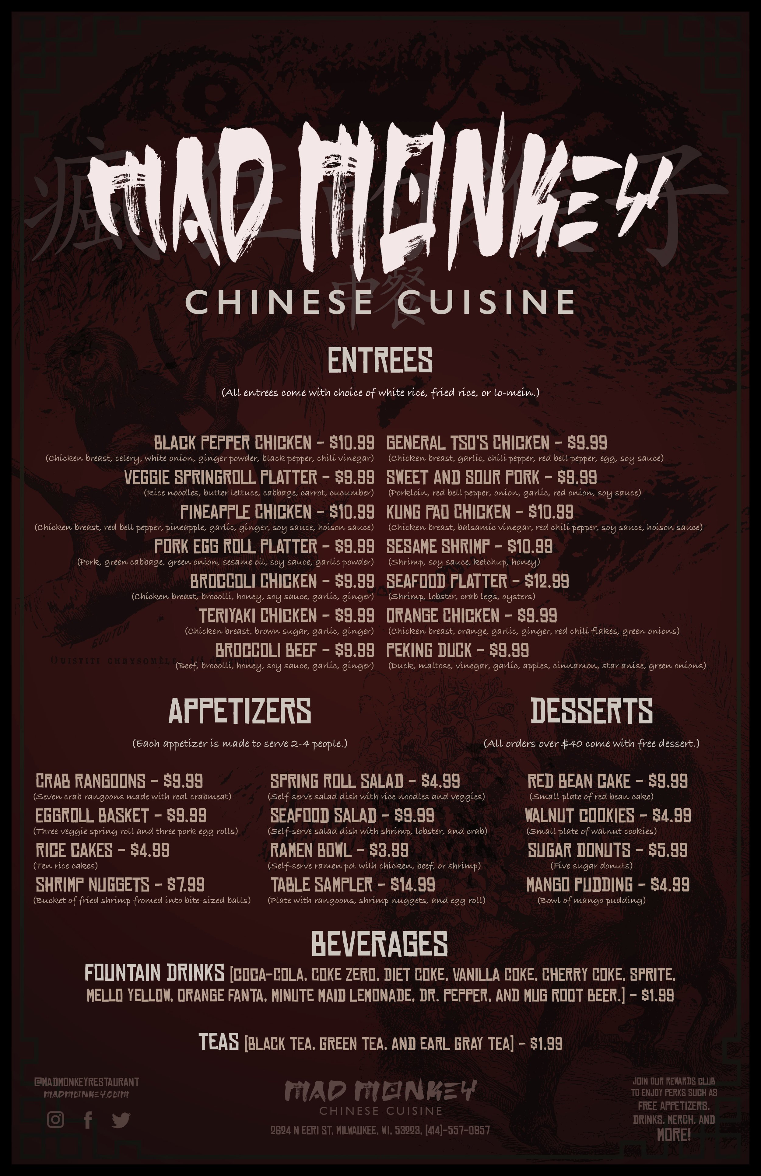
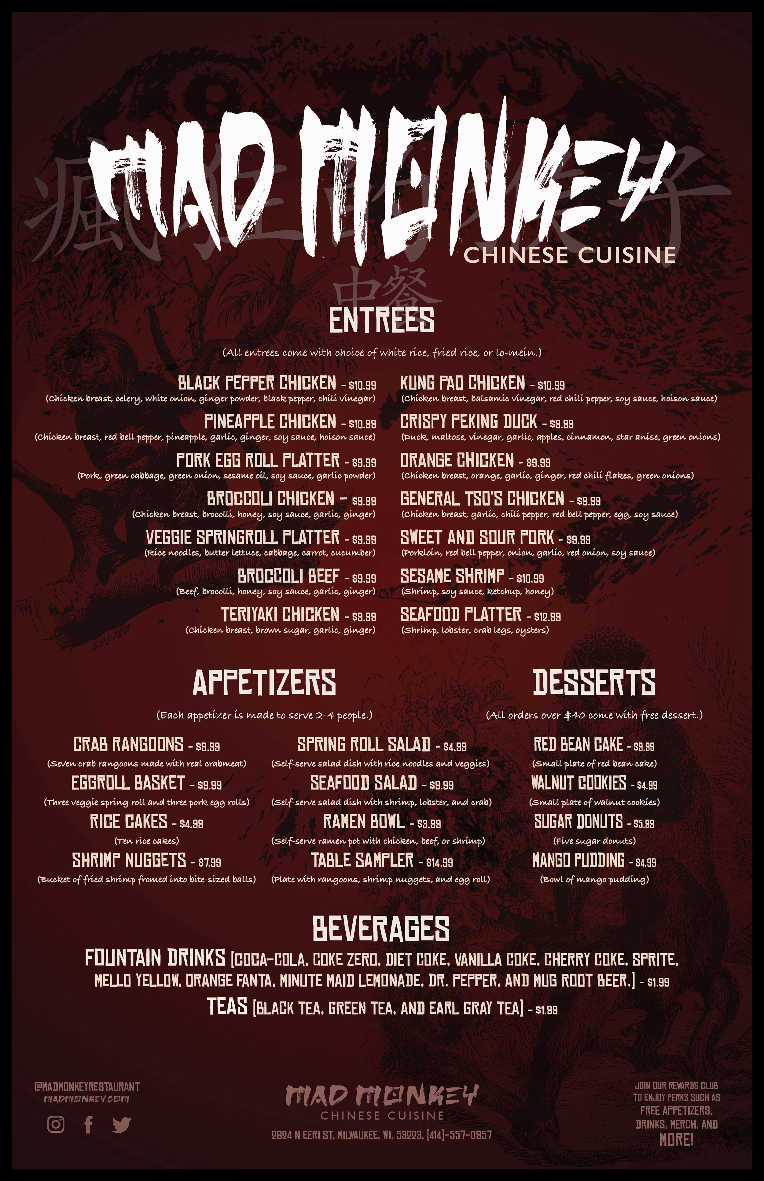
MAD MONKEY CHINESE CUISINE MENU
(SCHOOL PROJECT)
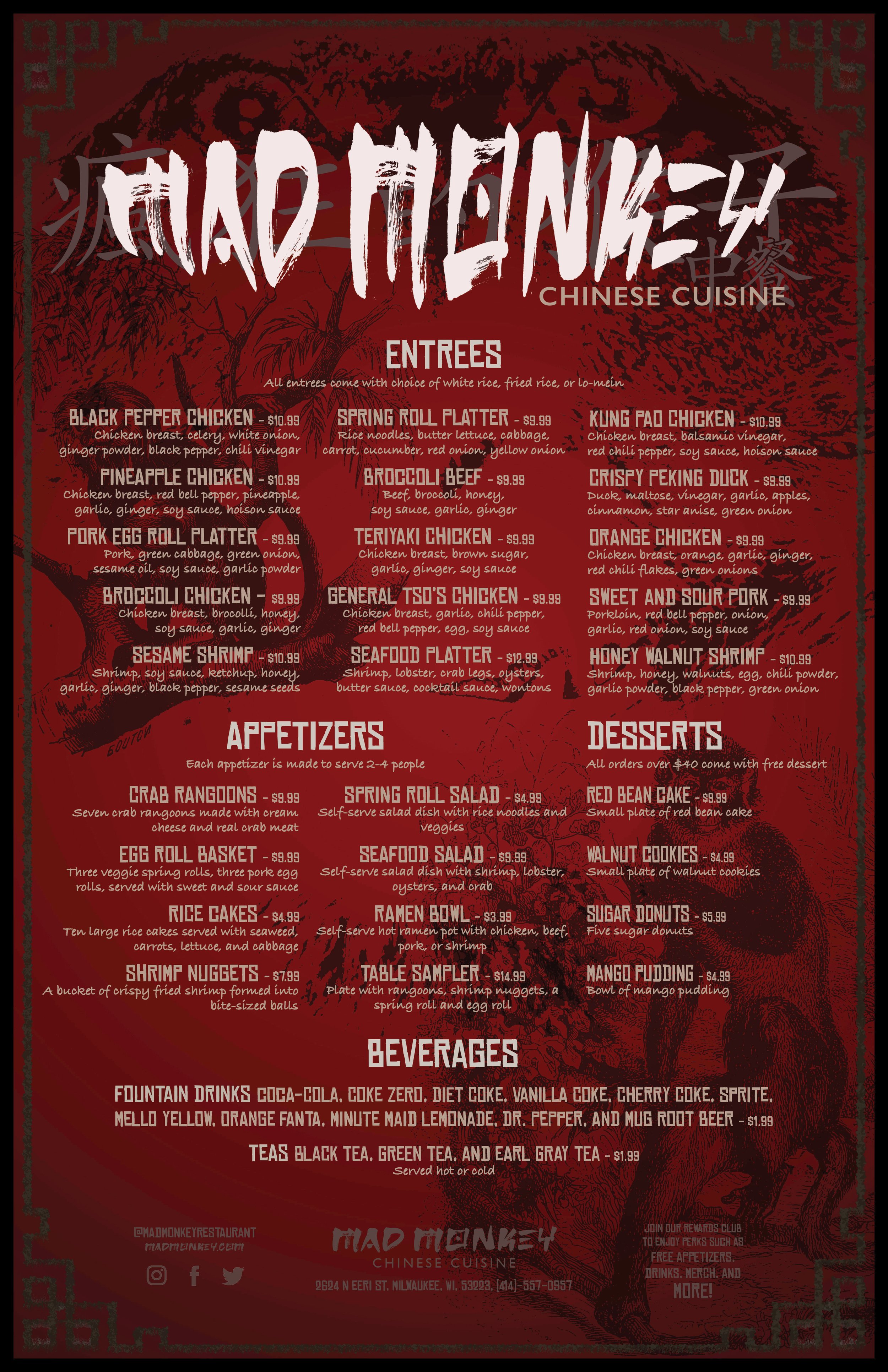
Mad Monkey Chinese Cuisine is another fictional brand that was created from a combination of names and restaurant types that were arranged on a list. This was a project for my Typography 2 class at Milwaukee Institute of Art and Design and my task was to create a menu that was typography-based with 7+ levels of hierarchy.
The process began with creating a mood board to reference throughout the project, pairing fonts and making a hierarchal system layout, gathering information related to menu items, and creating a layout to structure the piece. We then had to choose a material to print on and print our final design. Key elements of the piece were readability, structure, and the ability to skim freely.
Graphical elements were created in Illustrator, images were edited in Photoshop, and the final product was laid out in InDesign.

Mad Monkey Chinese Cuisine Restaurant Menu (Digital)
Mad Monkey Chinese Cuisine Restaurant Menu (Edit for print)
PROCESS WORK
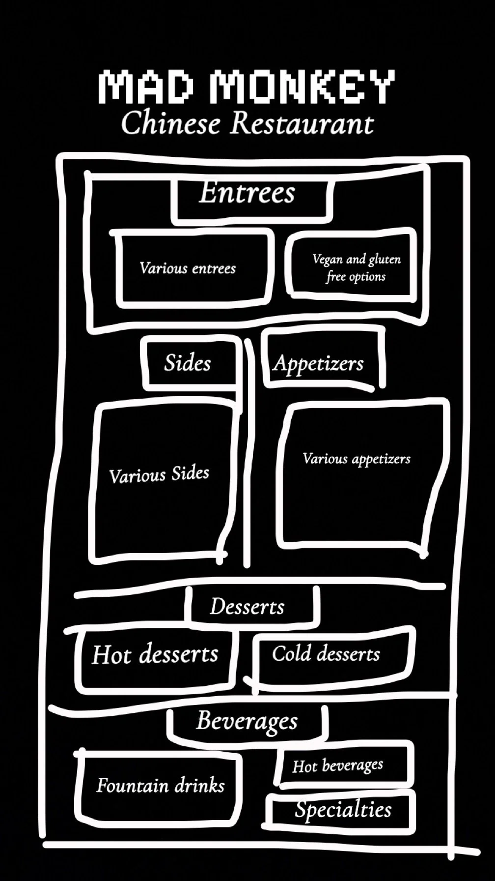
Moodboard
Type Hierarchy Slide 1
Type Hierarchy Slide 2
Type Hierarchy Slide 3
Type Hierarchy Slide 4

Menu Sketch 1
Menu Sketch 2
Menu Draft 1
Menu Draft 2
Menu Draft 3
Menu Draft 4
Menu Draft 5
Menu Final
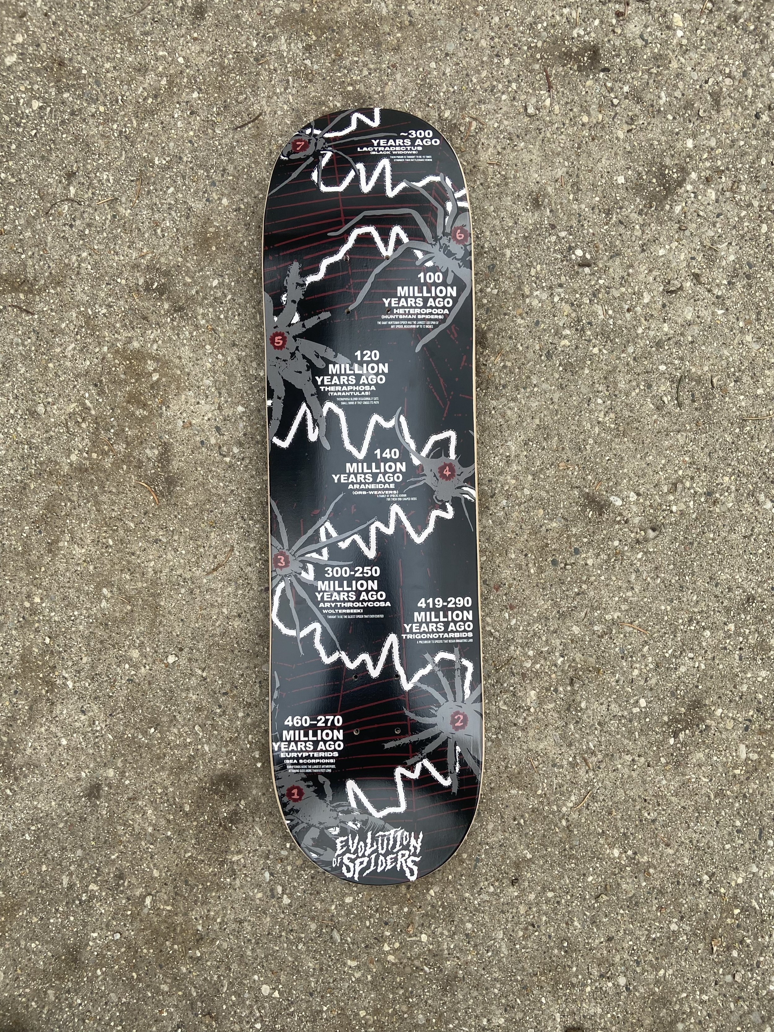
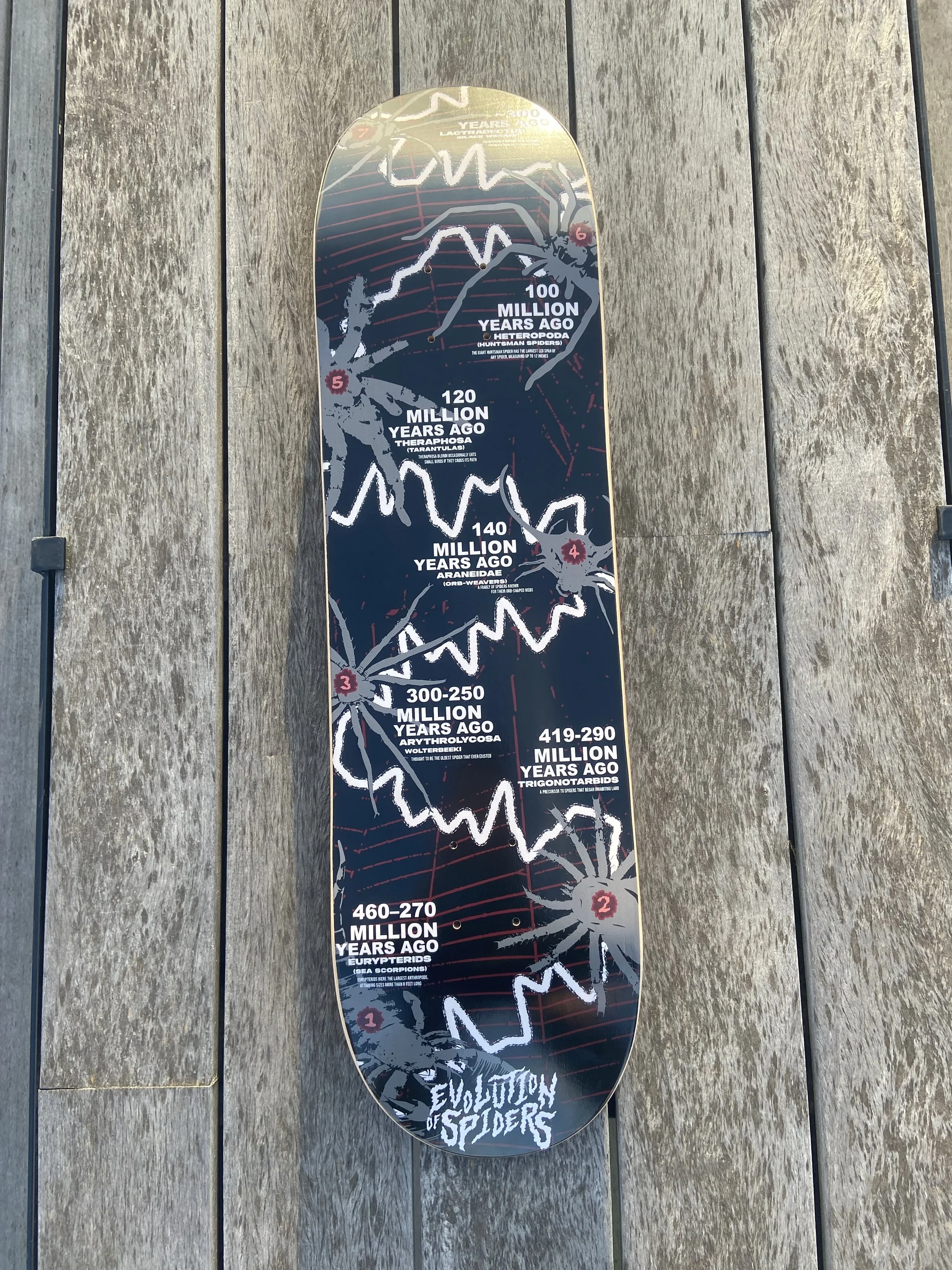
Evolution of spiders timeline
(SCHOOL PROJECT)
The goal of this project was to create a timeline that contained seven different datapoints for the Gen Z demographic. I decided to make my project on the evolution of spiders as a skate graphic.
The process began with collecting field data on a subject that we chose and I chose to keep track of how many spiders I would see in a day for a month. Ultimately we ended up not needing to use the data specifically but I wanted to continue with the subject with spiders while combining my other interests of skate graphics and zoology. This led to me doing research on various spider species and their origins so that I could create a timeline on spider evolution. I found plenty of images, treated them with stark contrast and vectorized them, and laid them out in timeline form using a web-like graphical element to express the timeline itself. I used a font I made by myself out of body wash for the numbering of datapoints and created a word mark logo for the project. I then had the skateboard desgin printed on an actual skateboard as a proof of concept and also went into a local skate shop to take pictures of it in a real life setting.
All images were edited in Photoshop and vectorized in Illustrator. All graphical elements including the logo, timeline web, and datapoint symbols were created in Illustrator, and the remaining text and composition were laid out in InDesign.
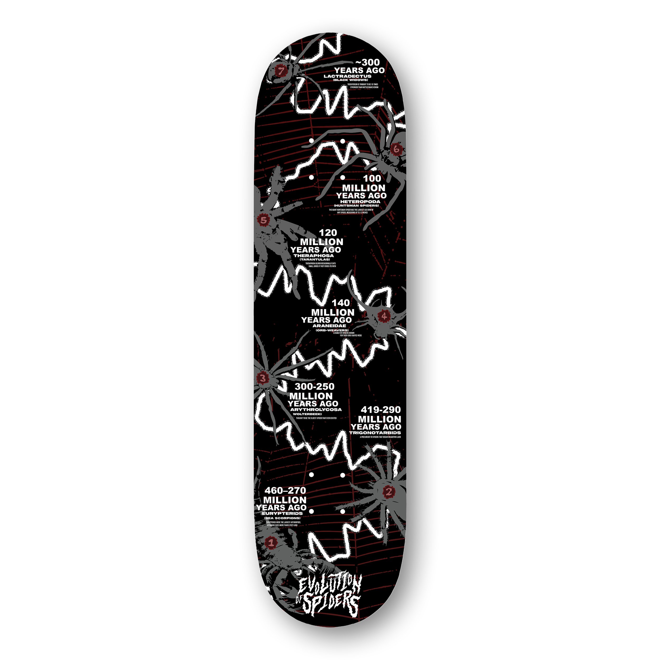
Evolution of Spiders Timeline (Skateboard Graphic) for Gen Z Demographic
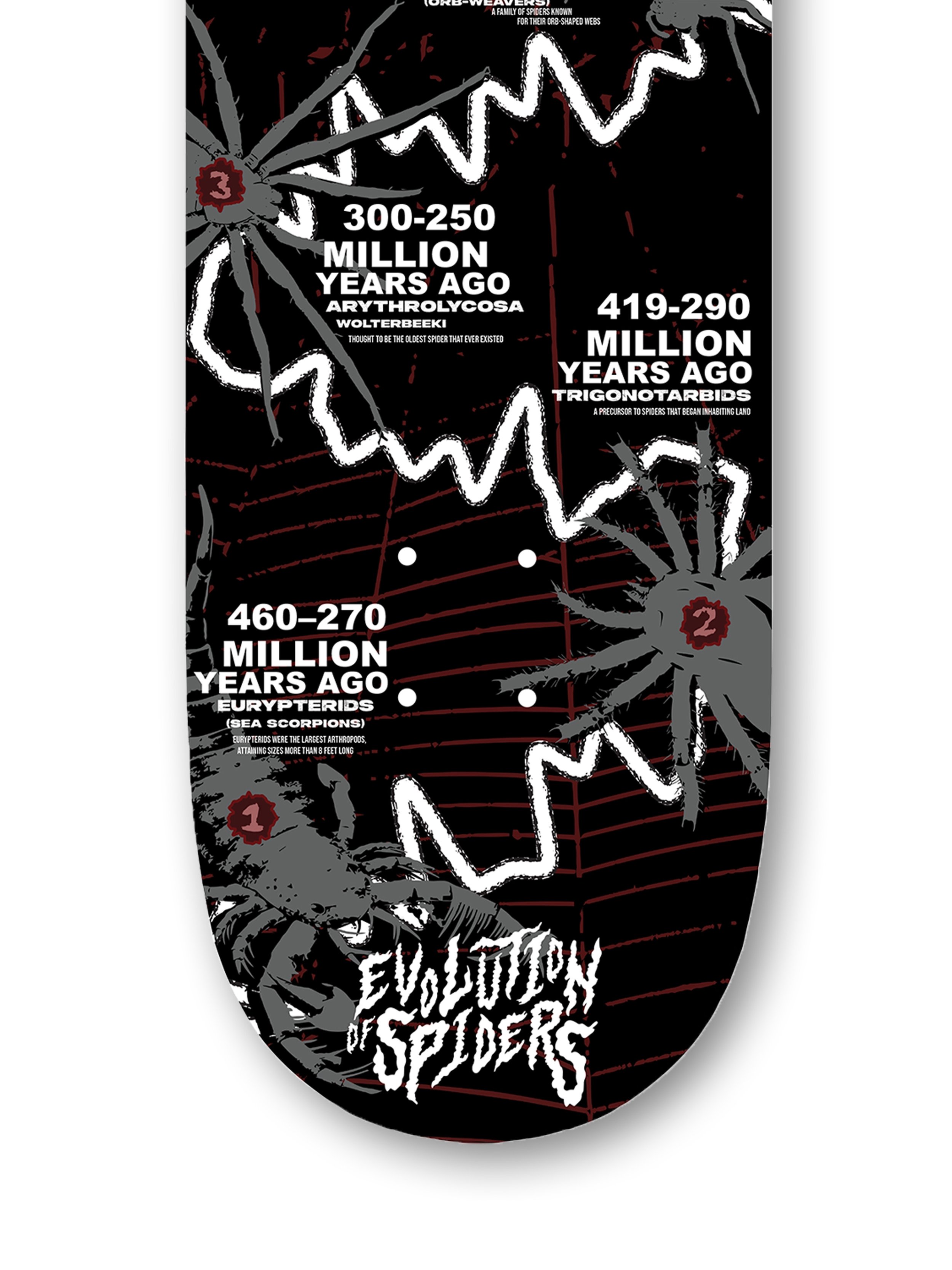
Bottom Half Close Up View
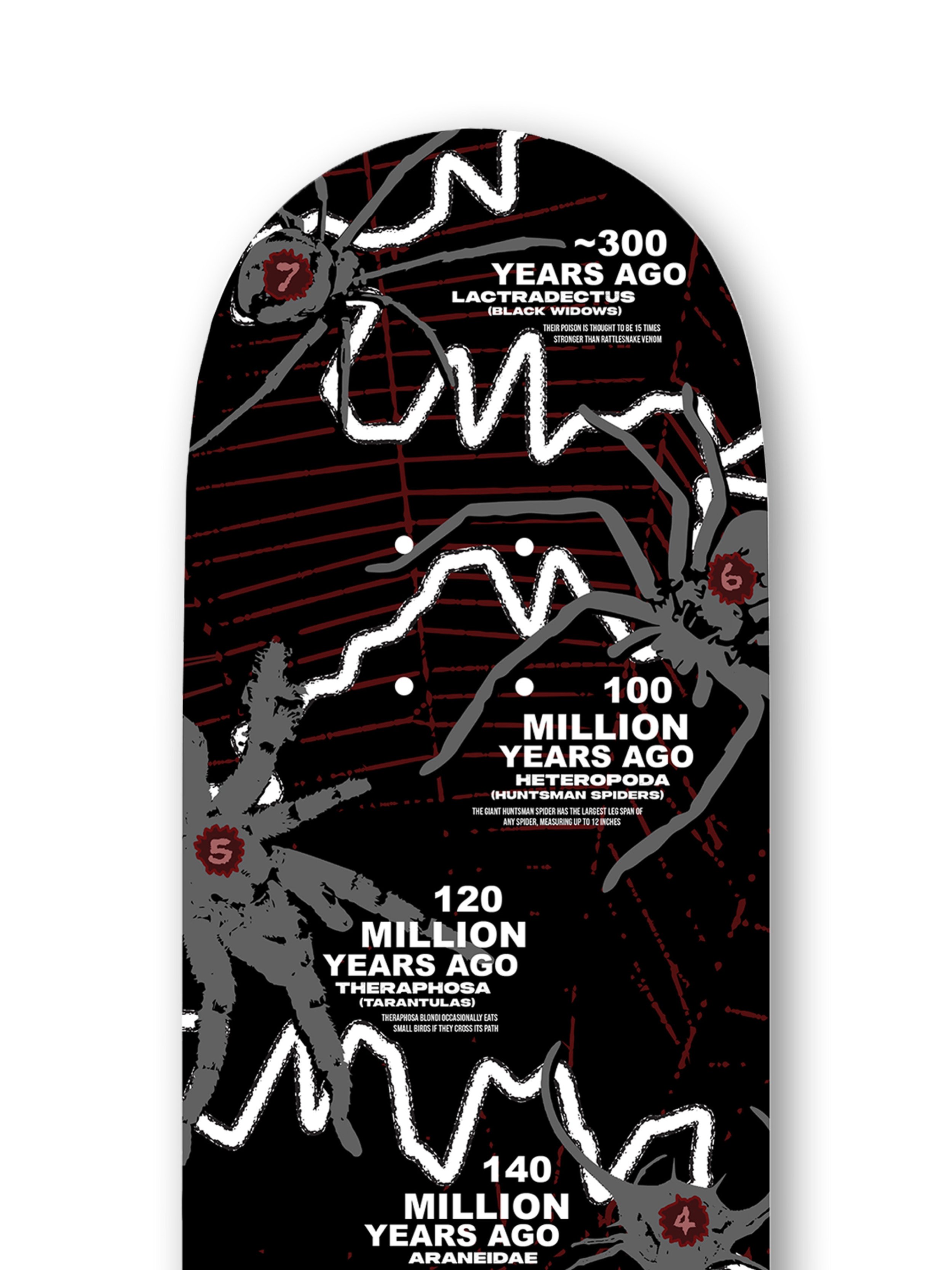
Top Half Close Up View
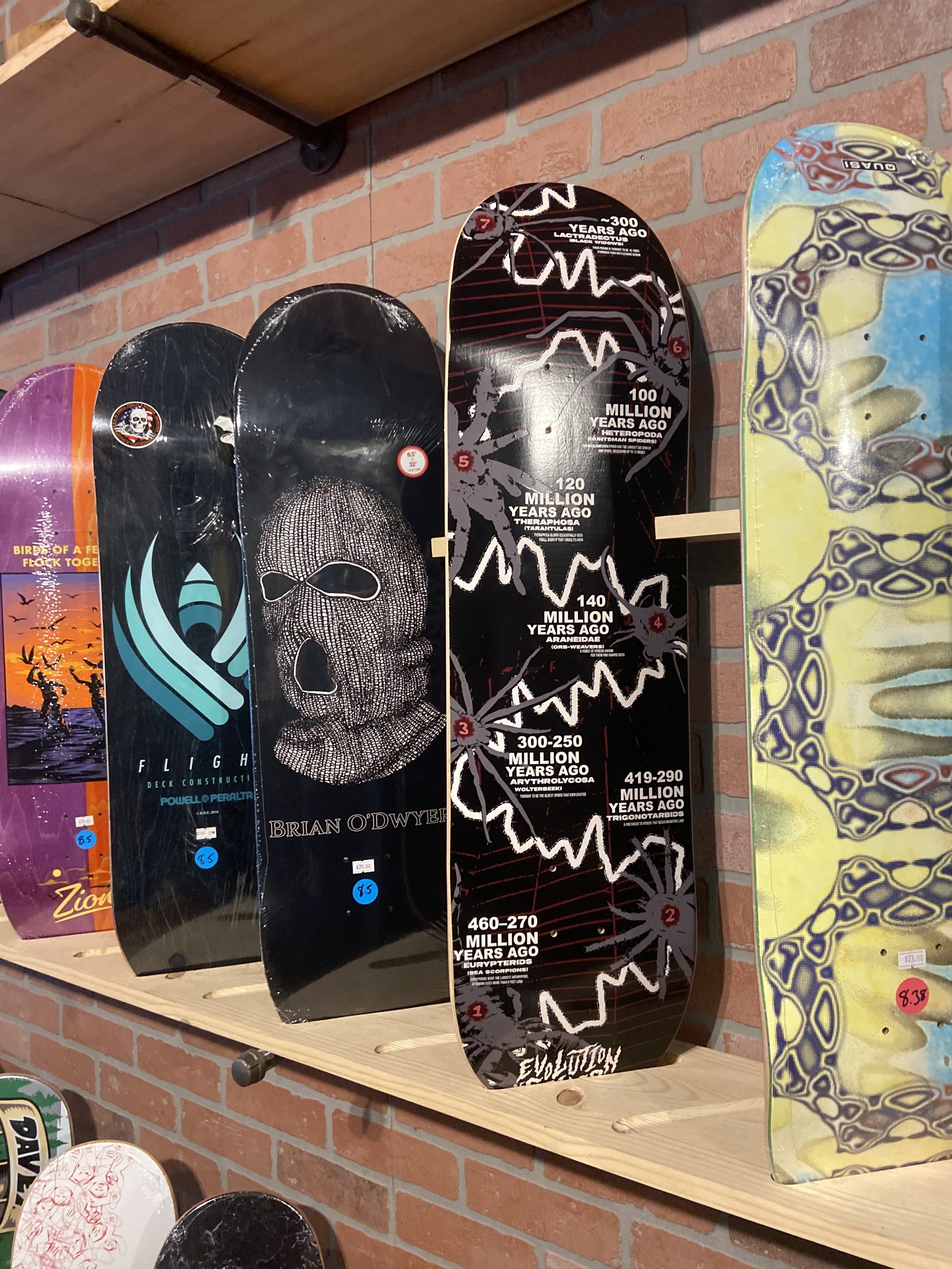
Physical Printed Board Showcased in Transaction Skate Shop, West Allis, WI
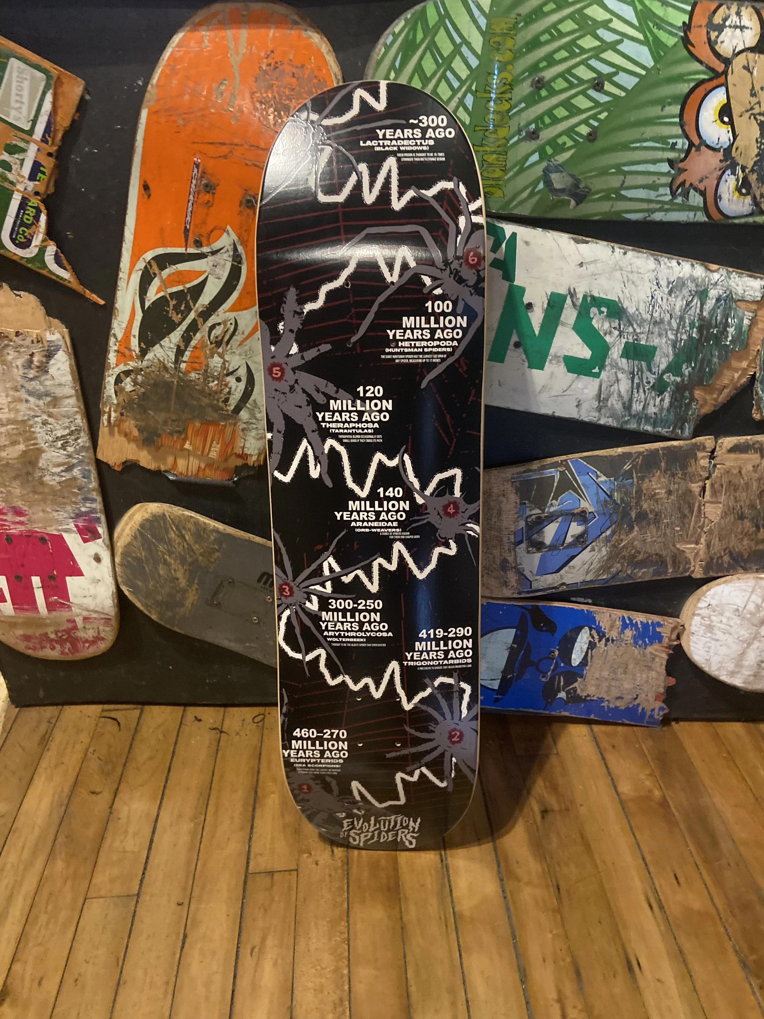
Physical Printed Board Showcased in Transaction Skate Shop, West Allis, WI
Physical Board Design Image
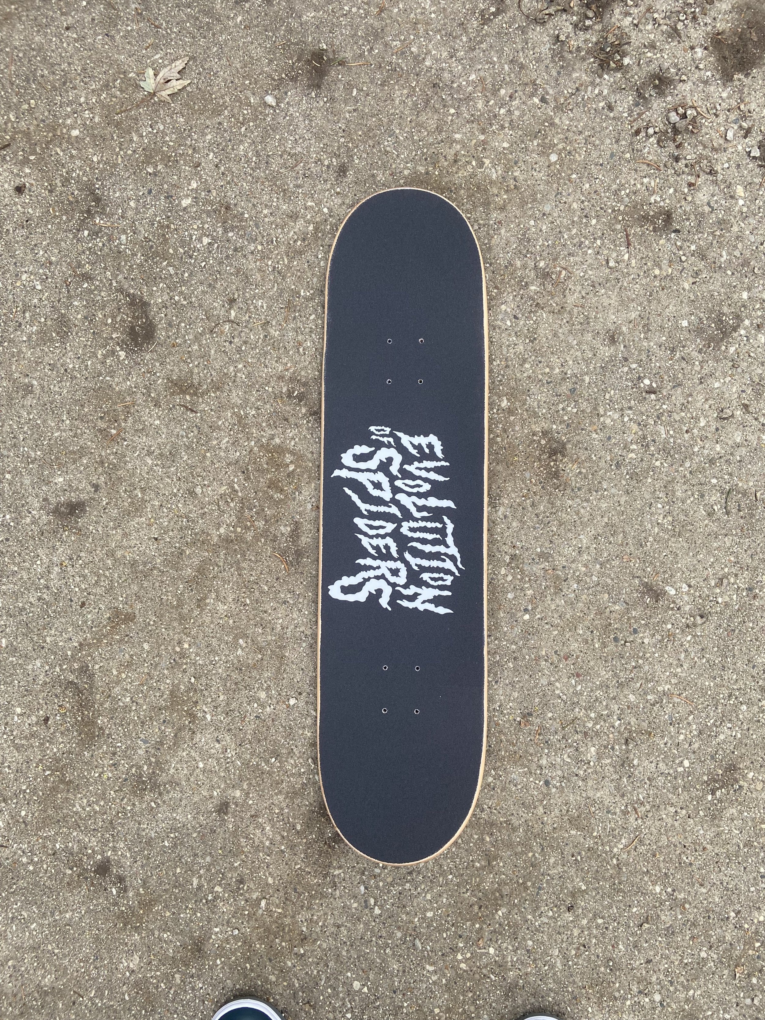
Physical Board Custom Grip Tape Image
2nd Physical Board Design Image
PROCESS WORK
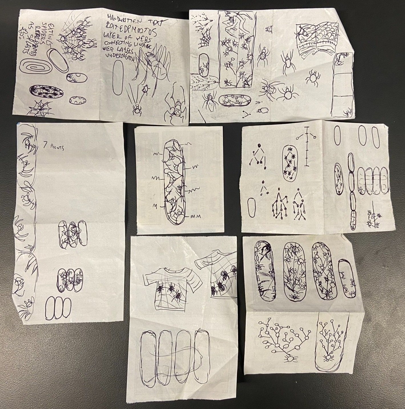
Initial Sketches
Examples of possible layouts for skateboard design
Draft 1
Draft 2
Evolution of Spiders Logo
Draft 3
Draft 4

Draft 5
Final Draft
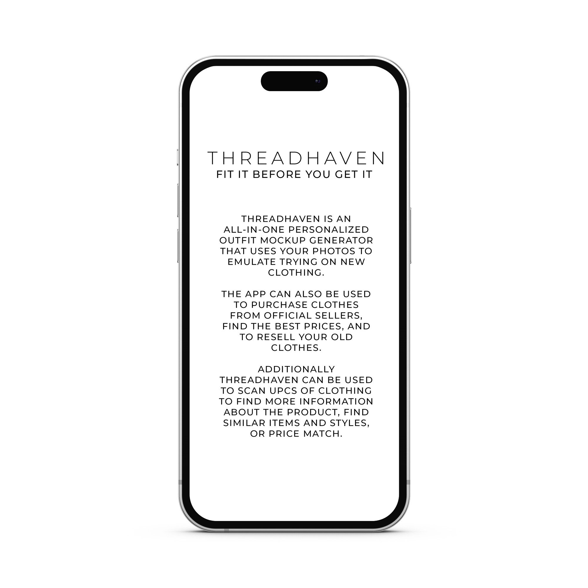
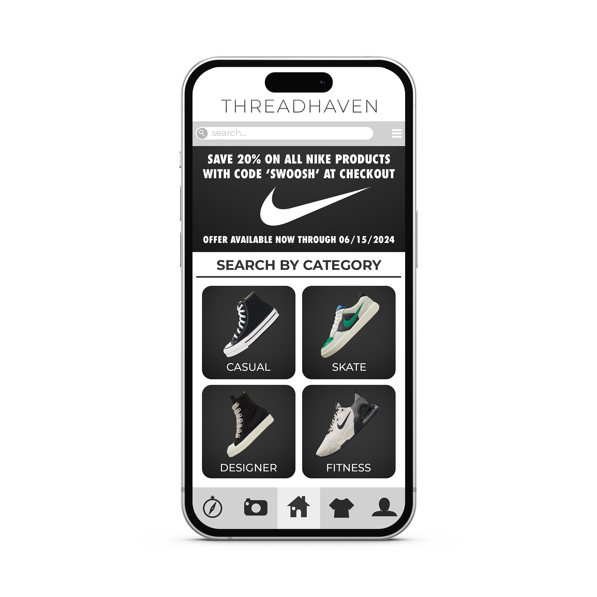
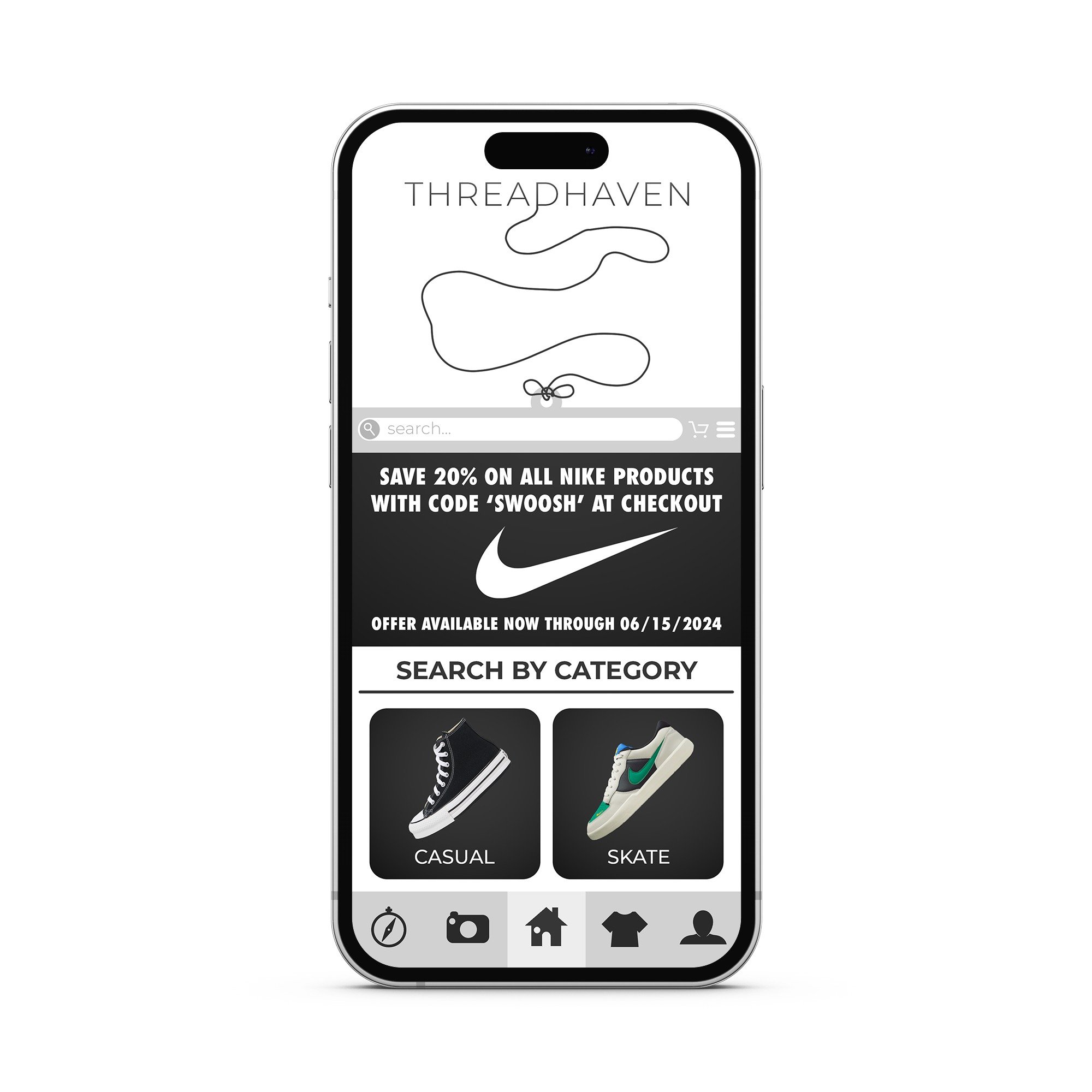
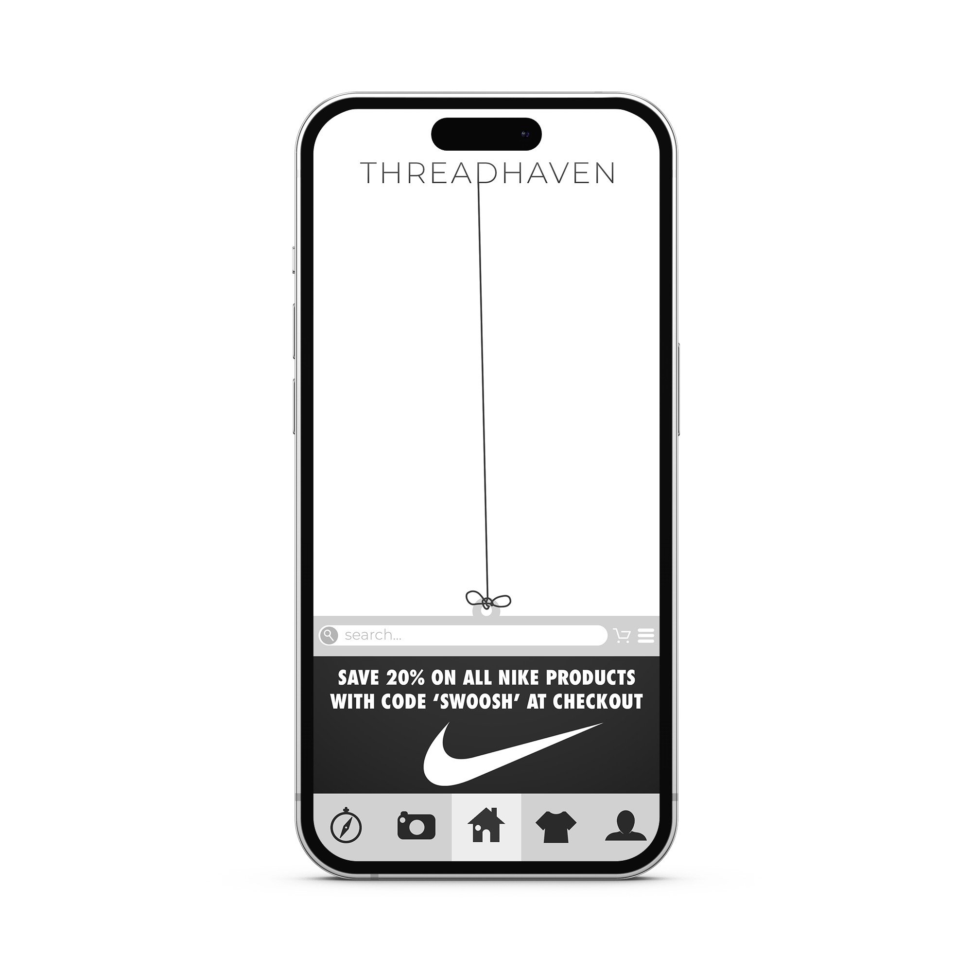
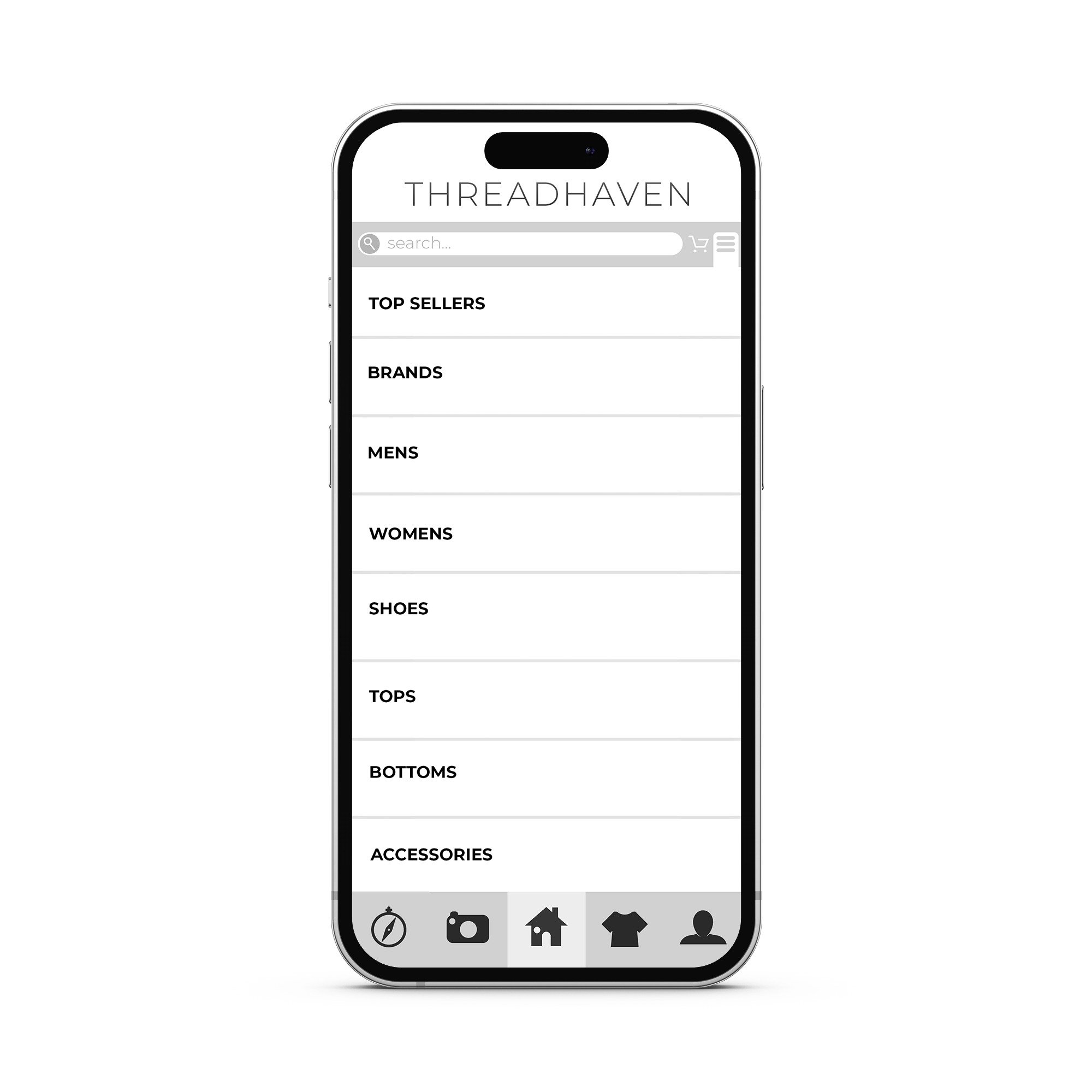
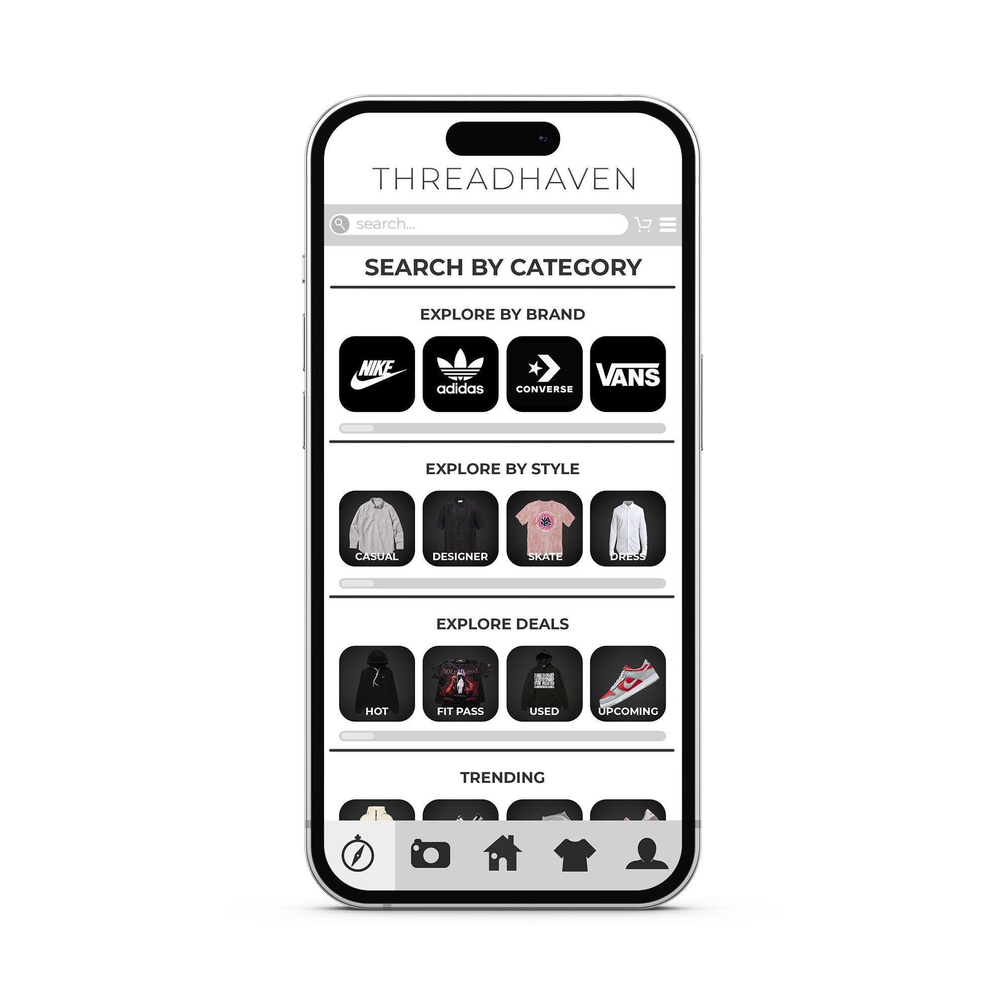
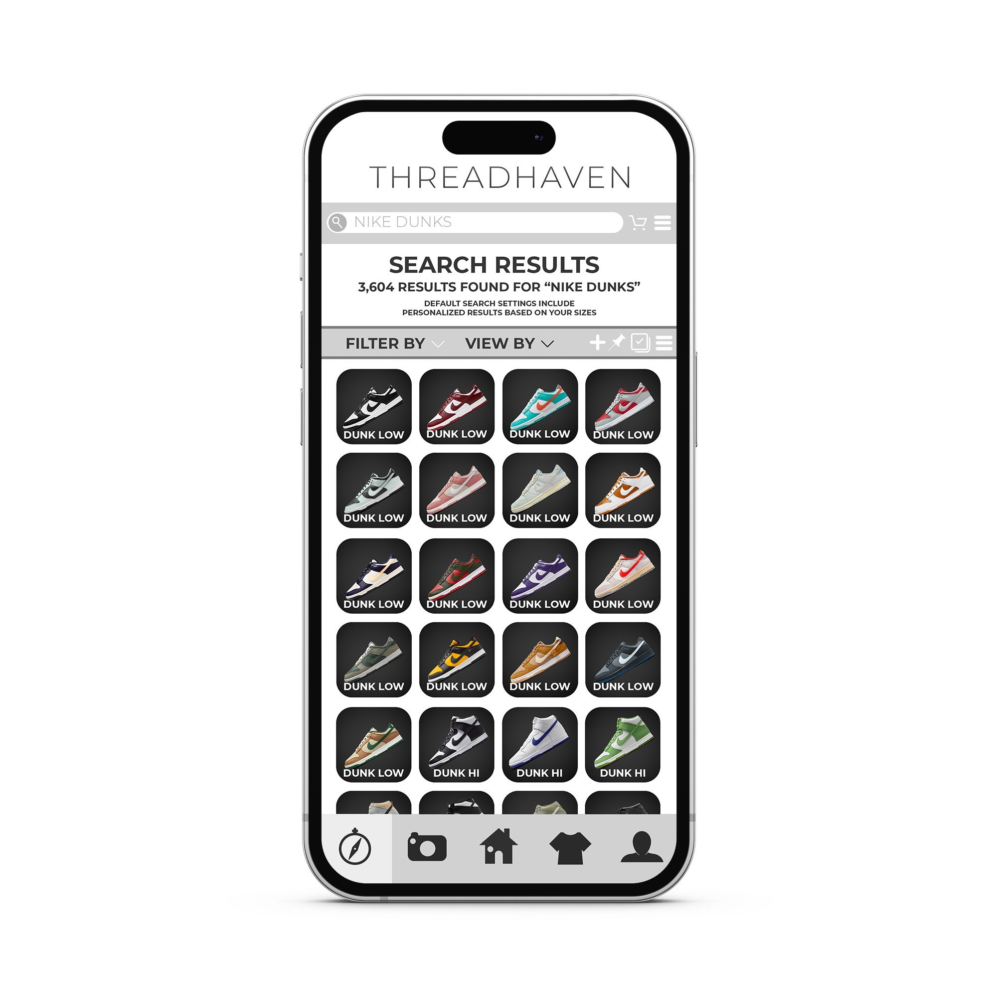
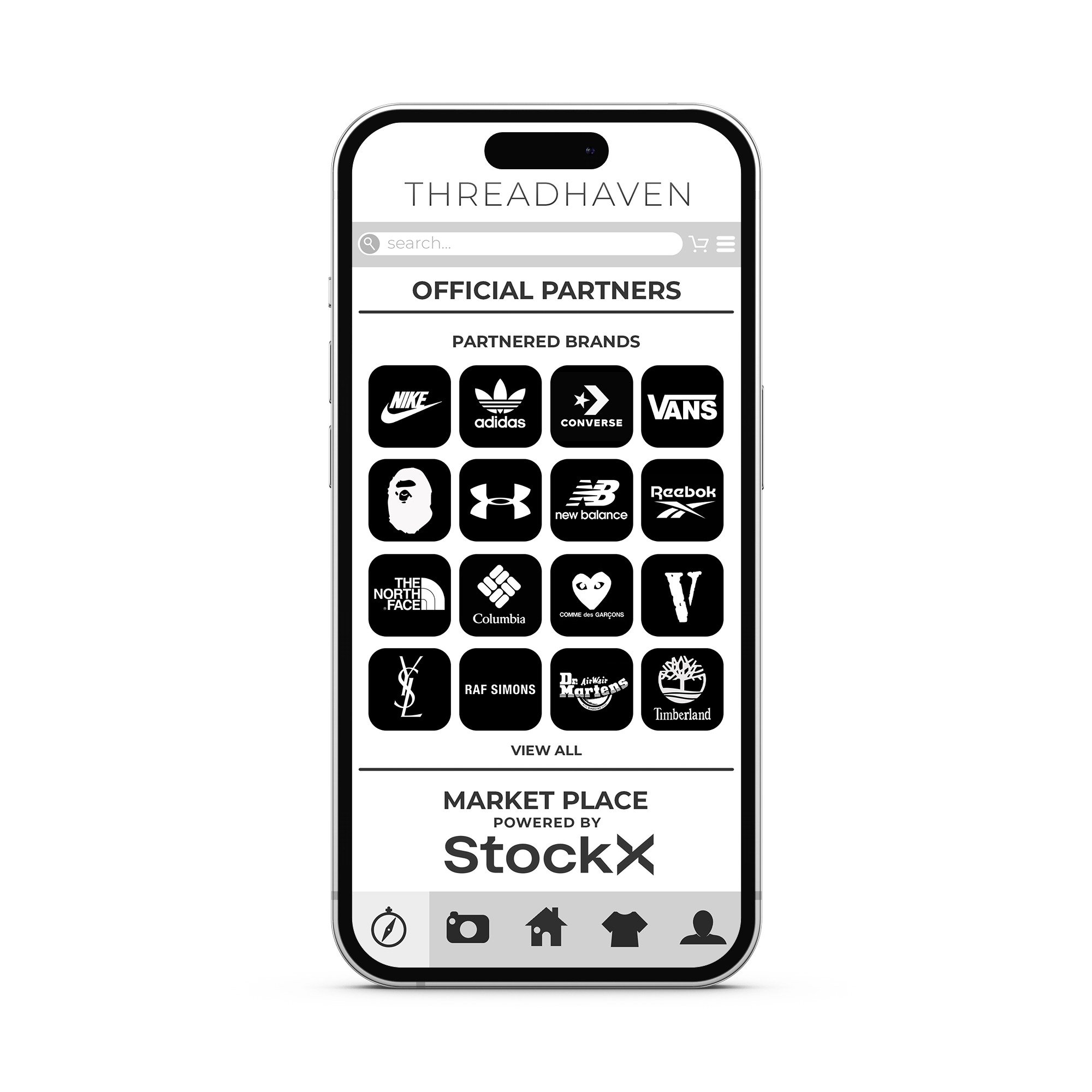
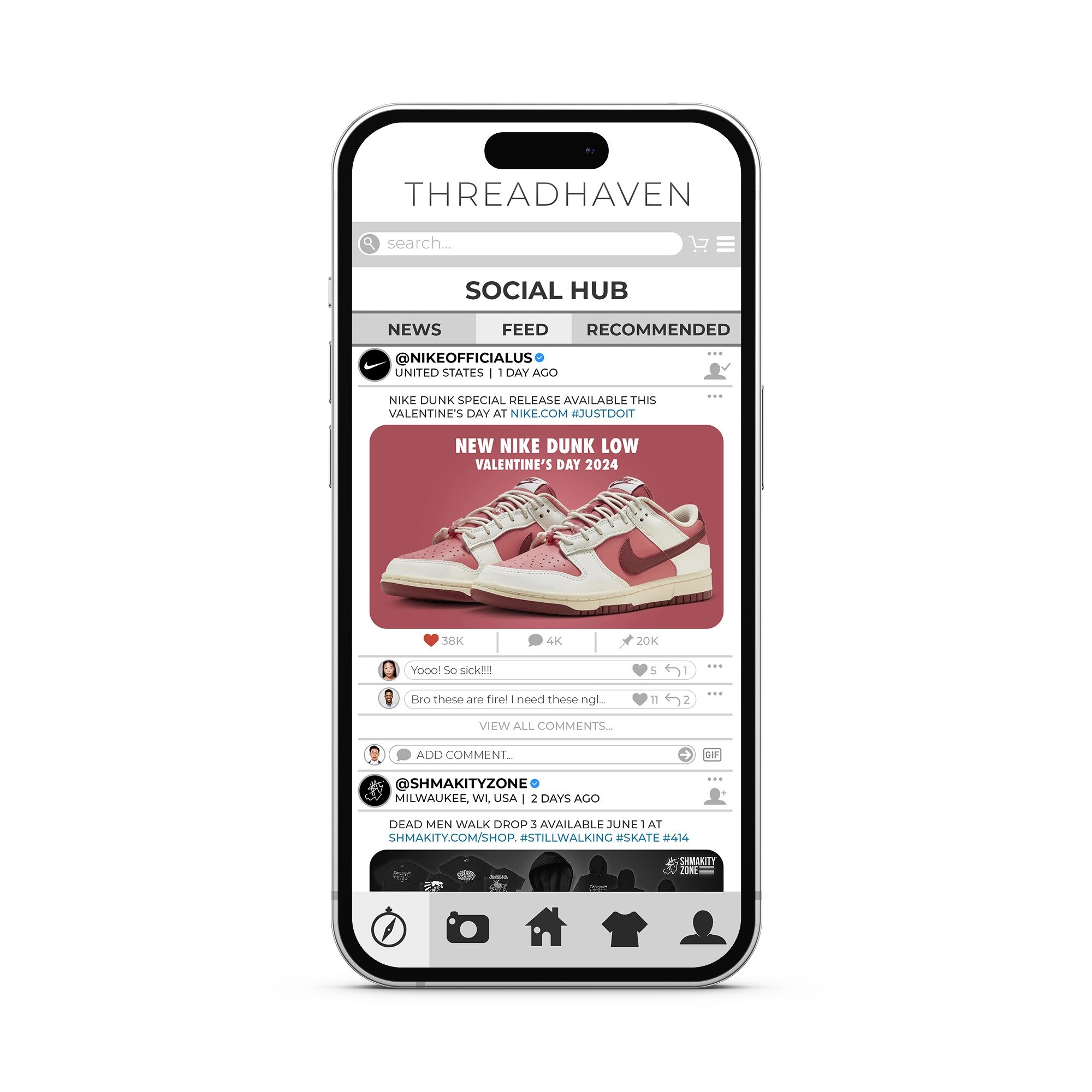
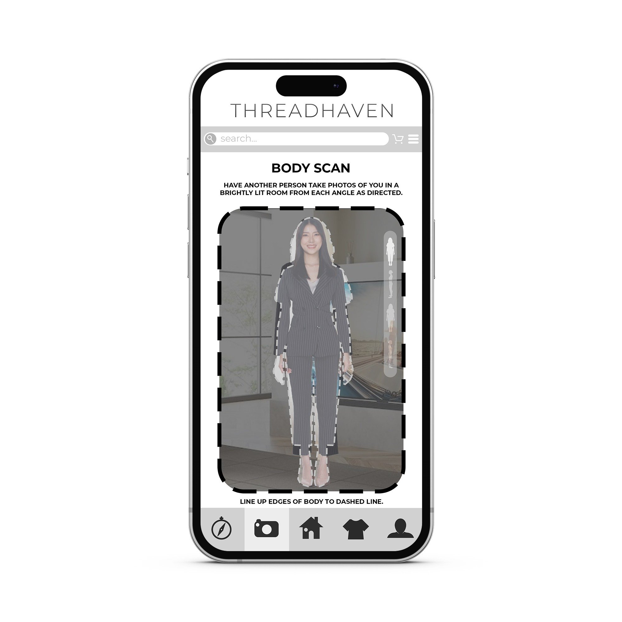
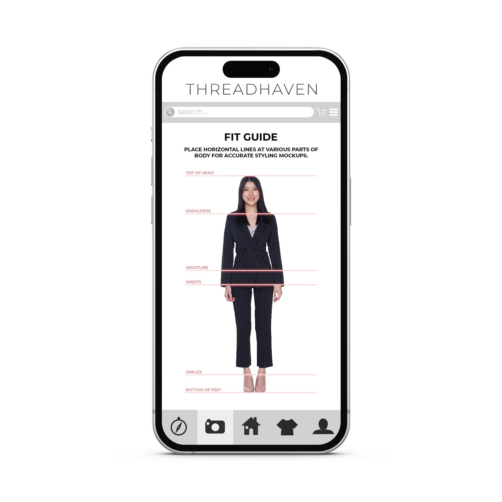
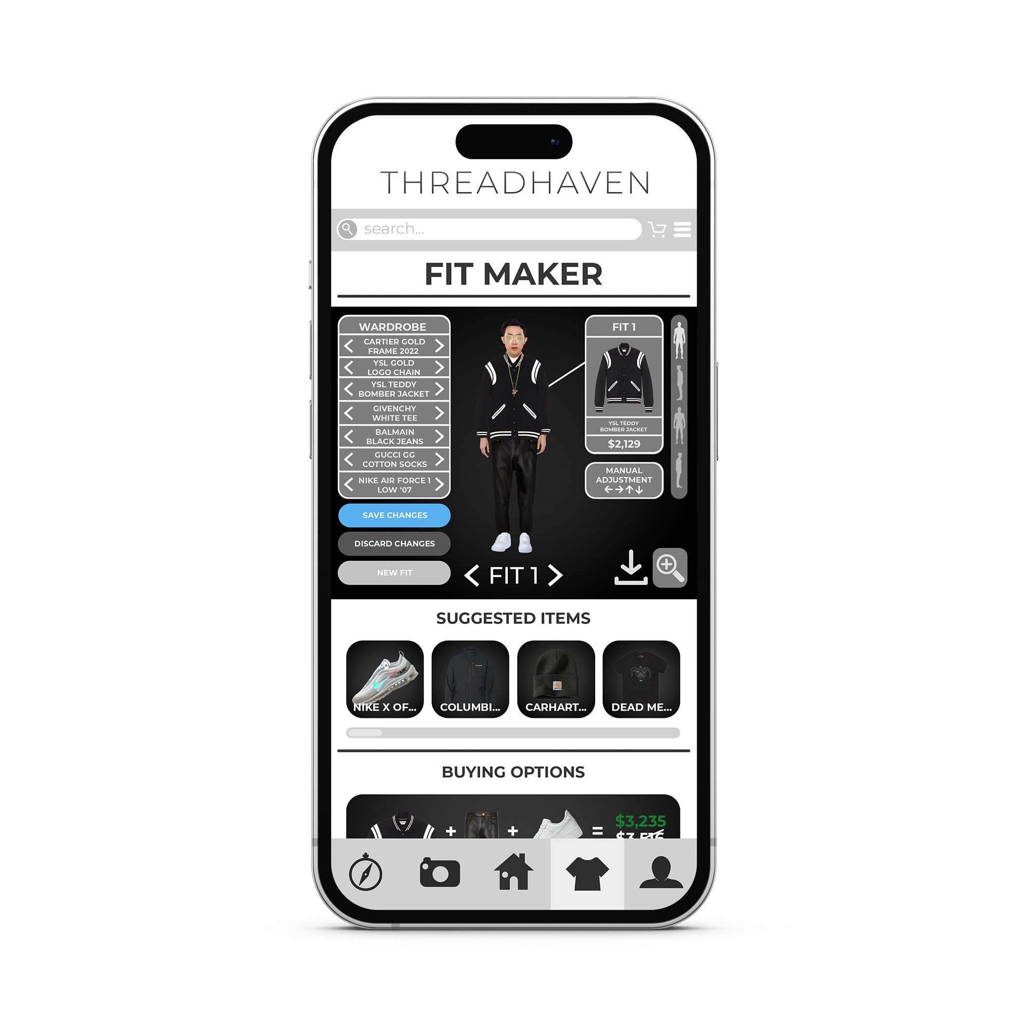
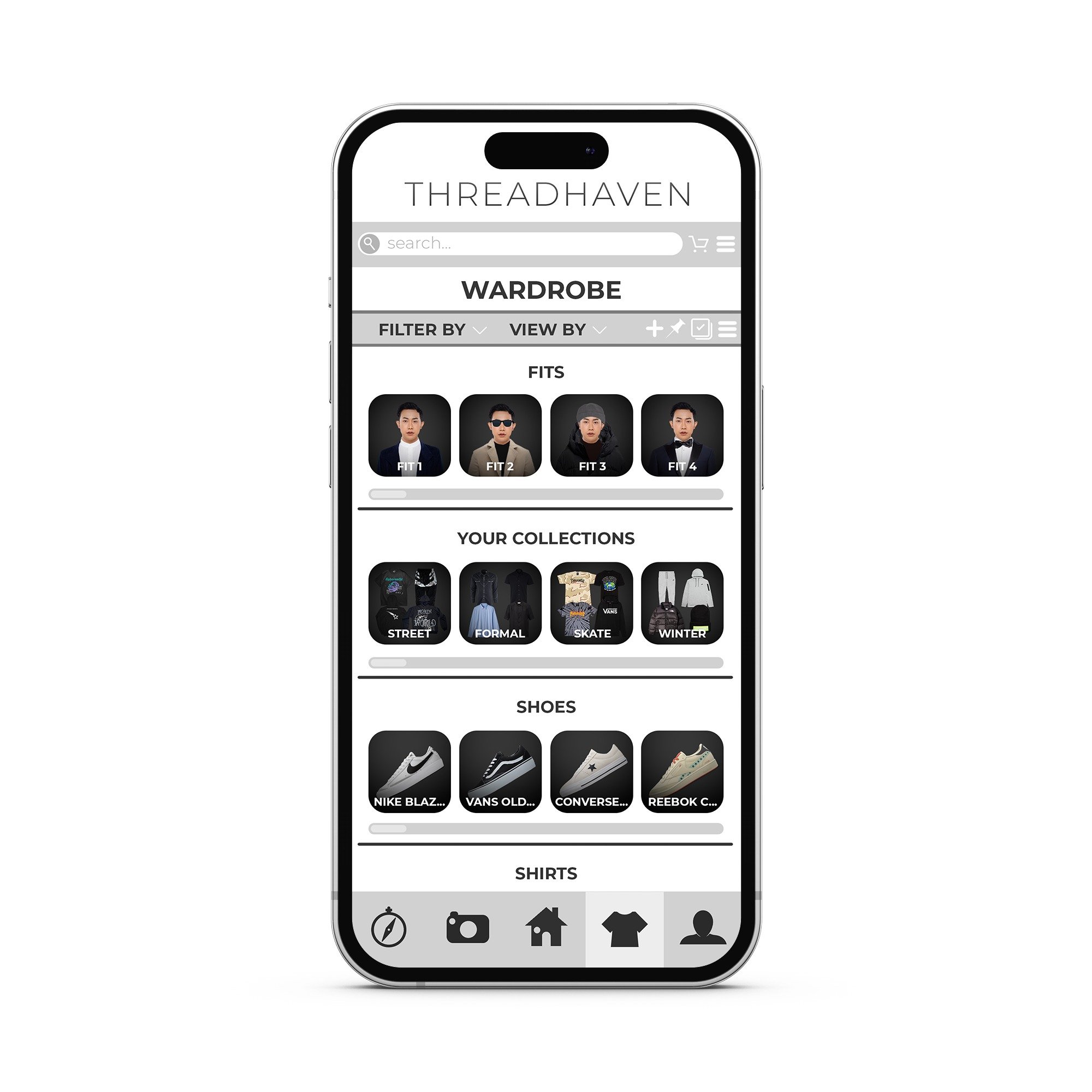
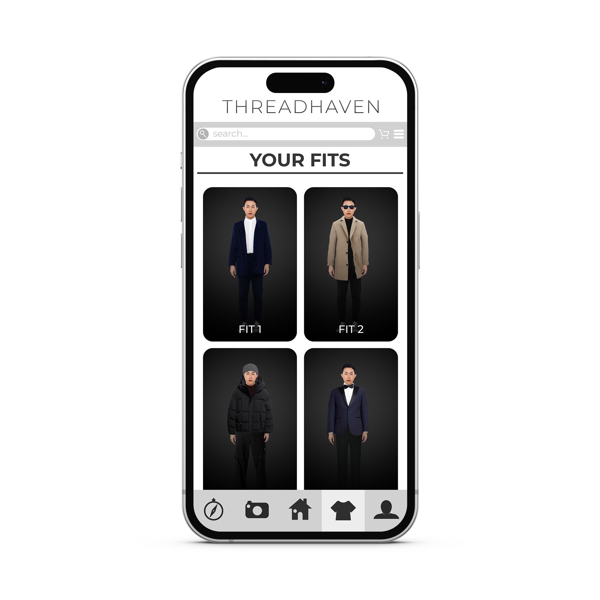
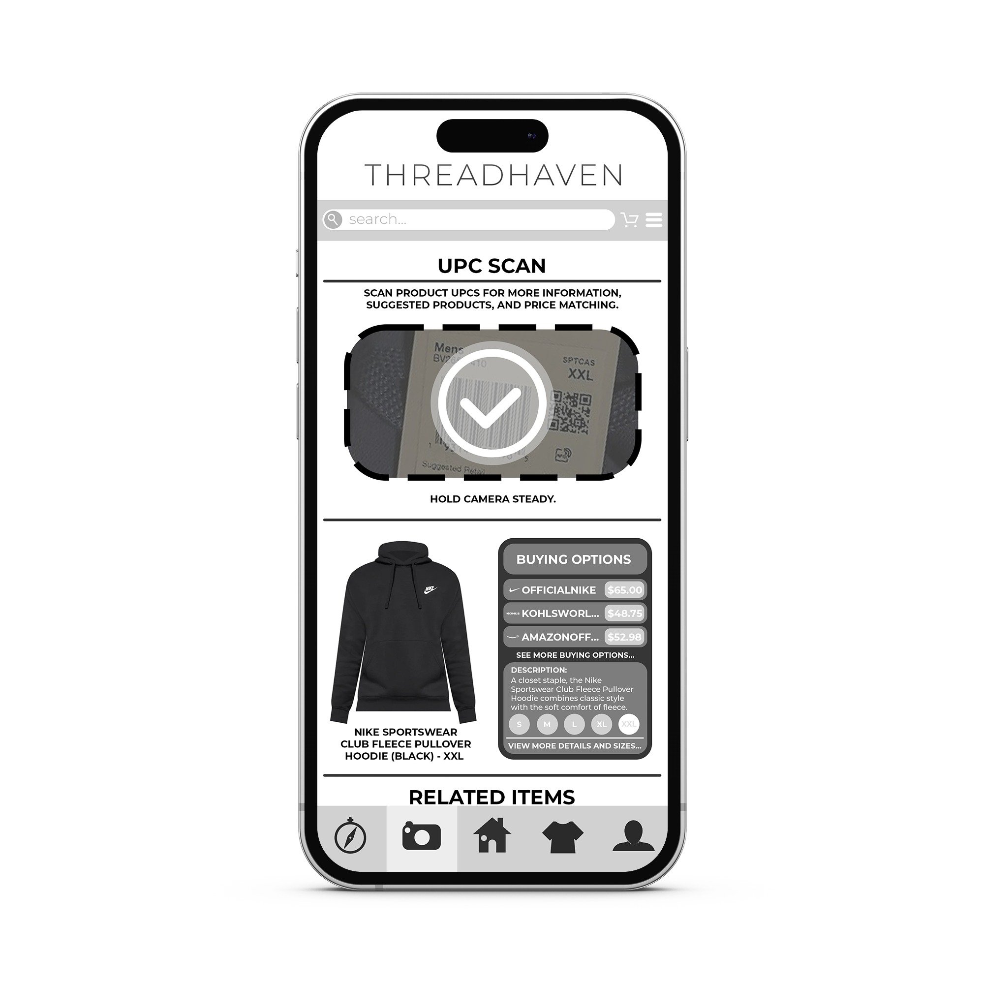
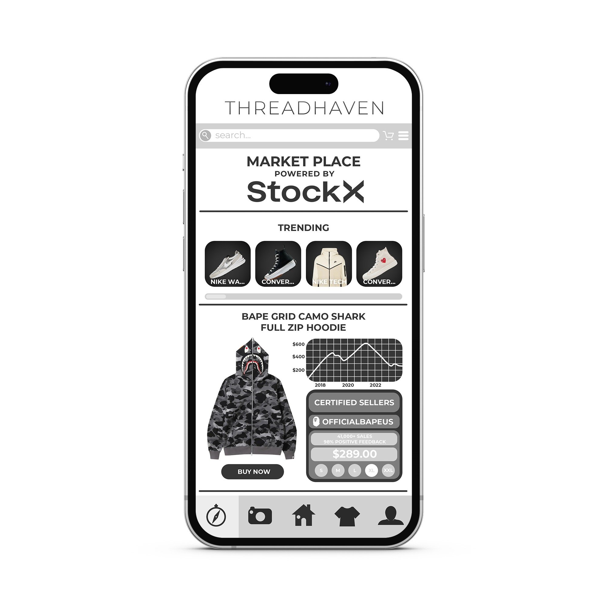
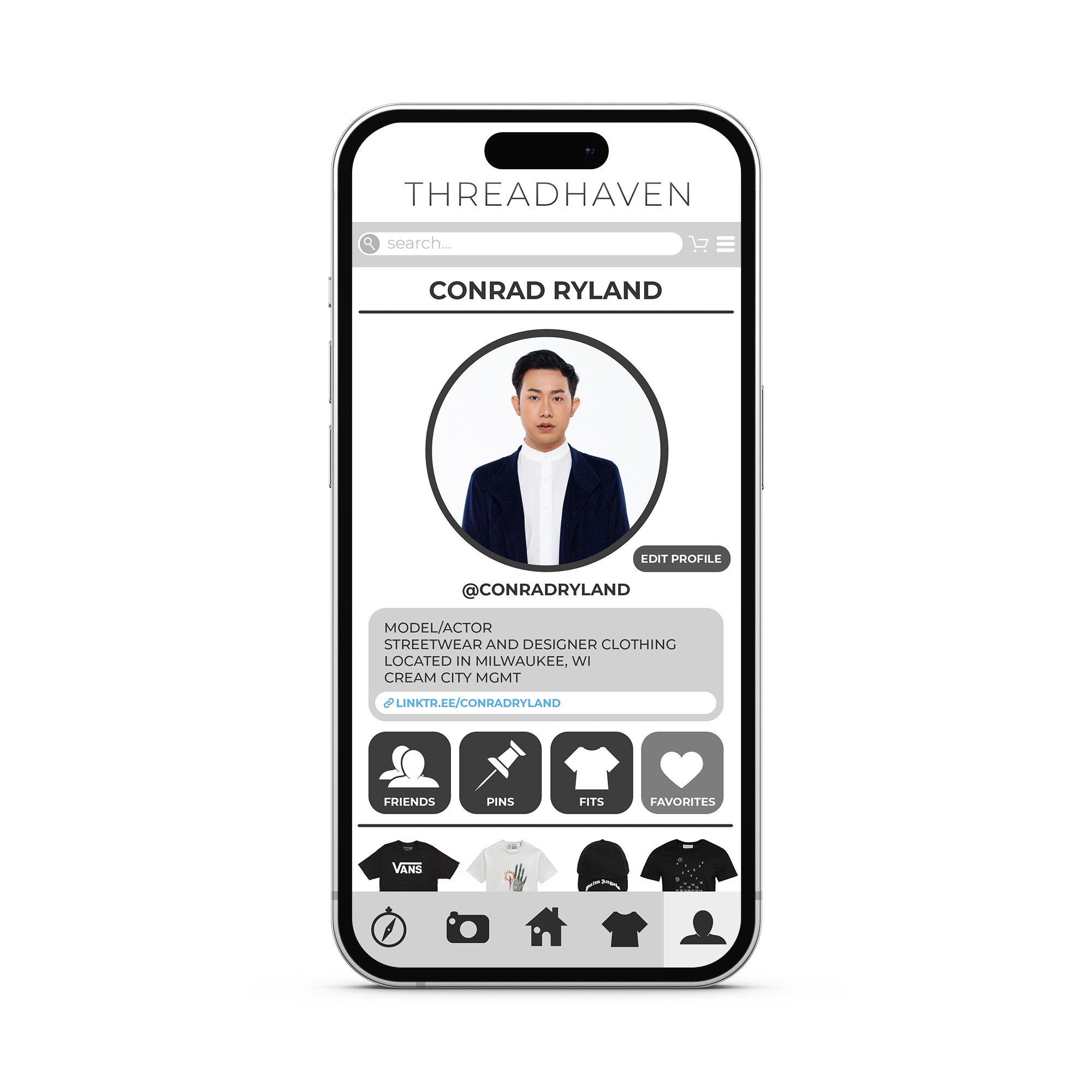
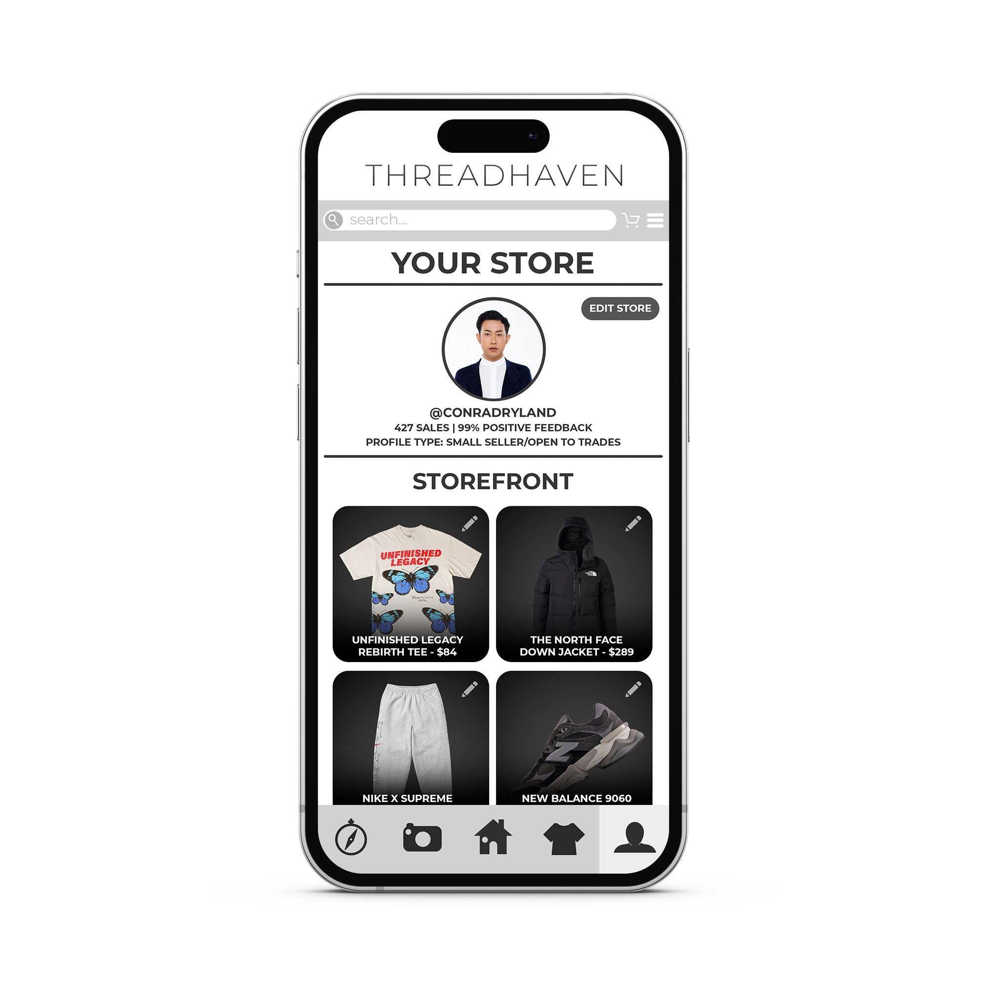
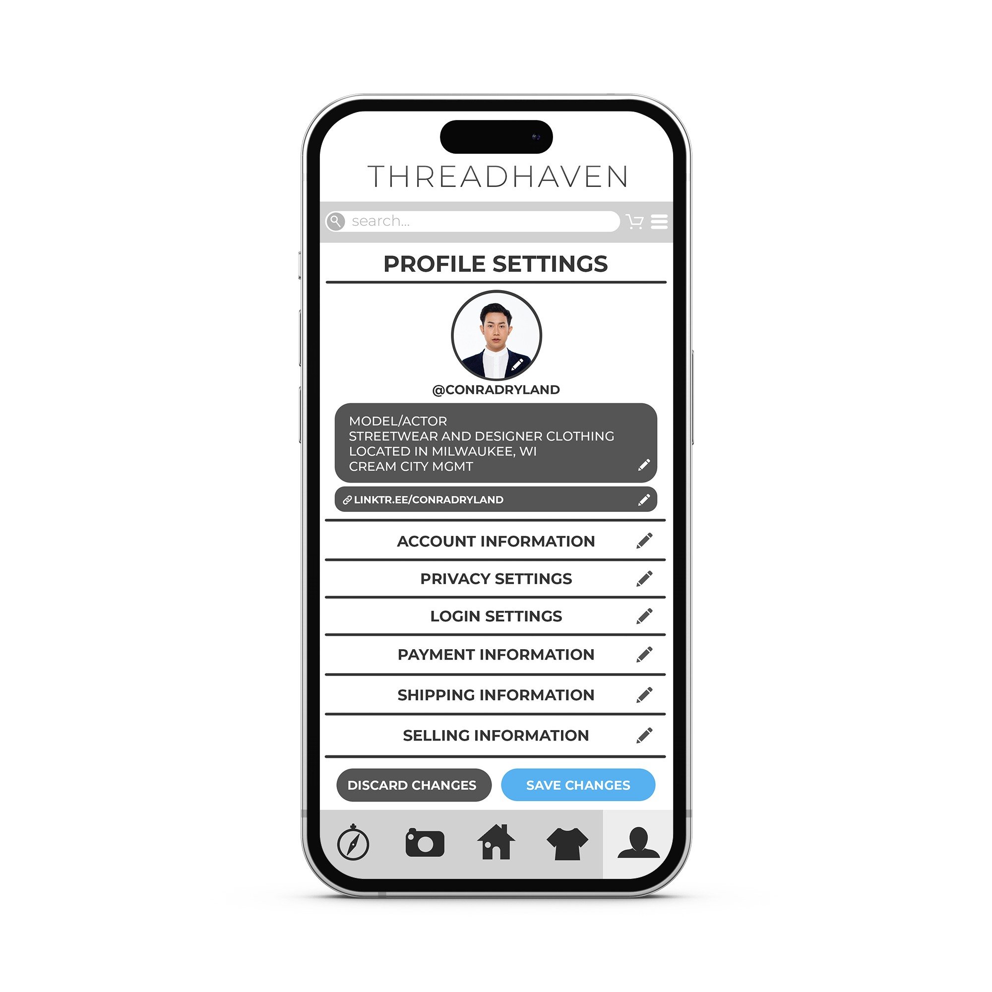
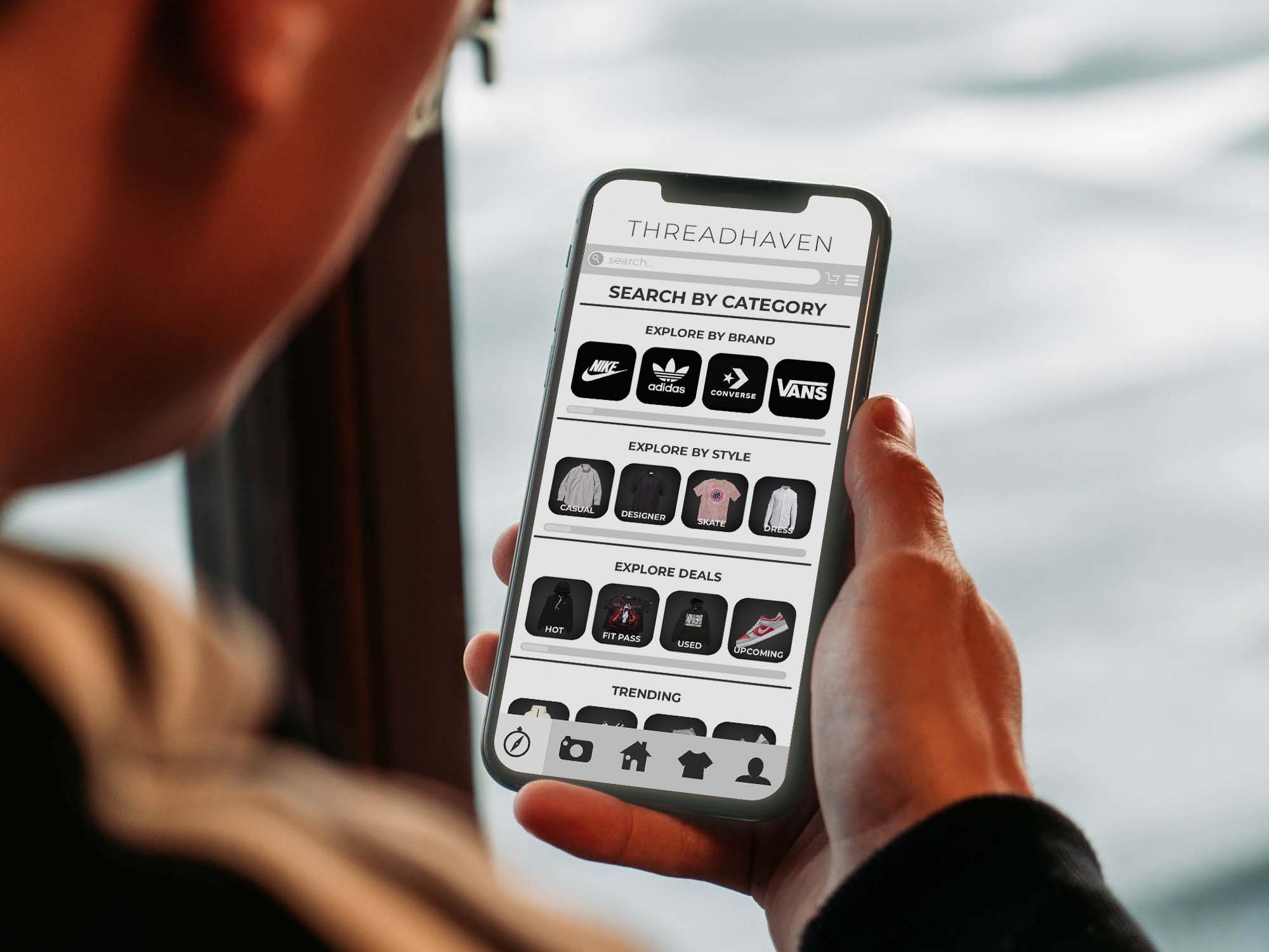
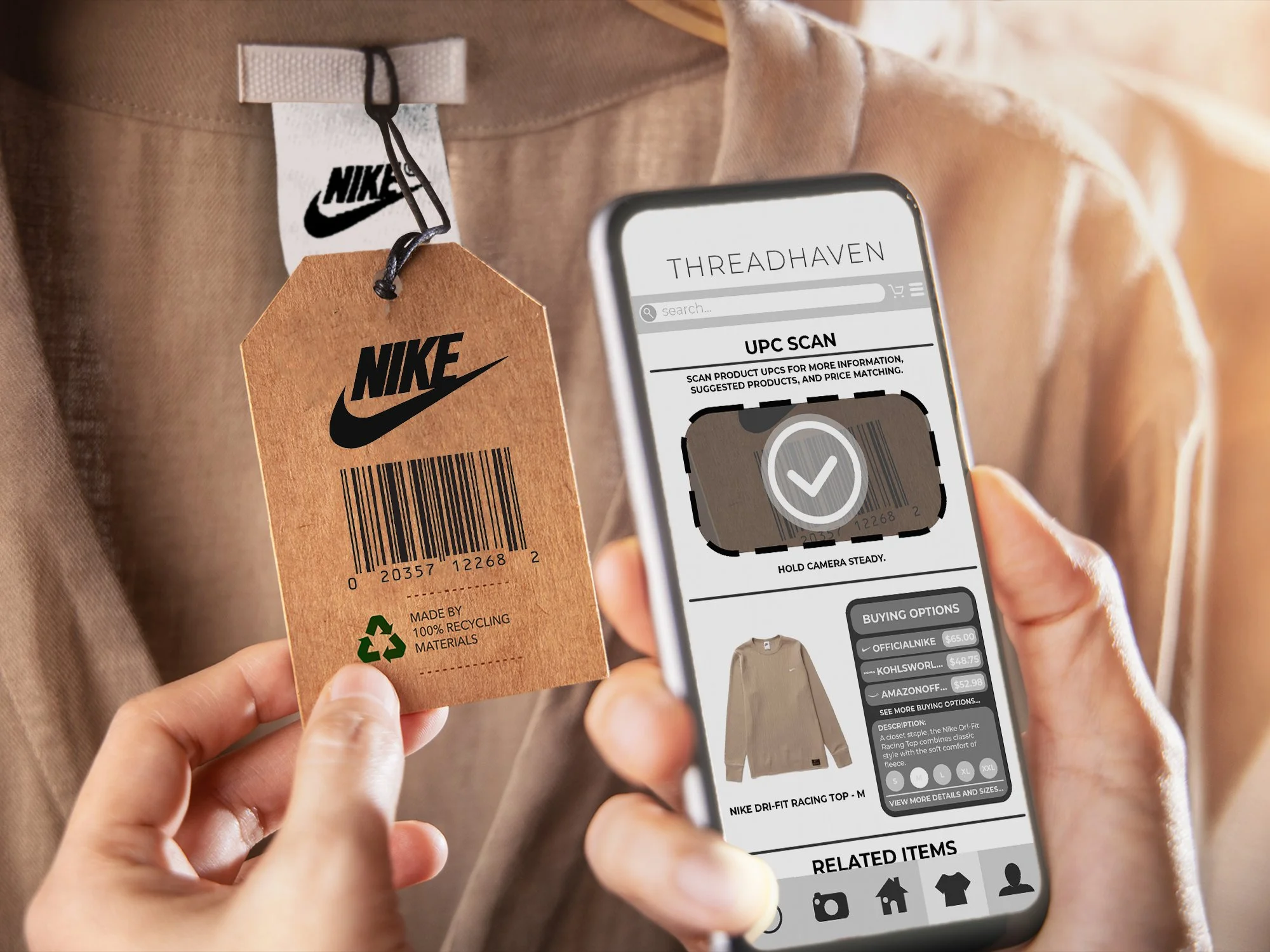
THREADHAVEN APP/UI DESIGN
ThreadHaven is a fictional app I created to practice app/UI design. The goal of this project was to create an app that encompasses many features related to the clothing industry such as buying and selling clothes and shoes, creating personalized digital mock ups for creating outfits, and having a social feed where users can follow brands and their friends.
The process for this project began by creating a logo and name for this brand and deciding what specific features this app would have. I then sketched out each of the pages and began laying out the pages digitally. Then I began collecting images to use for the pages and finally I created mockups of users using the app to demonstrate the features.
Logos and icons were created in Illustrator and photographic elements and mockups were created in Photoshop.

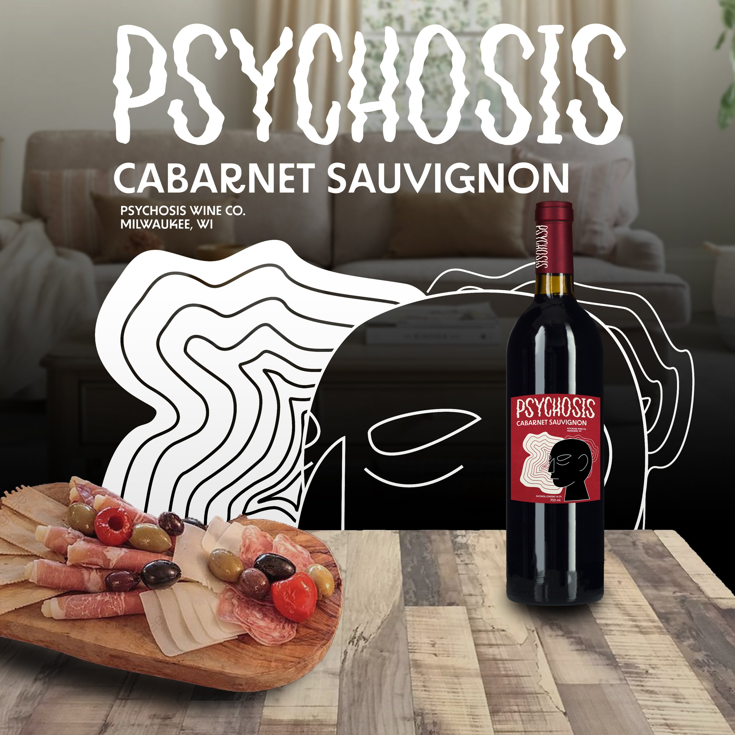
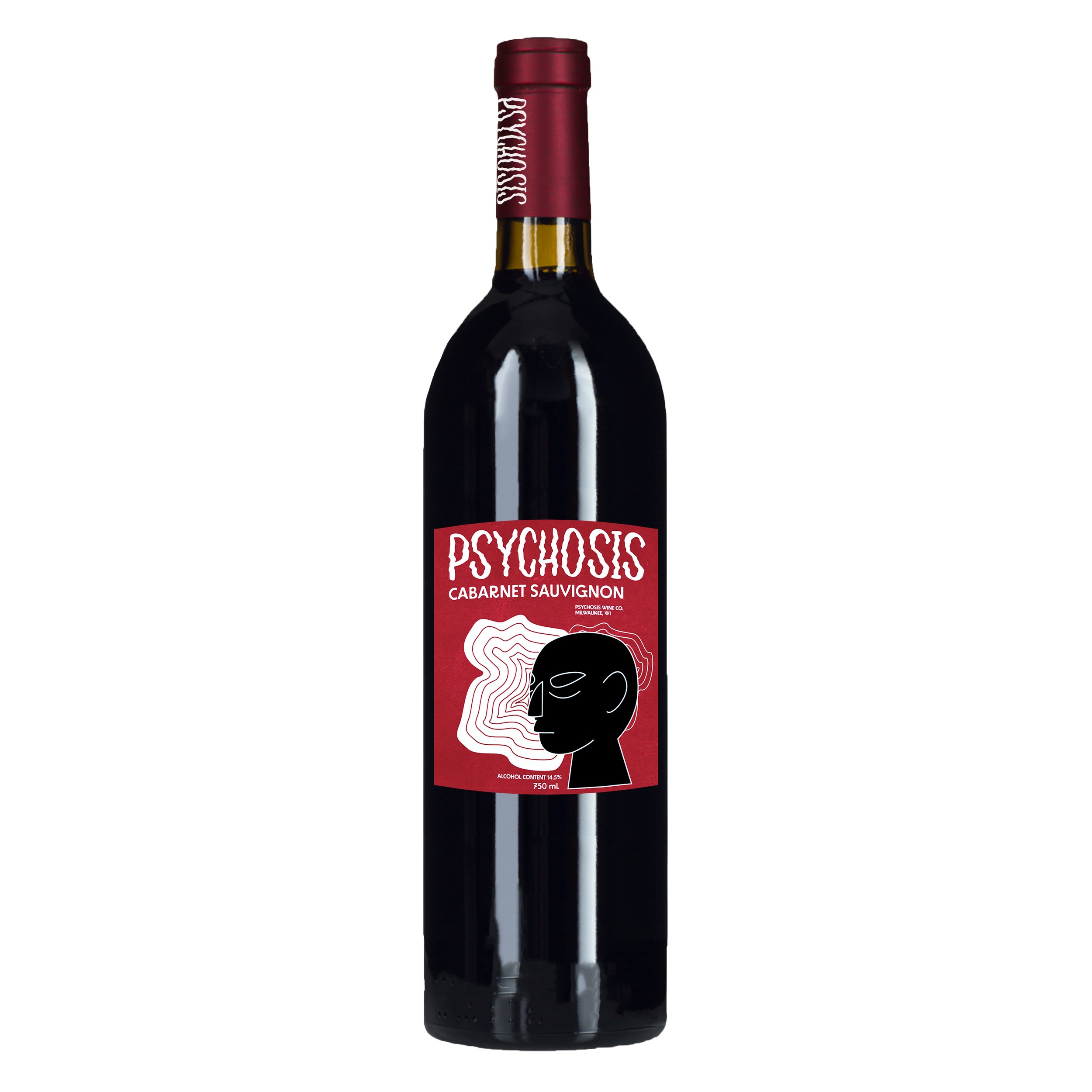
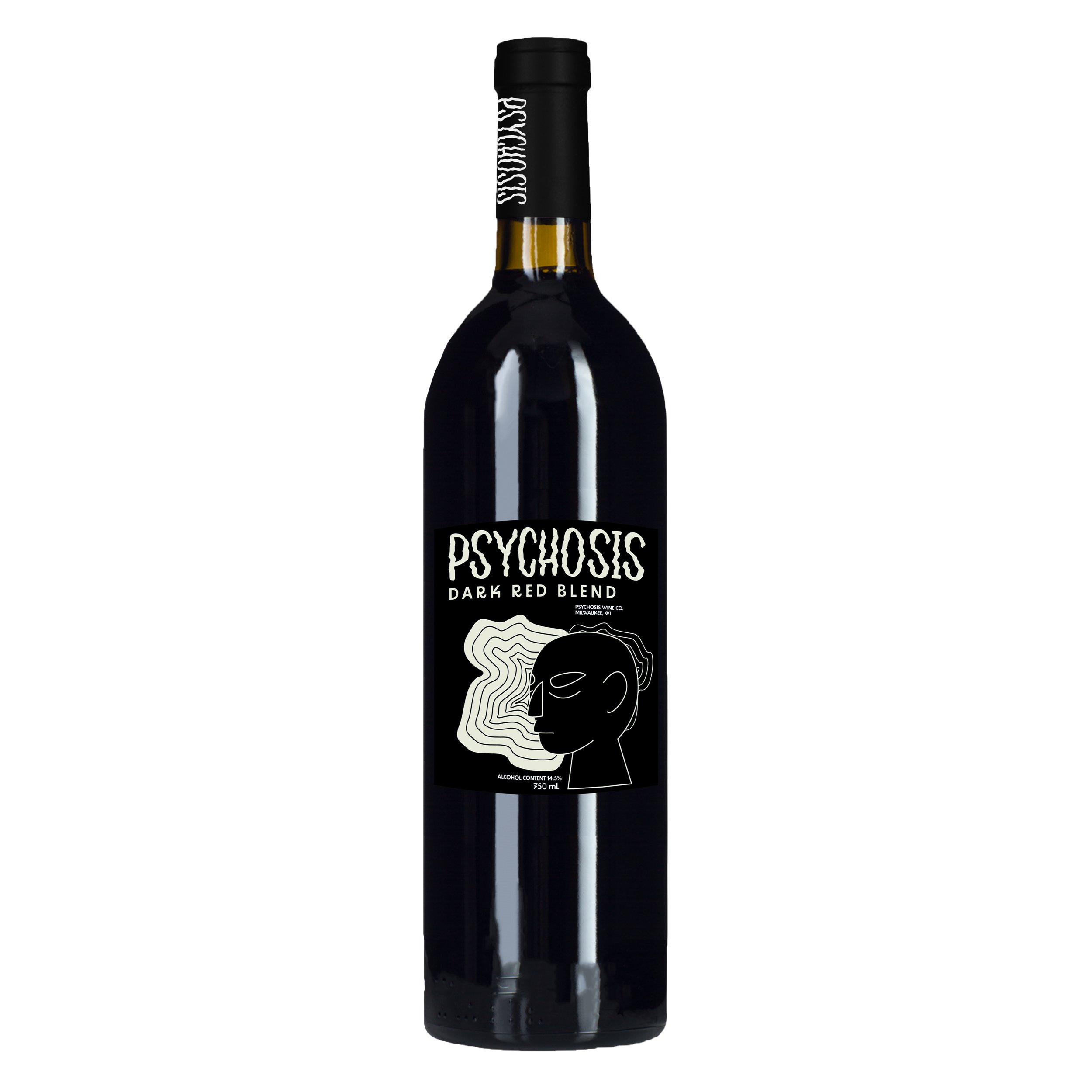
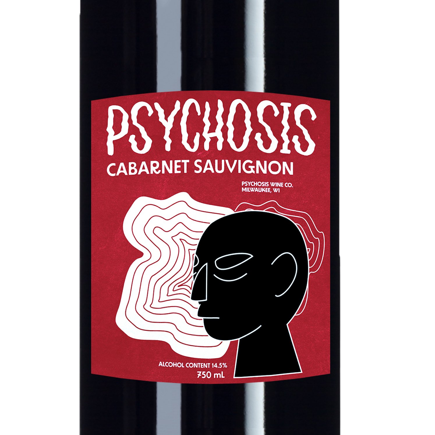
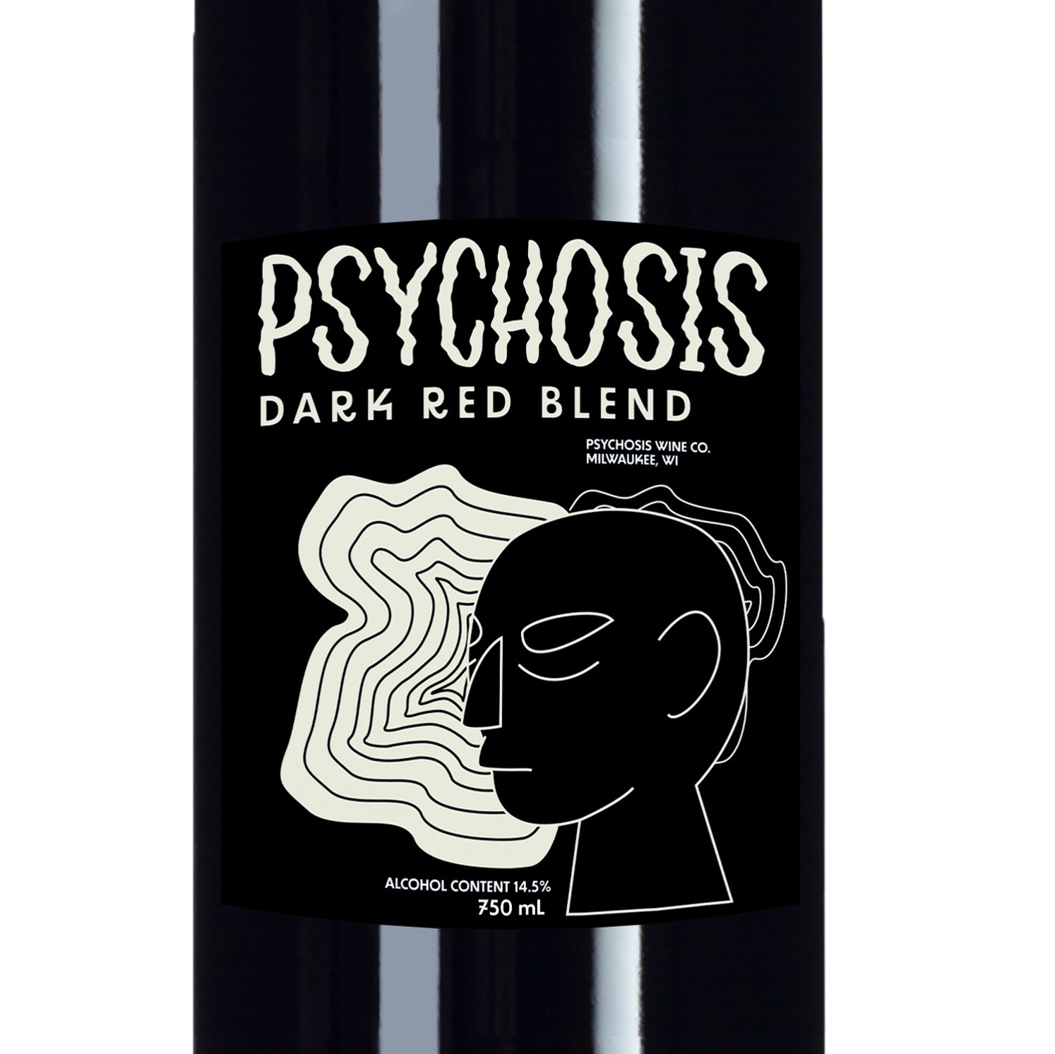
PSYCHOSIS WINE
Psychosis Wine is a fictional wine brand I created to practice my branding, design, mockup, and advertising skills.
Icons were created in Illustrator and mockups and advertisements were made in Photoshop.
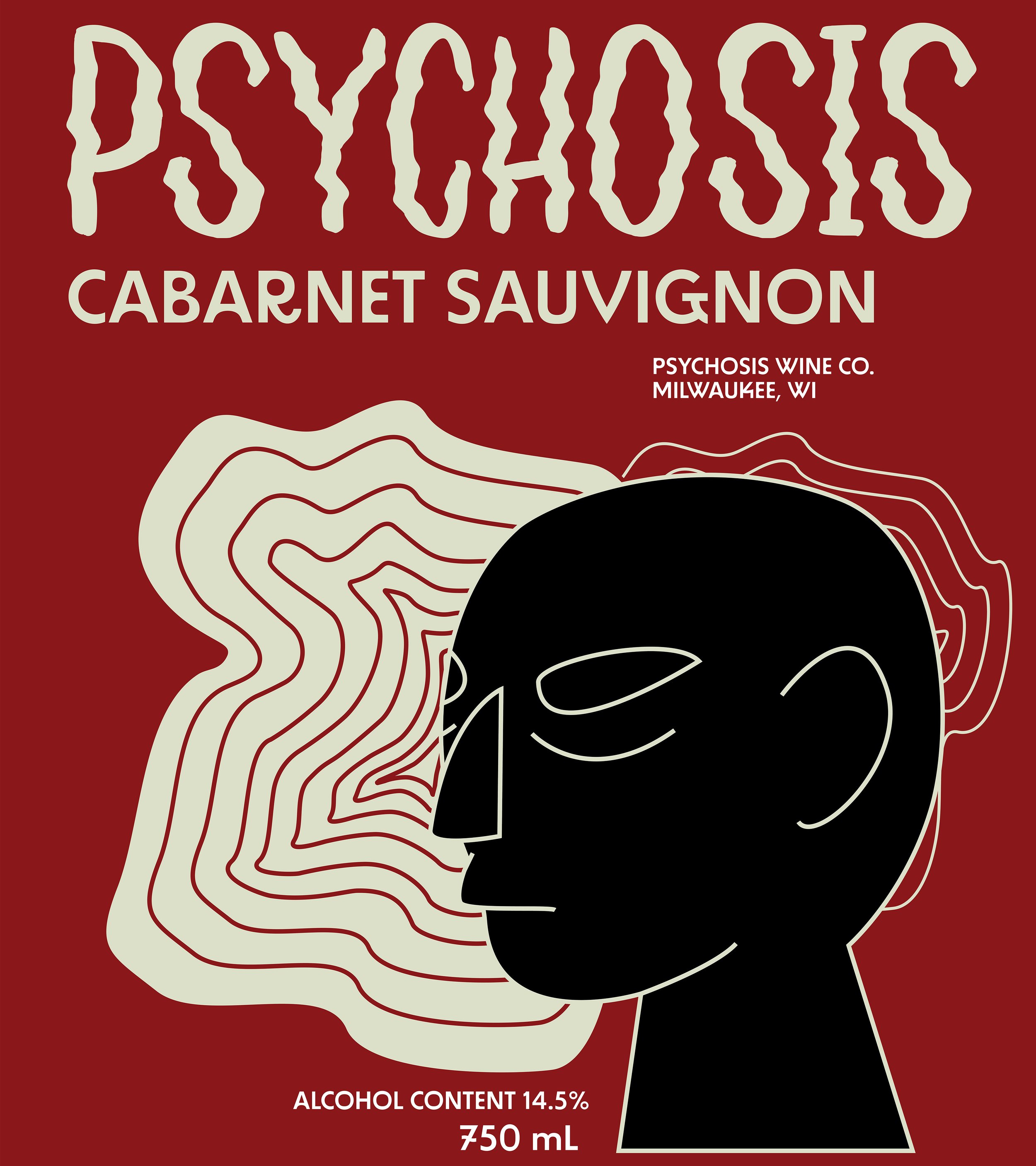
Psychosis Cabarnet Sauvignon Label
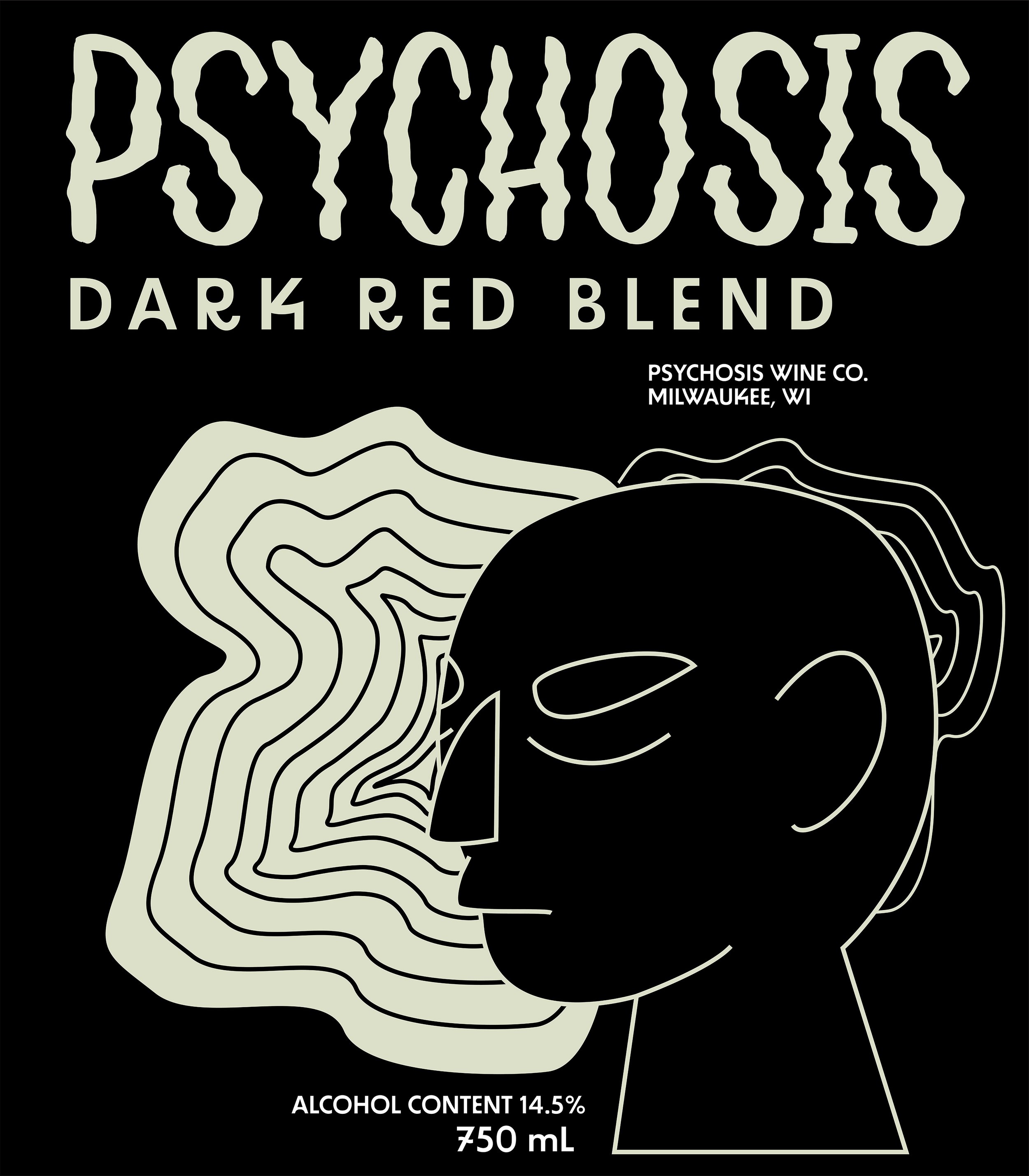
Psychosis Dark Red Blend
Psychosis Social Media Ad
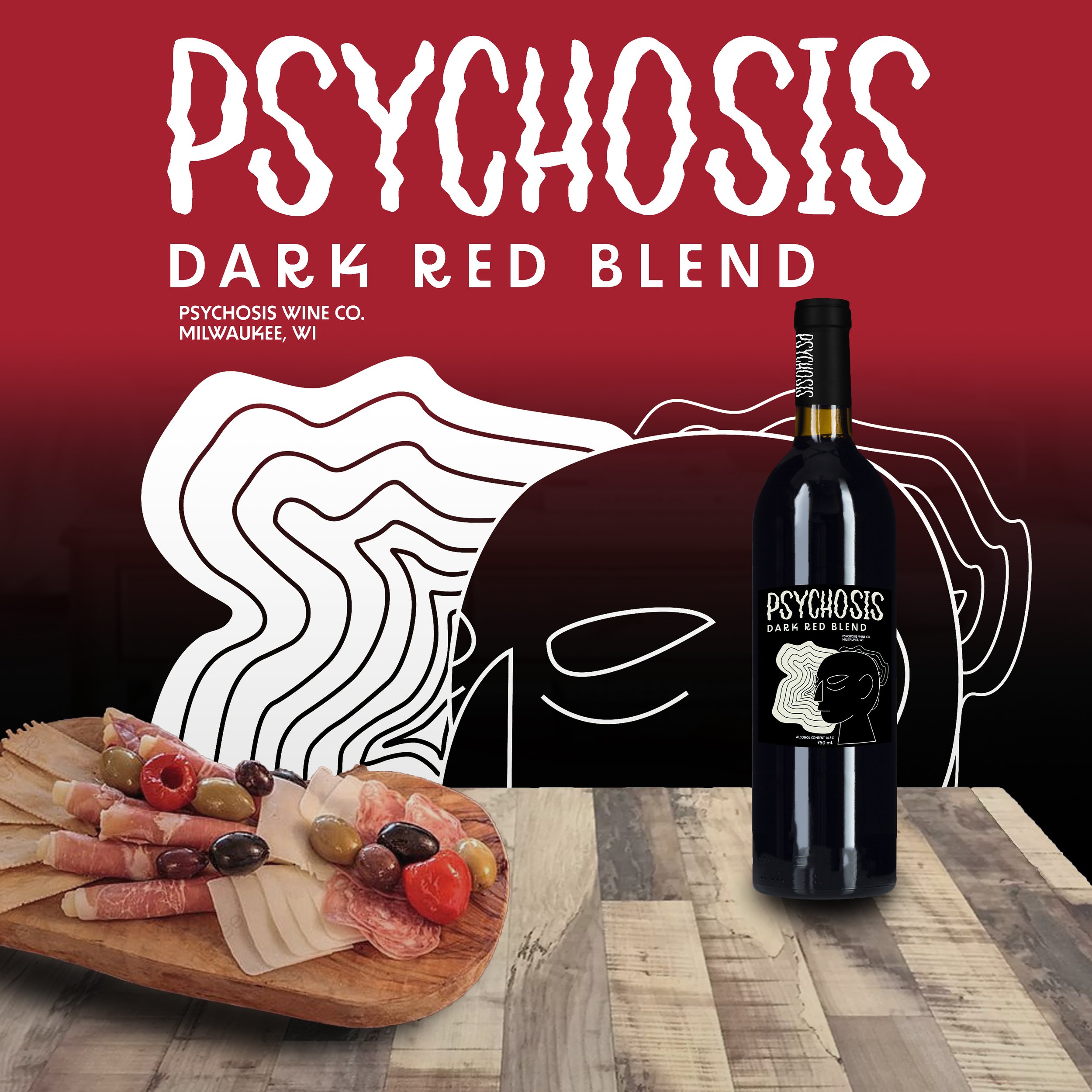
Psychosis Social Media Ad
Psychosis Cabarnet Sauvignon Mockup
Psychosis Dark Red Blend Mockup
Psychosis Cabarnet Sauvignon Label Mockup
Psychosis Dark Red Blend Label Mockup
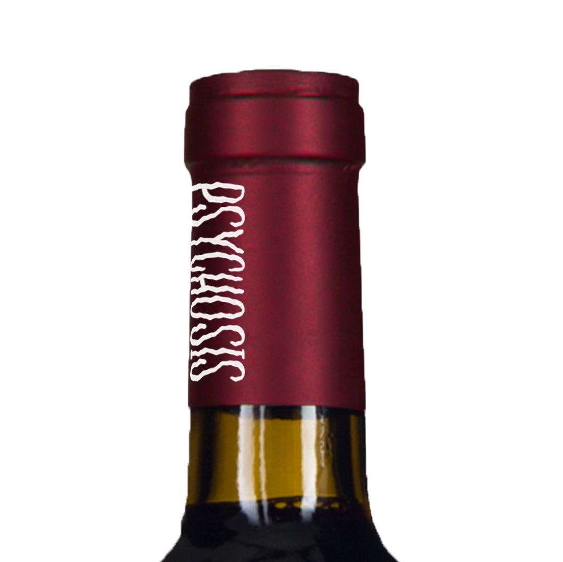
Psychosis Cabarnet Sauvignon Neck Label Mockup
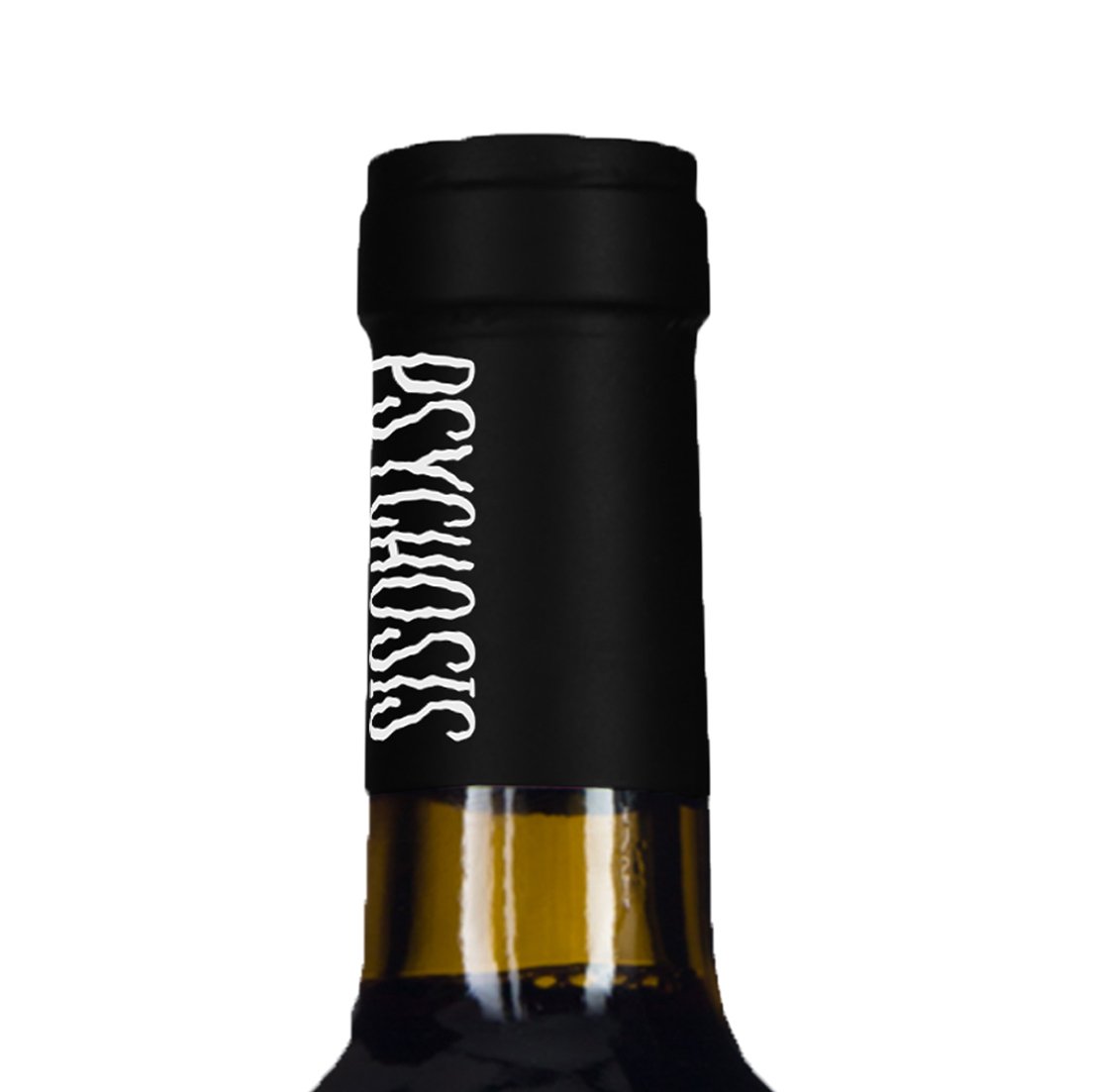
Psychosis Dark Red Blend Neck Label Mockup